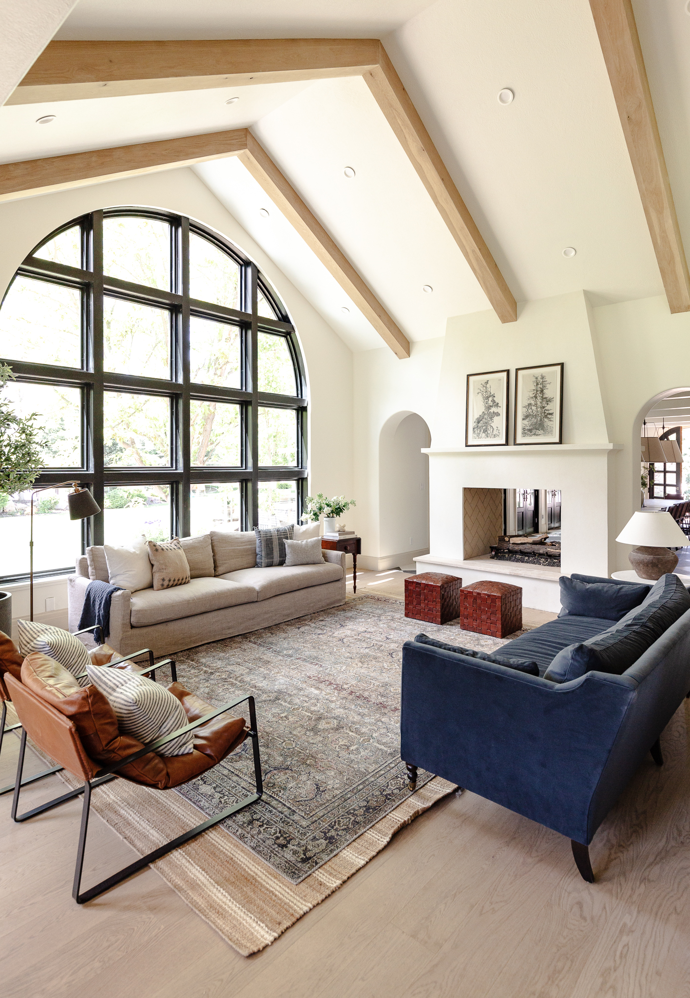
I have come to realize, pretty recently, that I like to build up each room to a certain level and them move on to another room and improve that to around the same level, all the way around just nudging each one up a few notches. It's fun and I feel like our money goes farther when it's distributed over a lot of spaces, but it also means no room is ever "done". Which, what does that mean anyway?
All that to say, we're getting ready to nudge our living room up a few more notches by building (??) a big coffee table and adding a chandelier and I wanted to flush out another arrangement before we do anything. This was the arrangement we've had since the beginning of this year. Although I did move the leather chairs into the basement.
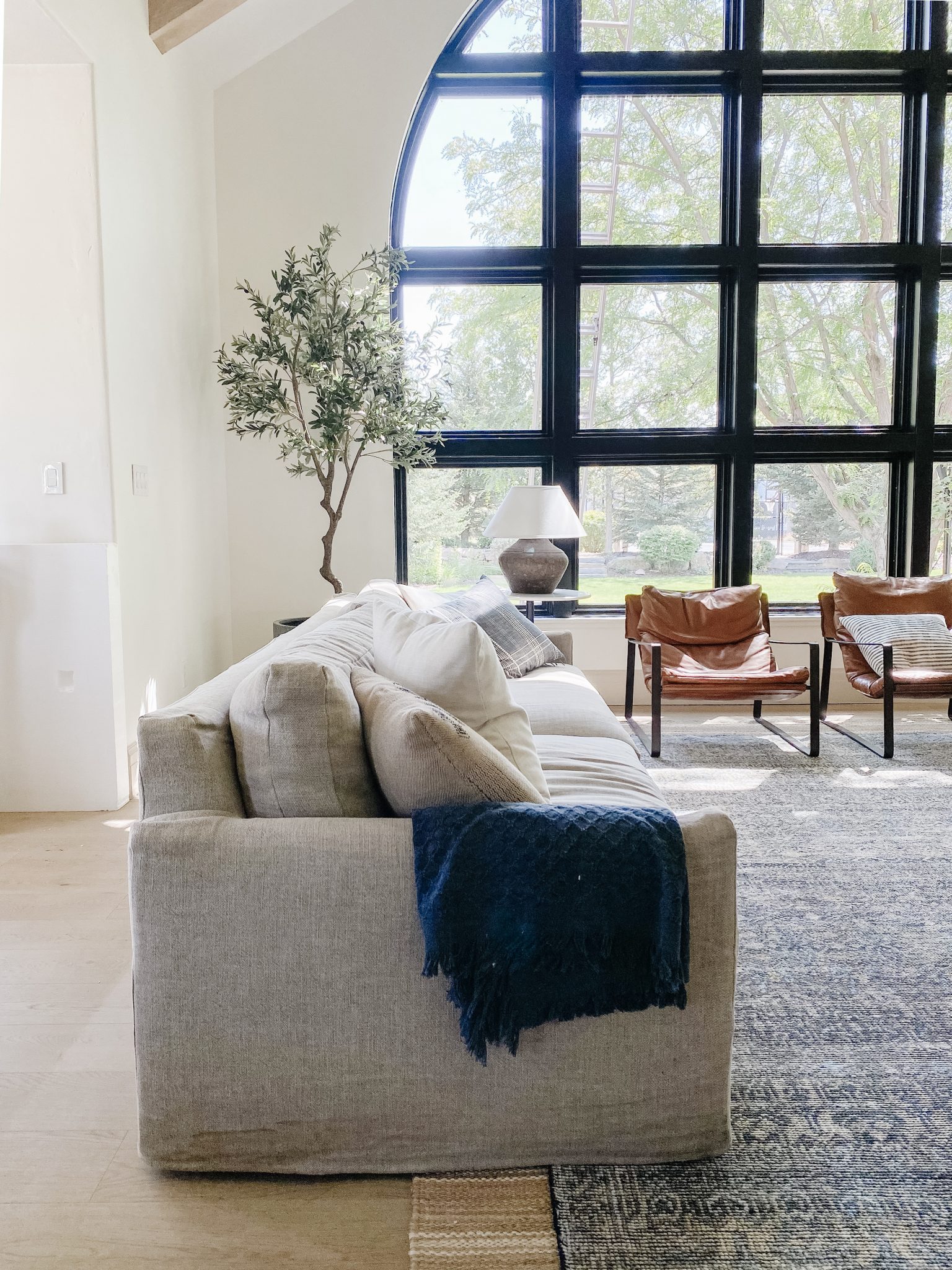
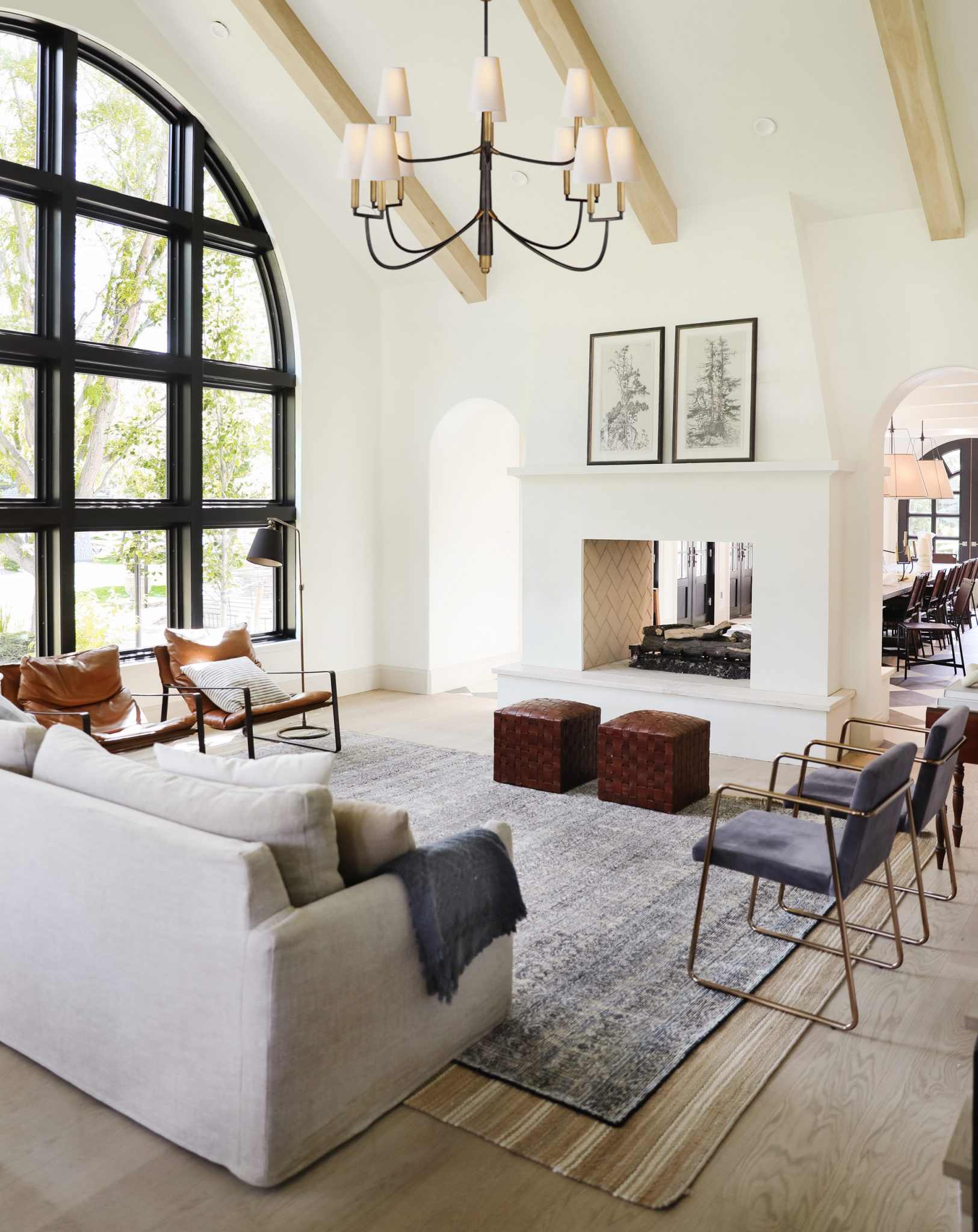
This is how we rearranged!!! (With lots of placeholder furniture).
I didn't think I would like this arrangement at all. I worried that the wall to the left of the window (it juts in to the breakfast nook area and isn't even with the fireplace) would make everything feel off-center, but floating the sofa up actually completely eliminates this issue.
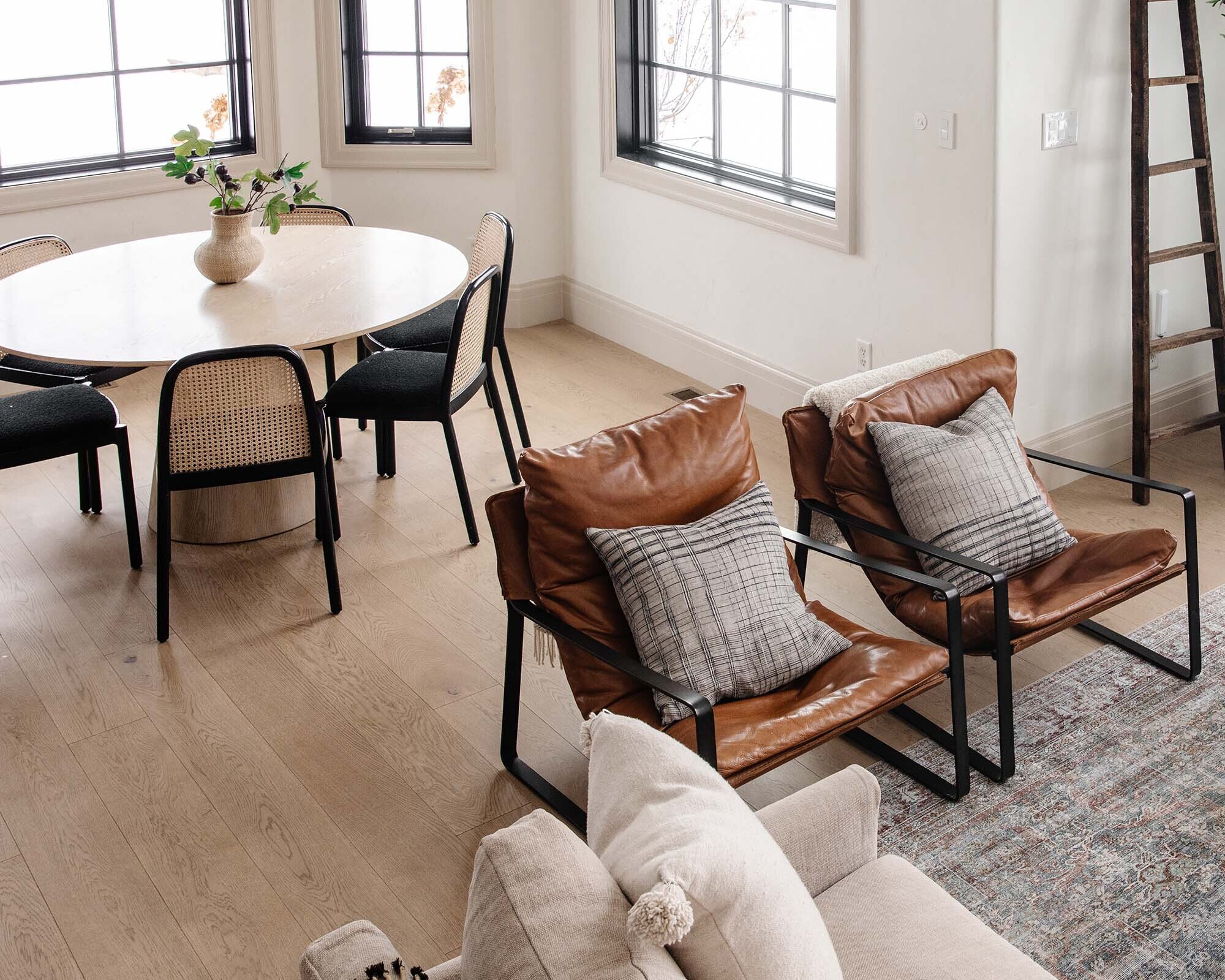
The leather chairs will go back in the family room in the basement (they're too lounge-y for our parents who have trouble getting out of them), but I brought them up as place holders to see how two chairs would look like on either side of the sofa, facing each other. I think if we did a pair of leather chairs and something upholstered that could look nice and collected. It also allows prime Christmas tree location in front of the window when that time comes.
Lastly, I ordered this chandelier for the living room months ago and it's been sitting in our garage through quarantine until we could get the carpenter back. Then I started second guessing if we even wanted a chandelier--and after photoshopping it in, I think it will add SO much to the space.
You can see I also pulled a couple office chairs in for the sake of visualizing what that would look like. If we do two chairs on either side, the two ottomans would definitely have to (too many twos!). I can't recommend rearranging your furniture enough, especially before you pour more money into a space. It's fun, easy, and FREE and has really opened my eyes up to what this room needs and maybe what it doesn't. What do you think about the new arrangement? Do you prefer the old?
LIVING ROOM SOURCES
Wall Color: Alabaster by Sherwin Williams
Trim Color: Accessible Beige by Sherwin Williams
Floors: Ingrid by Stuga Studio
Window: Pella
Navy Sofa
Neutral Sofa
Leather Sling Chairs
Striped Rug
Persian Rug
Side Table (vintage)
Floor Lamp
Table Lamp
Faux Stems
Tree Art
Woven Stools
Striped Throw Pillows
Plaid Throw Pillow
Olive Tree
Wall Sconce
Chandelier
Leave a Reply

WE'RE CHRIS + JULIA
Portfolio
Projects










I think this is great and the coffee table and chandelier will definitely finish it off. I would consider swivel chairs for in front of the window, that way when seated there, you can always turn around with a cup of coffee and watch the kids in the back yard, or angle towards the fireplace on a cold Idaho night. Just a thought.
The shape and fabrics for the 2 sets of chairs will be everything--knowing you, they'll be amazing!!
LOVE the new arrangement! Feels much more intimate and cozy! And I can only imagine winter nights spent in front of that fire!
I like the overall look but feel the lack of lights to read by and end tables to set down drinks. Perhaps the giant coffee table will solve some of the problems?
Change is good. And you can always change it back.
I do like freeing up the window for the Christmas tree.
The new layout makes the window so impressive, really let's it shine. Love it!!
I like this better! It feels like it will be much easier to move between rooms, and I love that you've opened up the window, and this couch allows for window and fireplace viewing. And I love the blue rug - bringing some grounding but pretty color makes it for me. And the chandelier and big coffee table will be great. But you will have to see how everything works once the coffee table is in its place.
I'm getting major Amber Lewis of Amber Interiors vibes here! She is the queen of the sofa/chair pairs combos. Every time I break down a living room of hers that I love, there is a sofa and at least two sets of paired chairs and a giant coffee table. I think once you find the right chairs and style it all up it will be stunning!
I love this arrangement. I feel like it really lets that amazing window shine. I can see an amazing Christmas tree in your future. I’m always thinking ahead to Christmas, my build ins around my fireplace were built with my Christmas in the city collection in mind.
Hi there! I love rearranging furniture too, but based on all the photos and videos you’ve shared of this space, I think I’m still a fan of the old layout!! I love your reasoning of the two couches facing each other and it seems to create good movement between your breakfast nook and fireplace. But on the other hand, the future Christmas tree placement is so spot on perfect, that kinda is enough of a reason in itself!!
I like this arrangement better! Can’t wait to see it with a new coffee table. Such a beautiful room!
If the focus is the window, and the fireplace, then I think this works. If the focus is on the family and friends being comfortable and interacting together, then I think the previous layout worked a bit better.
Seasonally, with the christmas tree and fireplace being focal points, you could definitely arrange this way and manage just the right level of magic and comfort for the season.
Ugh.. that’s hard one.. it’s so beautiful in there either would be great. I do love the idea of two sofas because you have such a large family. I do love that you can walk up to the window.. but then with that beautiful window it doesn’t get obstructed by anything. Lol aren’t you glad I gave my non opinion.
Perhaps it's just because in the initial "after" shot, the view out the window isn't as blown out as the "before" shot... but it FEELS way more open/flowing with the sofa not in front of the window. That was my favorite element of change.
I love the second arrangement! With a huge coffee table and more substantial chairs it will look amazing. I think the couch facing the fireplace and getting the full view of the gorgeous window really makes this layout perfect. Christmas tree will be epic in front of that window.
I love everything you do! You have such great taste, and often choose timeless pieces that compliment one another, even when pulling them in from other areas of the house. I think this arrangement will look perfect during the holiday season, so you can put your tree in front of that grand, dreamy window (insert heart eyes emoji). However, I loved the previous arrangement, and can’t wait to see the room with the new chandelier and the new coffee table!
i prefer the old layout BUT this is perfection for a Christmas tree! use this one seasonally? ????
Love it! The sofa gives my eye a visual stop point after the long view of the dinning room. My only complaint is the two ottoman stools. They just aren’t working for me in the space. Size and scale and color issues for me.
Love the new arrangement! I always prefer the sofa facing a fireplace; it’s just the best cozy vibe! I think a lot of comments are forgetting you’ll be bringing in more substantial chairs???? but i totally see it! I like the idea of more negative space that chairs offer. And I love that window being unobstructed by a big sofa!
I prefer the space with two sofas. The room is so big and grand. The chairs look so small. But, with more substantial chairs it might work better. As-is it’s giving me slight waiting room vibes.
Hi Julia, I love both arrangements, although if I HAVE to choose I will go with the previous one. Your Insta and FB story about the rearrangement has a grey suede bench in the middle like a coffee table. I don’t see that here. Could you please tell me the source for that bench? Thank you!!
I get where your going with it! Was definitely wondering where you would put the Christmas tree!? The big coffee table will totally ground things, and with the right chairs?? It’s going to look fantastic.
The other layout was nice. Absolutely nothing wrong with it. But, I love rooms that “come together.” There are so many great things about your living room...but my favorite is when I get to see the room as a whole. Not just the window, the fireplace, the couch...I hope I’m making sense????
2 sofas perpendicular and a pair of upholstered chairs facing windows.... I love the sofa facing the fireplace, as this is a beautiful focal point in the room and you will have many a fire going come winter. I also love how it creates a separate room from the breakfast area and kitchen.
I usually always end up LOVING all you do even when I’m initially skeptical but I prefer the other set up - it feels way more inviting, cozy and pleasing. BUT yes to the new light in that room - it definitely elevated the vibe in there.
Very nice but I must admit I prefer the other layout. I would consider this layout at Christmas just to have your tree in front of the window.
I know the obvious place for a Christmas tree is in front of the window, but I can’t stop envisioning it tucked in the corner, connecting it to both the window and the fireplace. I think it’s so fun that you have options, and can change for seasons or whenever you fancy. Your home always looks lovely!
Love this arrangement! It makes the room seem so much roomier, and highlights the view out the window instead of hiding it behind the couch. And that chandelier....so much love!
I love this new direction you’re headed in! It feels more casual than the two parallel sofas, and the walkway to the dining room is more open. Plus, you get a great view of the fireplace AND windows from the sofa. Another bonus- a sofa table would give you another surface for styling or storage. Can’t wait to see your DIY coffee table! I have plans for a large round DIY coffee table to fill extra space in our family room.
I really like the idea of swivel chairs that match the couch. Have you thought about flipping the rug back to the way it was and making a walkway from the kitchen into the dining room? Also placing a comfy chair, maybe leather, with an ottoman to the right of the fireplace, might be pretty nice. It’s just a thought.
The room screams for a sectional or two sofas positioned in 'L' shape. The larger pieces would help balance with the scale/size of the room versus several individual chairs. A large coffee table will also help proportion the scale/ground the room. Just two cents from a RID. Happy designing.????????????⚖????
I really love the couch in the new spot! It definitely visually closes off the floor space of the den from the kitchen, but I think that helps make such a massive room into a cozy and intimate space. As someone else mentioned, much less of a pass through area now.
I think it's great that the layout can keep changing and adapting over time, you're not locked into one layout. You can switch it up as the mood or seasons change.
Just thinking out loud here (so just considerations)....
It still feels a little odd having furniture where the blue office chairs currently are--just very tight and like you're blocking a walkway. Would using the ottomans on that side help give you a walkway when needed, but seating when not? Or maybe instead of two chairs on that side, just one kind of angled on that corner of the rug? Also, do you have room to shift the rug and couch closer to the fireplace to have a console table behind the couch?
I really love the couch in the new spot! It definitely visually closes off the floor space of the den from the kitchen, but I think that helps make such a massive room into a cozy and intimate space. As someone else mentioned, much less of a pass through area now.
I think it's great that the layout can keep changing and adapting over time, you're not locked into one layout. You can switch it up as the mood or seasons change.
Just thinking out loud here....
It still feels a little odd having furniture where the blue office chairs currently are--just very tight and like you're blocking a walkway. Would using the ottomans on that side help give you a walkway when needed, but seating when not? Or maybe instead of two chairs on that side, just one kind of angled on that corner of the rug? Also, do you have room to shift the rug and couch closer to the fireplace to have a console table behind the couch?
I prefer the new arrangement! I feel like it opens it up towards the window more. Love!
Breath of fresh air!! I love this layout so much. Everything feels lighter and it looks like there's lots of room to navigate all the connecting spaces. It's really inspiring to see how a room can evolve and change when we're not too precious about our original ideas.
I wouldn't want my back to the window! That window is so beautiful. That view is worthy of looking at????
Hi! I think if it had another sofa facing the window to create an L would ground it better. With the airiness of the windows, all those kegs are too airy (does that make sense?) I think it needs one more heavy piece and that gorg chandelier and it would feel just right
*legs. are airy, not kegs. *face palm*
Hello! I prefer the new. I’m sure you’d get chairs more to scale with your large room (as you said the current chairs are only a placeholders). It feels more open and you can see all of the beautiful window. I also like the couch facing the fireplace. I can imagine cozy nights with a fire and everyone piled on the couch cuddling and relaxing. I’m sure whatever you decide will be as stunning as all your other spaces!
I loved the mismatched couches!!! This feels a bit too "office waiting room" to me? Maybe a smaller couch on the non-window side, keeping the 2 accent chairs under the window (but that mights close off the space and I suspect part of your original gripe)? Maybe this as a temporary layout during November and December? I just loved the blue couch, leather chair & neutral couch combo! Very collected and well done!
Totally agree with the value of rearranging the furniture, and it made me appreciate your old layout so much more ???? I feel like the old arrangement appeared to have better flow. Also, I feel like the two couches somehow looked more inviting and communal, than the pockets of twos.
However, I totally agree with the “prime Christmas tree placement” in front of the window ???? I vote (if we’re voting) the beige couch makes this move for the holiday season, possibly accompanied by the blue couch in its old location for lots of family seating ???? or possibly just having one couch on the stair wall across from the Christmas tree with two sets of solo seating flanking it.
Hmmm, I see what you are wanting to achieve, but for me it still needs some. How about bringing back the blue sofa (because it’s gorgeous) have it face the window & replace the placeholder chairs? I prefer cozy sofas over chairs, and that way you still can pile on the sofa as a family and look out your amazing view. Plus the blue sofa brings color into the room. I think the absence of color is what makes the room feel a little incomplete.
Love the chandelier, but sorry how the leather chairs aren’t senior friendly. I’m finding that it’s something I need to take into account with my furniture choices as well.
I prefer the new arrangement, espec ially as it makes way for the Christmas tree in front of your large window. Would you consider cozier plush chairs?
Definitely favor the new arrangement! Would you consider cozier plush chairs?
I'm slightly torn. Both layouts work but I feel like something is missing from each. The room seems to be quite large and the window and fireplace are large as well. Maybe the scale is off? I do miss the color and texture of the blue couch, it some how grounded the space more. I'm excited to see how you bring it together though and I'm loving the chandelier!!
IMO (since you asked ;)) before was much better. The dining room is so grand, along with the giant windows and high ceilings and fireplace, that the living room now seems dinky and underfurnished with one regular sized sofa and a handful of chairs. It's not very inviting and I'm getting waiting room vibes with all those chairs. This living room really does need 2 sofas. And how lovely would it be to lounge on the blue sofa, gazing out that glorious window as the seasons change?
I agree with this comment!
I love rearranging! I also love you guys just having chairs in front of the windows so open so fresh you never disappoint!
I really liked it with the blue couch.
It's fun to mix things up and I can see how the new arrangement fills that desire, but I prefer the original. I think the blue couch does a better job at balancing out the big, chunky black window panes than a pair of chairs would.
Prefer the old arrangement, especially in the view as you come in from the music room, it feels to “light” without any substantial furniture there. It’s great to have an alternative though, for Christmas and other times when you need a little more open space in the entertaining areas of your home.
Everything you do is beautiful and your home is a reflection of yourself, so you do you!!! ????
I do prefer the old, although this looks nice too : )
Love the arrangement! Just thinking, what if you place the blue ish sofa facing the fireplace and the grey ish one facing the window (this because the grey one is a bit longer as I could see, they'll make kind of like an L) then under the window a bench so it won't create an obstruction for the view outside. (Insert thinking emoji here, hehe)
This is exactly what I was thinking!
Exactly!
I was thinking about this layout option too! One couch facing the fireplace and a second couch forming an L shape next to it. You could alternate having the second couch facing the window (like at Christmas) or right in front of the window facing away from it. You know, when you get that itch to switch it up.
This is what I would think too!
I love this idea because I love the blue couch where it was by I also like the white couch creating more of a border for the room. It does eliminate the pass through feel it had. But also the two chairs in front of the window works but it would be fun to see if a long narrow bench keeps the lines the couch offered there. Or if it would allo just feel like furniture pen? My mother rearranged furniture often, generally twice a year. It’s refreshing to the eye to see your space and things differently. Why do we have to pick one best way?
It took me a bit to try to visualize the new arrangement with bigger, cozy pieces, but i think this new arrangement will be fantastic...especially in the winter with the fireplace on!
Love that you tried a new arrangement, I've been secretly hoping you would try the Charly sectional in this room ????!
I think you hit the ball out of the park with the first arrangement. It’s so well balanced and allows for a more comfortable conversation space (in my opinion). However, I think the second arrangement is perfect for the holiday season!! As you mentioned the second arrangement gives prime placement for a tree in front of the window! So I say second arrangement for holiday season, first arrangement for the rest of the year!! Either way, such a beautiful space!
Both are so pretty, and fun to be able to switch things around with the seasons. I like the couch facing the fireplace for a cozy fall/winter when you will be using it. But the other way highlights the window for the spring/summer when the focus shifts to the outdoor colors. But you mentioned Christmas tree, and I'm so ready for Christmas!! (Ready to say goodbye to 2020!)
I love the 2 sofa arrangement for the rest of the year but maybe switch it up for the holidays? I have a large great room/ living room that mostly stays the same during the year but during the holidays (Thanksgiving to mid-Jan) usually moves around a bit to accommodate our large Christmas Tree and visiting family & friends. Just something to think about!
I love watching your home evolve! Thank you for sharing!
Both are great layouts for different reasons! I like the previous suggestion of simply changing it up between the two from time to time. Or when you have your tree out for instamce. Keeps it feeling fresh! Now can you please send your sister and husband over to my place to help me move all my furniture around?! I'm itching to rearrange now! Oh and LOVE the chandelier too - can't wait!
I love both! The original feels more like home, to me. The re-arrange feels like maybe a common area in a mountain town resort. (Too specific? ????) Still lovely, just less homey.
Anything you do looks great! You’re lucky you have the space to re-arrange. My rooms are so small I don’t have that option :(
I like it cause it feels more open with the new arrangement, but if u leave the blue sofa where it was, then u have 2 great seating areas that u can enjoy the view from without taking up a lot of extra space! At least at Christmas time that would work! How about a sofa table behind the gray sofa with a lamp on it?
I absolutely adore this new rearrangement, but my heart always will belong to the couches parallel with each other looking out the window. The view you get is insane!
Maybe just for the holidays you can arrange it like this to accommodate for a tree! And then afterwards, rearrange again back to how it was. That way you get the best of both worlds.
Love the old and love the chandelier!!
I absolutely adore this new rearrangement, but my heart always will belong to the couches parallel with each other looking out the window. The view you get is insane!
I like the new arrangement better, mainly for what it does for the window. I really like seeing more of the bottom of the window.
I love the new arrangement! I feel like you can appreciate the beautiful window even more without the sofa in front of it. Love what another reader mentioned about swivel chairs, with the option to face out or in. This new layout seems to define the space really nicely, and the idea of sitting on the sofa in front of the fire sounds just dreamy.
Oh - and yes to the chandelier! And maybe a round coffee table or ottoman. :)
I love the new arrangement and can totally visualize it with your ‘placeholders’. I love love the chandelier! Can’t wait to see the sets of chairs you pick along with the large coffee table. A bench it’s going to look so good next to the fire place as well!
I grew up with a mom who LOVED rearranging furniture ALL THE TIME. And it was always such a breath of fresh air in the house. We would end up using spaces we had previously ignored. She’s switch out entire rooms! She’d move the location of the dining room to the living room and try things out all the time. There’s no right or wrong, just new and different and some were better configurations than others but nothing was ever just wrong. That’s how I feel about your new lay out: it’s new and different and fun and a change and all these things are good things! I’m glad you don’t have a sectional there coz I always felt that sectionals limit your options when it comes to playing around with layout btw. Or so it’s been for us! Love the new feel, and not just because I love everything you do ????❤️
???? so fun! Now I want to do my living room! The blue sofa in here with leather armchairs would be so pretty too!
This is what makes your IG/blog so good. I love that you’re willing to rearrange your furniture for your followers. I love the old layout but it’s nice seeing it different ways.
I like the old layout better but I love the idea of this layout for Christmas. Facing the fire, room for the tree. I can wait to see what you do in here for Christmas ????
I love this new arrangement! Feels like the room can breathe and opens up that gorgeous view out the window. But ultimately you are the ones who live there and know how the flow and conversation actually work.
Prefer the old arrangement except for Christmas. You are so right about the tree in front of the window!
Love the new arrangement! It somehow highlights both the fireplace and the amazing window. I think adding the large coffee table will help connect everything, along with non-placeholder chairs.
You’re a saint for trying things people suggest! I would’ve said, nah I like it this way! Ha! I like the two sofa arrangement. It allows for more comfy seating, more face to face conversation, and better flow through the room from the breakfast eating area to the dining room. Looking at the back of the couch always feels like a sudden stop to me. Sometimes that break might be wanted but I love the open look! It’s fun to try different arrangements but at the end of the day whatever works for your family!
Love the new arrangement! The living room somehow feels both more open and more intimate. It seems more like it's own room, while still being open to your breakfast nook. The direct view of the fireplace from the couch will be so warm and cozy. Love it!!! :)
I love the placement of the gray couch, but probably would keep the navy couch where it had been, putting the 2 couches at an L rather than opppsing! I can't tell if that would be in the way of walking around though. Then you only need 2 chairs and the 2 ottomans could stay.
Love it! I really like how you now have a walkway to the dining room that doesn’t go through the seating arrangement. I like the two sofas facing each other too but always felt like it was awkward that there wasn’t a clear path to the dining room without walking in front of the sofa, which would have felt cramped once you put in that big coffee table you plan to build.
I love this new arrangement. The previous arrangement with the couch in front of the window really cut off a portion of the window and made it look smaller. In this arrangement you can really see the awesome scale of that amazing window! I love the idea of having two swivel chairs by the window so you could turn around and look out the window. I can’t wait to see this with a coffee table and new chairs. I’m so glad you decided to take a chance and re-arrange this area!
I like the 1st option how it was before but both are beautiful!
I love it. It makes it feel so much bigger and brighter. Not that it wasn't big and bright...but it just feels that way. Thanks for sharing... I love rearranging after time. Helps keep things fresh. Plus a great time to deep clean. Ha!
You can't tell in a picture what a space really feels like, but it looks like it would feel nice in the new layout. thanks for sharing all the process!
I love the picture with the chandelier photoshopped in! It really ties in the living room with the dining room. I think you can make either layout work. They both look nice. Does the blue sofa look lovely in the music room?
I've always loved the look of two full sofas facing each other. It always feels luxurious, because not everyone has that amount of space. I think the layout works, esp. since you moved the sofas closer, providing the walking path behind the blue sofa to the dining room. If the size and shape of your new chairs provide more "clearance" (vs. having the legs jut out a bit behind), that will help with the overall flow as well. My vote is for the original layout. The new chairs and a coffee table will bring it all together!
Did you try the blue sofa where the white one is? The upholstered chairs might do what I think is missing—some sort of anchor. But as always, looks great!
My sofa also floats in our living room. We have a tall long and narrow table behind it which totally helps to ground it and visually breaks up the view of all that couch back Lol! I think you could do that here as well... just a thought.
Personally I really like the 2 sofas but I would love to see a matched pair for some symmetry. You can always rearrange into an L shape for the holidays. :)
I love the leather chairs in their new spot, they just work so well with the windows and look like an incredible place to curl up and read something. I know you said they are temporary there because the grandparents have trouble getting out of the chairs, but are there no other seating options for them to use? If the couch is also too low I can understand that the chairs need to be replaced though. But whatever goes there after should be something light, and either two pieces or not too long. But the black metal structure with the black window frames is just really great.
For the other side, maybe you can find something similar to the Charlie-sofa, just smaller (like one back pillow wide instead of two) instead of the office chairs. In front of the fireplace, I'd likely skip actual furniture, and go with some floor pillows and/or one of those bigger sack-like things, in a cozy fabric or soft leather, as that would make an awesome lounge area for the kids and also for reading (or reading to them) in front of the fire etc. Though I wouldn't be surprised if it were quickly commandeered by the dog :)
In any case, I'd try not to do all angular seating in a square arrangement like now, because its orientation around an empty center will always make for a bit off a group therapy talking-session vibe (and I can't really imagine a low table or anything in front of the sofa either to change that up). Having an informal lower area by the fireplace would break that up and feel casual and inviting, even for people who can't get down on the floor themselves to partake.
This is beautiful (as always), but I think I like the original layout best! Does the new placement of the sofa feel too much like a visual block from the breakfast nook? (I think I have the layout right in my mind...it’s behind the sofa, right?)
I like the new arrangement, but where will the lovely blue couch go, now?
I loved the old layout and I love the new layout! The bones of this space are so beautiful that every furniture arrangement looks good. That being said, I think that this new arrangement works better. It feels welcoming and visually reduces clutter. I feel like the two sofas mimicked the lines of the doorways and made it feel like there wasn’t an end to the living room, whereas the sofa with it's back to the kitchen caps off the living room and makes it feel cozier.
Love the original one, but this one would be great for when do you holidays!! It’s always fun to switch it up a few times a year!
I love, love, love it! I think you did such a great job with the layout and now the living room looks much bigger! I think wherever you sit or go, that window view won’t be missed, so no biggy!
I also love rearranging furniture. I lean towards the old arrangement, but I think you're right that it's hard to imagine the new setup since the chairs are all placeholders. It would be fun to see what options you're thinking of in terms of chairs.
Love this look so much better. It opens up that big picture window— instead of a couch blocking the beauty of it.
Is the line on the floor between the breakfast nook and the living room from sunbleaching? Do you know if the sun will fade that area with the new rug placement? I always worry about it in our home and so I've kept the rug placement the same since moving in. Will that change your thoughts on drapes on the grand lovely window or is the fading part of the lived-in look you're embracing? Just curious as I love both hardwood and rugs but the sunbleaching is the annoying downside.
It's actually just dust! If it was bleached, the rest of the floor would be lighter.
Oh phew! That's a quick fix then. Some species of hardwood actually do darken in the sun. I called it sunbleaching but should have said sun exposure! Anyway, have a great day!
I really like the new direction! Quick question...how do you keep your sofas from moving on the hardwood floors?! I have the back legs off my rug too but I’m constantly having to adjust it! I’ve tried some nonskid pads and nothing has worked!!!
These are really heavy sofas.
New sofa it is! ????????????
Love this room and new the chandelier. The last picture with the view into the living room makes it look like a lot of chairs. Is there a way to arrange the two sofas in an L shape? I really liked the blue sofa in there.
I would probably rearrange it this way to accommodate the tree during the holidays - but i'd keep the original layout for the rest of the year. I think the other layout would work better for our family. (We'd be more inclined to hang out and use the space with the previous arrangement.)
I loved the before, but I also love how the second arrangement opens up the window! Why not try the blue couch where you have the blue placeholder chairs now? Will it be off balance, or will it create a cool L-shaped sectional-like vibe, and allow more seating and views of the outside?
It would block the walkway
It looks great Julia, either way ! Reminds me of being a kid and moving around my bedroom furniture every weekend, haha. Personally I love the second “new” layout as I think with the double sided fireplace it contrasts to the direction of the dining table... the room almost looks wider. I can even imagine a skinny table behind the sofa for decor, family games and another visual break between the breakfast nook and living room. Also I love how you are already thinking of Christmas tree placement , me too ! :)
I prefer this arrangement!! I hadn't asked because like, goodness it is YOUR house, do what you want! but was hoping you guys would rearrange just for the fun of seeing what something else would look like! For one, I am just so enthusiastic about a couch facing a fireplace and not having a couch "blocking" the window (even though it totally didn't block it, just not having that solid horizontal bar of furniture in front of it makes my eyes really get to enjoy it!). I also think the two mismatched couches facing each other didn't feel eclectically curated to me, it just felt like "oh those couches don't match." I think my eye was jumping between the two couches like WHICH ONE DO I LOOK AT hahaha. While in this layout, you could have pairs of different chairs and it would balance a curated feel with symmetry, if that makes any sense! I also agree that I can just SEE the Christmas tree in this arrangement! Will be so neat to see how you continue to pull it together!
I LOVE two sofas facing each other, so I didn’t expect to like the new arrangement, but I actually think it’s better. Because the ceiling is so high and the window huge, it makes the seating area feel more conversational.
This living room is my most favourite living room
among all socials and has been since you first shared. I do miss the blue sofa! I love that sofa and that colour scheme is just EVERYTHING! Can’t wait to see what leather chairs you choose! I love the chandelier addition too - I remember a while back you contemplating adding one or not and I also though “Nah” - but it’s beautiful and definitely adds some richness to the space.
Love it!
I think you need a little loveseat instead next to the large window
I think you need a smaller sofa where the office chairs are, but I love seeing the full window through the other two chairs. A large square or organic shaped coffee table or ottoman would look lovely under the chandelier. When I am stressed with life I rearrange our house. It is something I can control!
I like this layout more than the old!! What about having your two couches and two chairs instead of four chairs?
Is the line on the wood floor between the breakfast nook and living room from sunbleaching? Do you know if the sun will fade that area with the rug placement changed? I've always worried about it with our hardwood floors so I've stayed committed to the current rug placement since we moved in. Would you put drapes up to reduce fading or is that just part of the lived-in look that you're embracing? I love hardwood and rugs but it is a worry with fading.
I do like the new arrangement, especially with a large coffee table, but I loved the blue couch so much.
I am a person who LOVES looking out my windows, so this arrangement feels better to me. I've never liked a couch in front of the window. I also like the couch facing the fire place. Come winter that's where I would be. Watching snow fall outside and looking at the fire. Agreed, too many pairs of things and none of it feels grounded, but I'm sure it will when you are done
Definitely prefer the before, that window view is so good! Seems like such a big room for only one couch. Love the chandelier.
I think both arrangements are lovely. This arrangement is what I would do naturally, because I tend to orient the furniture towards the fireplace as the focal point. That said, I loved your old layout more than I would have thought. As with everything you do, I'm sure you will make it stunning.
I think what's throwing this new arrangement off is that you really need a larger piece of furniture in front of the huge window to balance it out. The two lounge chairs look comically small & spindly against the backdrop of the window looming over them. FWIW - I much preferred your previous arrangement, and thought you nailed it out of the gate.
I preferred the old setup...i think because the room is so huge, it liked two big sofas to anchor it rather than more "smalls" (the chairs). But I know this setup isn't all pulled together yet and you've proved me wrong before! ????
The new layout is great!!! You could consider a long bench behind the sofa...we’ve always done that instead of a table and it makes talking to people in the room behind the living room so much easier while still anchoring the sofa. Makes a great vault onto the jumping pillow as well. ;)
I can easily visualize a sectional in that room. I think all those chairs make it look too broken up. Just my opinion ????
The new layout is lovely! And allows for two pairs of chairs - such a treat! So easy to imagine new armchairs + coffee table. When the order of the day is casual conversation rather than movie slouching, I (selfishly) prefer sitting in a comfy single chair with my own boundaries than sprawling on a couch. Whoever mentioned swivel chairs - I'm with you, great idea. Oh, and I love the scale of the two pictures over the fireplace. *Chefs kiss*
Team old arrengement here! Not that this one looks bad, but i dont love that whoever is the kitchen or breakfast nook will look at the back of the sofa...seems like there’s no flow between kitchen/breakfast nook and the living room. Plus, i loved that the sofa faced the huge window. Big furniture for a big room! My two cents lol but i really like the idea of trying new arrangements! Since you are at it, how about trying the blue sofa in the office?! Hahah ????????
I prefer the original arrangement. Also the Blue couch adds so much to the room.
LOVE the chandelier! I can see the benefits of both floor plans. I personally would rather have a sofa that faces that gorgeous view outside. Have you considered an L-shape sectional that could be paired with two chairs under the window? Gives you a comfy seating area facing the fireplace and outdoors but remains conversational and easily adaptable for Christmas. Or you could put the sectional facing the fireplace and under the window and then swivel it to the former when it’s time to put up the tree.
I honestly prefer the two couches facing each other, but do what you love!! It’s such a lovely space, and I like how the dining, living, and music rooms work together.
Does the blue sofa not fit in front of the window where you have the leather chairs? Or put the cream one back and put blue sofa facing fireplace? Just a thought, that is what I always pictured! Kind of an L shape with sofas. Anyway you do it will be beautiful!!
I love rearranging furniture too! What is great about your cohesive look around the home is that you can play with pieces in all your spaces (even if they aren't the final ones).
Have you considered a backless settee or a lounge for in front of your window? You have such a great, large space here - it gives you many (too many?) options!! :) Wonderful work!
I suggested this arrangement months ago and I love it! The new light is perfect for the room. Keeping sofas away from the window and the stairs just makes it feel like the room can breathe.
I can’t believe some people don’t like this, this layout makes so much more sense!! The two sofas facing eachother but off the walkway from the dining room, this way you’ve created a better flow for the entire space. And I love having no sofa in front of the windows, it feels totally unobstructed now. Sure there’s some tweaking to do (maybe a sofa table of some sort behind the sofa) but I really prefer this layout!
The only thing I don't love about the new layout, is the sets of chairs seem far from each other- like you'd be raising your voice to have a conversation. Our home layout is a lot like yours - we have a tv free upstairs livingroom open to the dining/kitchen, and a downstairs family room for tv. We love just chatting upstairs. But even in our smaller house we moved the furniture even closer together in that room to be more intimate, and its perfect.
I like the coziness of the two sofas. You had a bench at one point in front of the fireplace that I really liked the look of. Here, I know they are placeholders but it is way too many legs and couples. You always come up with gorgeous layouts so it'll get there.
Would the blue sofa work where the two office chairs are? You would still have two sofas and then two chairs opposite. I do love this new layout.
Love it the new layout! Have you thought about a deep love seat in front of the window? Or perhaps day bed to play away from the pairs.
I personally would want to create actual obstruction-free walkways from the kitchen to the dining room, probably by keeping the two sofas facing each other but moving them both toward the center of the room.
Love the chandelier mockup!
What about putting a chaise or an upholstered, cushy bench where the ottomans are? You'd keep the same sight lines, eliminate one of the "two's", and it would be more comfortable to use as extra seating...
Yeah, I think we'd do a bench there. Those are just placeholders.
I much prefer this new arrangement. Makes the room look more settled and layered (even with the “stand-in” temporary chairs)...the old arrangement always felt/looked a bit too much like a pass-through room the way it was laid out. This new room makes you want to stop and look around. Well done! And I love how you’re always up for changing and rearranging.
Both are lovely but the latest option feels like an actual living space and the first feels like a pass through space in the photos.
Love the black chair you try in the corner.
I like both but prefer the old arrangement. It looks more cohesive ????
Part of it could be because this is a lot of placeholder furniture, too.
What happened to the navy sofa? We rearranged living room furniture this week, and then moved things again. Currently have a void that I’m not sure if it’s “new” or “wrong”... How long do you live with something before you decide it’s not right, instead of it just feels different?
I give it 48 hours. That's such a good distinction--new or wrong. The navy sofa is in the music room!
I looove it! I could immediately picture you guys around your huge Christmas tree!!
I like the look of this arrangement better but I wonder if it’s as practical/comfortable for your family as the prior arrangement. I know you’re making “liveability” a priority, as you should, and so I think that’s what matters most! You’ll make any space look beautiful.
I have to say, I like the old arrangement better! I think it made the room feel cozy and comfy, but still provided a lot of seating options. It provided that look of live ability which someone else mentioned. I know it could be my struggle to look past the placeholder furniture but I pick old arrangement!
I love the original layout! Both are stunning and have their own purposes but the two sofa layout feels more inviting and comfortable if you all were to sit in there. Plus I love the pictures of you all on the sofa with the window behind.
I agree that arrangement doesn’t work. I would enjoy sitting and looking out that grand window. Your grey couch doesn’t seem to have held up well. Are you disappointed? That’s a pricey piece.
What makes you think that? It's held up awesome. Also it's slipcovered and I can wash it anytime.
The mock up with the chandelier is lovely! I loved the two couches facing each other, it looked like it would be so cozy and conversational. You obviously know the needs of your space better! I'm excited to see what the coffee table looks like and would love to know how you build it.
I don’t always love sectionals but I think you have the perfect layout for one. :)
I feel like it’s too many legs ????♀️. Maybe if two of the chairs were skirted or swivel? I just love the look of facing sofas... Especially when facing the fireplace isn’t the best view in the room.
I do love those loungey leather chairs....
what about a sofa, two chairs and a n open-sided daybed?
Remember, these are not the chairs that would be there. These are just placeholders.
Although I love the potential for Christmas tree placement, I think the lounginess and causal yet sophisticated vibe of the two couches would win me over. But I’m sure with the right chairs it could have the same feeling. Did the sun darken your wood floors around the rug? I feel like it’s lighter where the rug used to be.
Sorry. I meant to make a new comment, not reply to this one!
It's just dusty
Personally I like the old arrangement for every day and the new arrangement for the holidays (prime Christmas tree spot and more seating opportunities for the family gatherings). So personally, since I love rearranging rooms every so often, I'd just do the new arrangement come late fall! ????
My sofa also floats in our living room. We have a tall long and narrow table behind it which totally helps to ground it and visually breaks up the view of all that couch back Lol! I think you could do that here as well... just a thought.
*love, not move ????
I move rearranging furniture! I liked the previous one, too- though I wondered if the sofas needed to come in a bit closer together. With this arrangement, what if you did some comfy swivel chairs in front of the window? Then they can swivel to look outside or into the room. Beautiful no matter what, though!
I love the old layout! Will the other couch not work with this new layout? I feel like this room needs larger pieces instead of 4 individual chairs. Whichever way you choose to go, it will be beautiful! I always love all of your final decisions. :-)
4 chairs would actually be more seating than the arrangement we had before.
I love the chandelier SO much! It makes the room feel so cozy and elegant. Both arrangements are nice options, even to just move to the new arrangement for the colder months when you would actually be using the fireplace and have the Christmas tree up like you mentioned. You can always move it back when you don’t need to use the space like that?
I don’t hate it, but I love the flow and feel of the two sofas facing each other much more! Your original arrangement allows that gorgeous window to be the focus.
It's all amazing! So where did the blue sofa go? :)
in the music room
Personally I like the old arrangement, it feels so much cozier with the two sofas! But I agree, so fun to rearrange and see how things look another way!
I love rearranging furniture. Here's what I would do: I'd like to see the blue couch under the window. Nix the layered rugs and just keep the blue one. Eliminate the two chairs in the walking path. Maybe do a single leather (or two) with their backs angled against the fireplace.
that doesn't sound like enough seating! haha
It would be the same amount as before? The linen couch facing the fireplace, blue couch under the window and two chairs by the fireplace.
The sofas are actually too close together (we needed to scoot them in and move the leather chairs downstairs) to fit chairs on the ends. So it was just two sofas in here.
Looks like Julia took your advice after all!