We started a then and now segment here on the blog once our primary bathroom was finished. Just a fun little side-by-side comparison of our current primary bathroom and our previous one and breaking down the similarities and differences. Today I thought it would be fun to take a closer look at our living rooms, then and now.
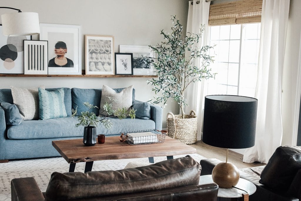
Then
Now
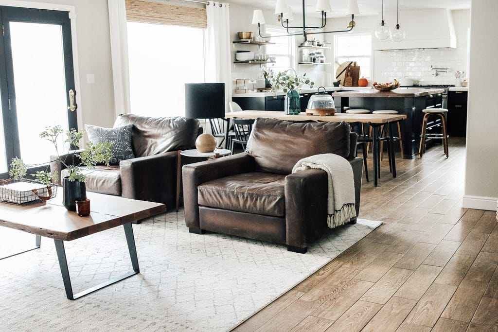
First impressions? I think it's safe to assume that I moved away from the more transitional look of our previous home and fully adopted "modern-cottage" in this home which is exactly what I was trying to accomplish. I always preach listening to your home because not every home would look good with a modern cottage style because of the time it was built, or the area it's in. I think I saw a similar difference in our bathroom then and now as well.
Then
Now


Natural Light
It's always nice to have natural light, but I think it's especially great to have it pouring through in a living space. In our last home, we actually added a whole new window in the living room and it immediately gave the room a boost of life it didn't have before. Especially where it was a smaller room, it opened it up and made it feel bigger. Our current living room? We added a big ol' custom arched window. Truly one of the best updates we made in this home and it brings in gorgeous light all-day long. A living room has to have a lot of natural light for me.
Seating
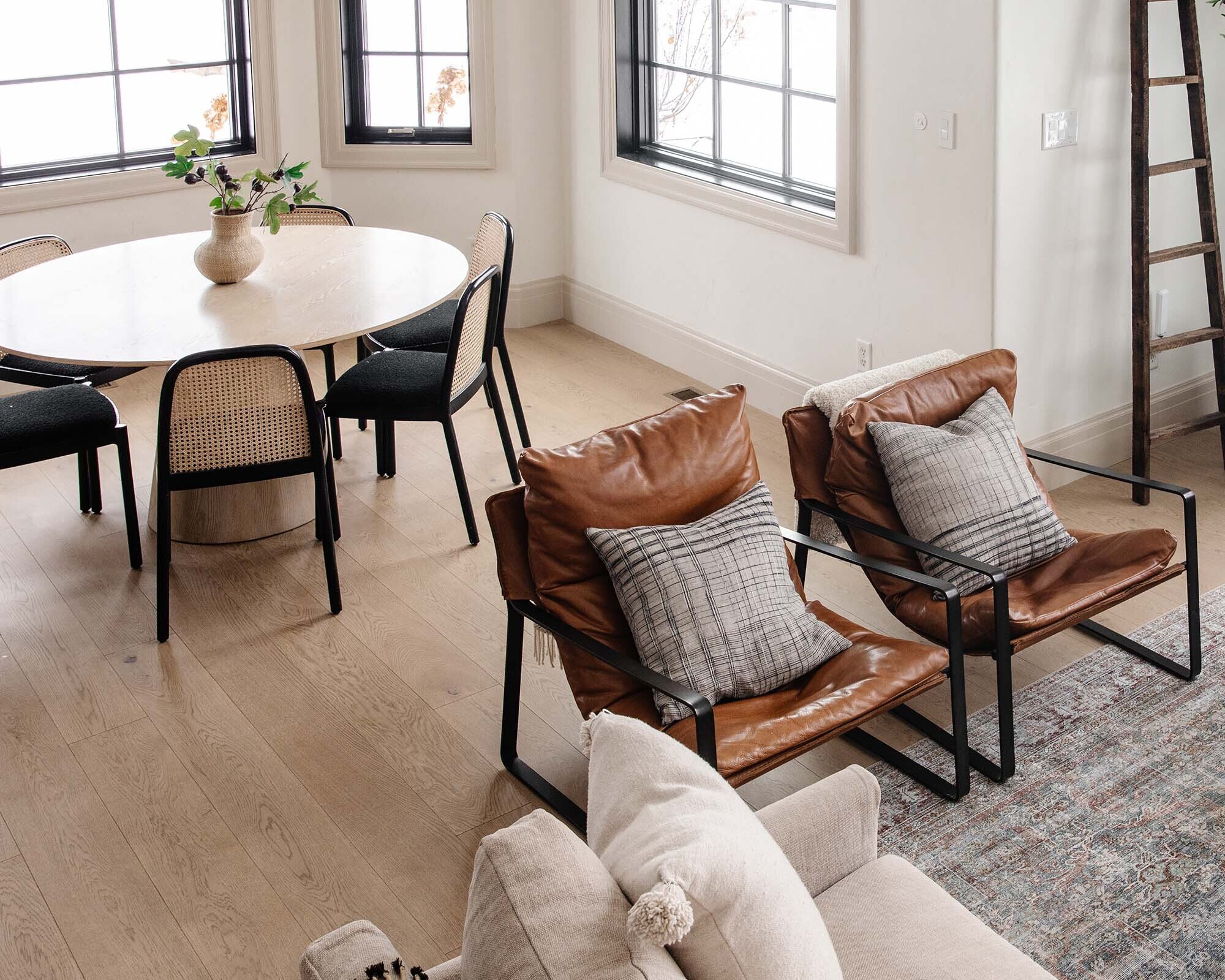
We definitely have more space for seating in our current living room, but I am still spotting some similarities. The first thing you might notice is that both rooms are set-up for conversation instead of pointed at a wall. We like to keep tv's out of the living room and I stand-by that decision. Inviting friends and family over for food, games, and good conversation is something we have always loved to do so we make sure we're set-up for that. Another thing to note is the blue modern sofa got swapped for a more traditional navy blue sofa. Forever and always will love blues. I also love seeing how we repeated the leather chair pairing. I would actually say that our current leather chairs are a more modern shape and I love how they are subtly mirrored on the opposite side with the leather cube ottomans. A touch of warmth and a way to add even more seating without covering up the fireplace.
Lighting
Let's play a game. Other than overhead lighting, how many accent lights can you spot in each living room?...
Then: There's a floor lamp, a table lamp, and an a picture light, for a grand total of 3.
Now: Two floor lamps, a table lamp, and a task lamp for a grand total of 4.
I really think I nailed it in both homes, the only thing I am taking note of in the previous home is that both lamp shades are a similar drum-shape. It would have been smart to switch it up.
Shapes
If you look at the lines of the sofa, the leather chairs, and the coffee table in our last living room, what do you see? Straight, straight, straight. Even the rug and the artwork lean more geometric, and don't forget about the planked wall. I do see one little side table with a round shape, but you can spot curved lines in in our current living room everywhere. The more obvious being the arched window, and the arched doorways, but look closely at the coffee table, the side table, the table lamp, the curves on the navy blue sofa, and even the leather chairs have a natural curved-shape seat, ooh and I almost forgot the rug. Shapes can entirely change the feel or the room, and I think it's obvious the impact these differences make.
Artwork
The art ledge in our last home became kind of iconic at the time. It was so easy to make and allowed us to feature beautiful art, layer it, and trade in and out favorites. I changed the artwork many a time and it completely changed the look and feel of the room in an instant. It's an easy way to mimic more of an art gallery. What we have now is a few pieces above the fireplace, and one little piece in the corner if you look closely. I think the biggest reason why is that now we have this beautiful window that features the most beautiful kind of art: the outside.
Other Notable Similarities and Differences
I still love a good faux olive tree. They feel timeless to me and bring in such a beautiful shade of green.
Our home currently has a gorgeous fireplace and I'm sad to be leaving it. It's a shining feature to the room and it made it feel like a cozy place to be. I didn't know quite how much we were missing out on until we moved here.
One thing that I started to get the hang of in our last house before we moved is designing in layers. I'm actually really proud of where I was, but I'm loving where I am now. You can see coffee table books stacked, and even more things stacked on top of those. Blankets draped on sofas, chairs, and ottomans. I think it really helps a space feel curated, alive, and lived-in.
What Now?
So I think the begging question is what will our future living room look like? As I'm taking note, I know I really need gorgeous natural light number one, and number two I would love a fireplace. Everything else? I'm going to take my own advice, listen to what our next home wants, and go from there.
Sources:
Yale Living Room:
Wall Color: Benjamin Moore Hazy Skies
Dark Planked Wall Color: Crave by Kwal Paint (Mount Etna by Sherwin Williams is very close!)
Area Rug
Coffee Table
Faux Stems
Sofa (in Rain)
Leather Chairs (Burnished Walnut in grand)
Art Ledge
Faux Olive Tree (I did a round up of more here)
Tree Cut Print Art
Art Light
Tripod End Table
White Oak Base Table lamp
Arc Floor Lamp
Bamboo Blinds
Curtain Rod
White Grommet Curtains
Our Current Living Room:
Wall Color: Alabaster by Sherwin Williams
Trim Color: Accessible Beige by Sherwin Williams
Floors: Ingrid by Stuga Studio
Window: Pella
Rug
Navy Sofa, Navy Pillow
Linen Sofa, Throw Blanket, Cream Pillow, Tan Pillow
Leather Chairs, Throw Blanket, Plaid Pillow
Coffee Table, Round Woven Tray, John Derian Coffee Table Book, AD Coffee Table Book
Woven Leather Ottomans
Marble Side Table, Table Lamp, Candle
Olive Tree
Planter
Double-Arm Floor Lamp
Shade Floor Lamp
Tree Art
Chest
Gold Lamp
Vase
Branches
Black Frame
Art
Leave a Reply

WE'RE CHRIS + JULIA
Portfolio
Projects











Excellent, just Marvelous ⭐⭐⭐⭐⭐????
I love the similarities and I like this post and how you point out everything, like the shapes. As far as feeling, both spaces have the same vibes to me.
Julia, I wholeheartedly agree. Not only listening to the house, but also your own inner design voice, which evolves and changes over time. Over the years, my own has shifted from Victorian inspired, to eclectic/Eastern (remember the old Pier 1?) to French Country. When I moved to the PNW, I was inspired to change again to a more modern aesthetic with less clutter, fewer candles and more uplighting! Yours will continue to evolve and be inspired by your new home.
Request: It would be lovely to have one last full house tour video, once the current renovations are done. I don't think you've done one since last spring.
we must!
Yes! ❤️
It’s so interesting to see the constants that remain as your style evolves! One element of your prior home I’d love to see your current take on is the picture ledge. We diy’ed one a few years back and I’m struggling to make it feel current. Can’t wait to see what you have up your sleeve in your next home!
Lol! Forgive me, but I am so over picture ledges. I don’t know why.... I always think to myself, “just hang the pictures on the wall!”
Her sister/photographer has done a wonderful photo ledge installation in her own living room - check her out on instagram. @andiandreastudio