After finishing the Study, I was really craving a home project with a lighter lift (is there such a thing?). Although no project is without its bumps and hiccups, slowing down and renovating Faye's bedroom was exactly what my heart, head, and body needed. It's been an absolute delight working with her over the last few months, letting Faye take the lead in designing a room that she loves, making the both of us happy. And so, without further ado, here's Faye's new bedroom!
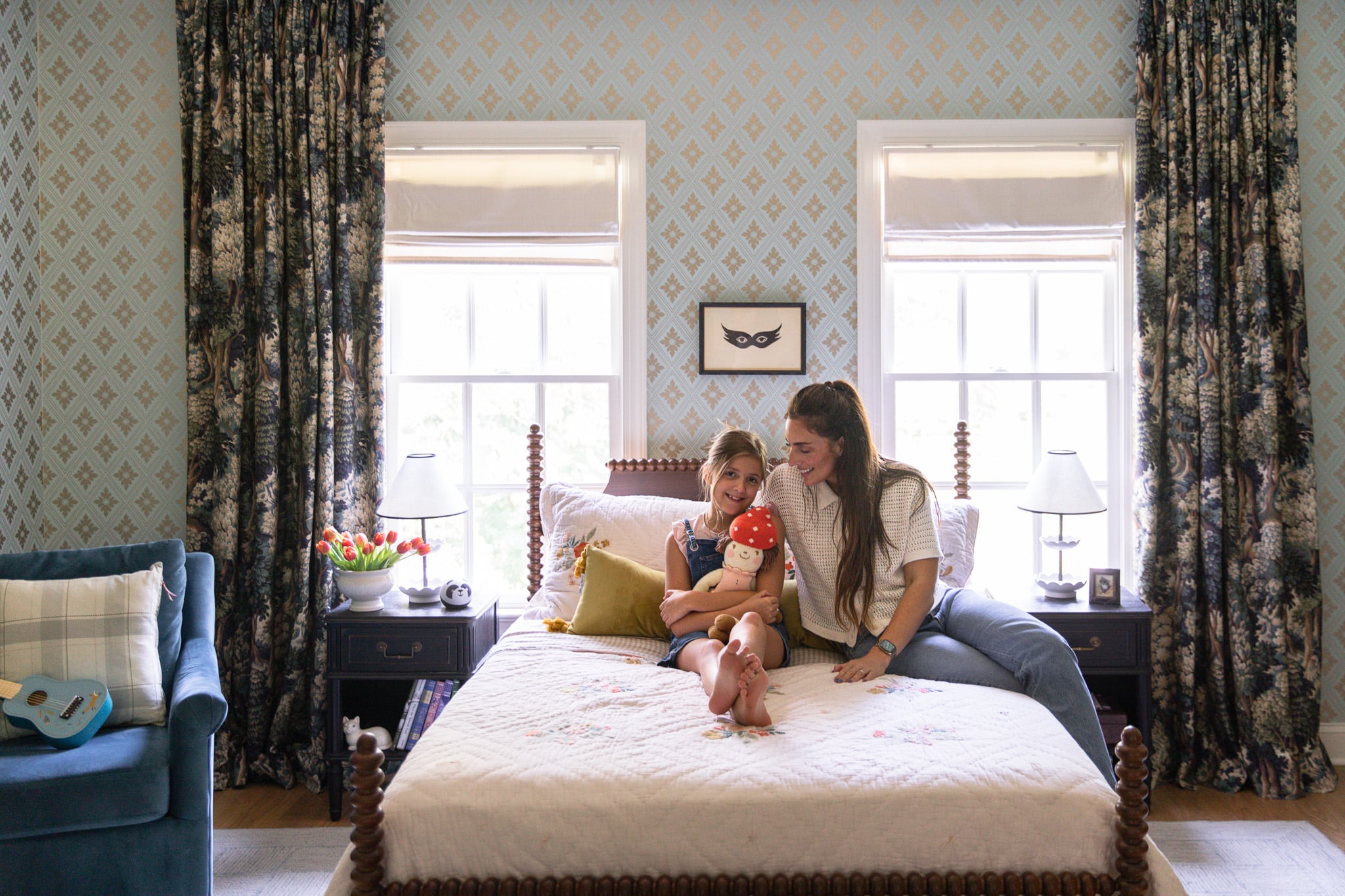
Wallpaper | Turned Wood Bed | Embroidered Quilt & Sham Set | Velvet Lumbar Pillow | Curtains (custom by Martha & Ash) | Lamps | Blue Swivel Chair | Plaid Pillow | Roman Shades
See More of The Process
Faye's New Scalloped Bed
The Original Mood Board
Three Layout Options for Faye's Room
Wallpaper Selections For Faye's Room
Faye's New Traditional Wallpaper
Does a Bedroom Have to Have a Closet?
Quick & Easy Curtain Hanging Tip
Before

This photo was taken right when we moved in. The only thing we changed was pulling up the carpet and laying hardwood floors throughout the house. But the sponge-painted walls and everything else stayed the same over the last 2 years. One of the very first things we did to kick off the makeover in Faye's room was take out the closet to bring some symmetry to the space. The closet was a dark hole of lost things, cutting into the right window, so we took it out and brought in a dresser and armoire for functional storage.
After

Room Sources
I love that this room is a mix of new things, things from our Pottery Barn Kids Collection, old things, and used things. Faye is such a collector, so every bit of this makes sense.
Before

After

After we removed the closet, we installed this wallpaper that Faye picked out of all these other selections. She really went with her gut, and I absolutely love how it came together and so does Faye.

This room was heavily inspired by our Pottery Barn Kids collection, but it wouldn't be a CLJ room without incorporating pieces from our other collaborations – the Loloi rug and Shades of Light chandelier.


These curtains are the gift that keeps on giving. Originally they were made for Polly's modern cottage bedroom and have since hung in Greta’s room and now Faye’s room. The print is one of my favorites because it’s incredibly versatile and fits with my whole home color palette, and I’m so happy to have found a more permanent place to hang them.
Before

After

Room Sources
Every time I see this view, I'm so glad we made the decision to remove the closet. It opened up this room so so much and the room functions much better without it. Faye loves having a dresser to store and display all these cute things, as do I.


This darling bedding is so Faye. The reversible quilt and shams feature two designs that can be easily interchanged, but I love how the embroidered floral design is so dainty and whimsical. It's the touch of girlish fun that this space deserves.


Having a space for Faye to sit and read, draw, or play her ukulele wouldn't have even been possible without removing the closet. I wasn't sure there was going to be room for a chair, but it was high on her wish list and I'm so glad we were able to fit one in. I love that she has a space to do everything her heart desires in her very own room.


For a while, I was a bit stumped over what artwork to hang in these frames. Finally, I had the idea to look through public-domain art, and I stumbled upon these vintage illustrations from the original Wizard of Oz book series, illustrated by W. W. Denslow. The Wizard of Oz is somewhat special and nostalgic to our family, and wouldn't you know, they fit in with the color scheme in Faye's room.

These prints are the perfect amount of vintage and eclectic. The great part about the frames is that they can easily open and close from the front, and Faye can eventually swap in and out her own artwork if she wishes. Isn't that every child's dream??


In case you're wondering, we're still very much in love with this darling armoire. The mirrored fronts allow it to double as a full length mirror! So nice!

Scalloped Rattan Basket | Wave Gallery Frame
And there you have it! A 360 of Faye's finished room. It feels so good to check off another project from our 2023 list, and I'm sighing with relief before jumping to the next. Any guesses on what's coming next??

All Sources
Trim & Ceiling Paint Color: Sherwin Williams Creamy
Curtains (custom by Martha & Ash)
Curtain Rod
Curtain Bracket
Curtain Rings
Wallpaper
Crown Moulding
Roman Shades
CLJ x Pottery Barn Kids Turned Wood Bed
CLJ x Pottery Barn Kids Quilt & Sham Set
CLJ x Pottery Barn Kids Sheet Set
Velvet Lumbar Pillow w/ Tassels
CLJ x Pottery Barn Kids Little Flower Table Lamp
Frame Cat Art
Nightstands
CLJ x Loloi Francis Silver/Sky Rug
Mask Print (Similar)
Mattress
CLJ x Pottery Barn Kids Turned Wood Dresser
CLJ x Pottery Barn Kids Antique Gold Mirror
Mushroom Basket
Green High Gloss Ceramic Table Lamp
Beige Glossy Clay Flower Crock
Genevieve Picture Frame
CLJ x Pottery Barn Kids Art Display Frame
Wizard of Oz Artwork
Blue Mora Swivel Chair
CLJ x Loloi Sage/Multi Pillow
Astrid Fringe Stool
Casa Florentina Armoire with Mirrored Doors
Poppy Stool
Wood Hangers
Albany Cane Rattan Bin
CLJ x Shades of Light Marlo 4-Light Chandelier
Wood Hook Rack
Scallop Rattan Basket
Wave Gallery Frame
Gold Wall Plates
Custom Name Pennant
Leave a Reply

WE'RE CHRIS + JULIA
Portfolio
Projects











Let her be a kid with fun colors and creativity. This is a very boring and old lady bedroom for a little girl.
Alright, I'm curious. What happened to the old bed that was similar to the one from your line? I'm dying to know if it fell apart like mine. I actually bought it after seeing you feature it a few years ago and while I love the look, the thing was a piece of crap. The footboard has cracked twice and there are tons of reviews reporting the same thing. Is this why you dumped it?
it broke in the move :/
Lots of cool ideas! Do all of her clothes fit in the armoire and dresser, or do you have other storage somewhere else in the house for clothes and swap them out seasonally?
A tangent: Please consider writing a post about what you do with all the stuff friends and extended family buy for you and your kids that clash with your aesthetic. I know you’re hiding primary-colored plastic toys somewhere in that gorgeous house. 😆
Just perfect. And so smart how you've introduced and repeated pops of earthy green and dark blue. Brilliant blending of patterns and colors. This so, so good.
I love the bedding! I get she was able to make choices for the room and that is a beautiful thing. I think the rest of the room direction is a bit moody and mature, which mutes the fun, youthful vibe.
Peak mother/daughter collab moment haha. A designer mother’s dream! This is all so beautiful, and has so many elements I would never have envisioned (the curtains against that wallpaper is so good!). I never thought I’d say a laundry hamper is my favorite item in a bedroom, but here I am saying it.
I love the armoire with the wallpaper. So complimentary.
I love this room. Faye's room at the Modern Cottage was my all-time favorite...until this! There is something magical about both rooms. The artwork could not be better. I love the curtains they are perfect. Faye's choice of wallpaper (twice!) proves she has the designer's eye! She might give momma some competition one day! ; )
I remember Faye as Glinda the good witch. She looked estatic.
Sooo cute! I love the rug too wow! Thanks for the link 😊
It's beautiful! Soooo whimsical! I love that it flows with the rest of your house and style but still speaks to who Faye is and what she likes. The wizard of oz art find really ties it all together!
You're so good at what you do, Julia! I would have never thought to put those curtains with that wall paper, but they ended up being so sophisticated and fun paired together! I'd love a lesson from you on how to tell what clashes and what goes, because you get the balance right every time!
The wallpaper and paint trim is gorgeous. The Jenny Lind bed is classic and timeless. I just don’t see how anything else in the room goes though. The curtains, the prints, the rug, the color of the armoire and chair…what? I don’t get it.
Soooo precious - I love all the classic touches and the Wizard of Oz prints. I would have LOVED this room as a child.
I remember Faye really wanting to keep her pink heart light in the room but I don't see it. That would have added the extra touch of whimsy and color that this room needs to keep from coming across as heavy and dark.
I am not sure where that information that she "really wanted to keep her pink heart in her room" is coming from? I think you may have seen a story where we were emptying her room at the beginning of the renovation and she asked where the heart was? I told her it was in the hall and she put it in her fort in the playroom! If she wanted it in her room, it would be there. I actually just asked her if she wanted to put the heart in her room (it's from the dollar spot at target, btw) and she said "no it's in my fort"
I absolutely love faye’s bedroom. I think she picked the best wallpaper and I now want to do a granddaughters room with it as well. I love the drapes and think they bring in an interesting aspect. The gallery is great and I love using the wizard of oz pics that were free. 👍💕another win IMO. Love it all 💕💕💕
Wizard of Oz is the singularly most terrifying film ever marketed to kids.
How is this comment conducive to this post? Imagine you work really hard on something you're proud of...you share it for the world to see--and then someone makes a completely irrational and negative comment about YOUR taste, hard work and dedication?
WOW.
This room is gorgeous and beautifully curated. Thank you for shining, chrislovesjulia! <3
What a gorgeous room! I love the picture of her playing her ukulele! The armoire is perfect where it is, and the great thing is that if she needs more closet space as she gets older you can always build the perfect one in that exact spot, taking up that whole wall. And she still has that whole huge dresser. I’m happy she’s so happy with her room🥰
I love it! It’s so beautiful and whimsical. She did a great job helping design it and I think she will appreciate it much more because she had a hand in it.
I love how collected it looks. Tell Faye I think her room is so beautifully colorful and fun.
Precious!! Can you provide a source for the scalloped hamper in second to last photo?
Lovely ❤️
I love every detail of this beautiful room!!! A dream space!
It's beautiful and I can definitely see this wall paper growing with her too and swapping out art, accessories and bedding as she grows up. As for what's next, I really hope it's Greta's room! I loved the inspiration you shared!!
It’s so darling and perfect 🤩
Looks so good and will grow with her. I think the closet removal and the drapes are the game changers!
Such a beautiful, interesting, personal room - well done Faye! Just wondering what you will do with the illuminated pink light that was in the room before…