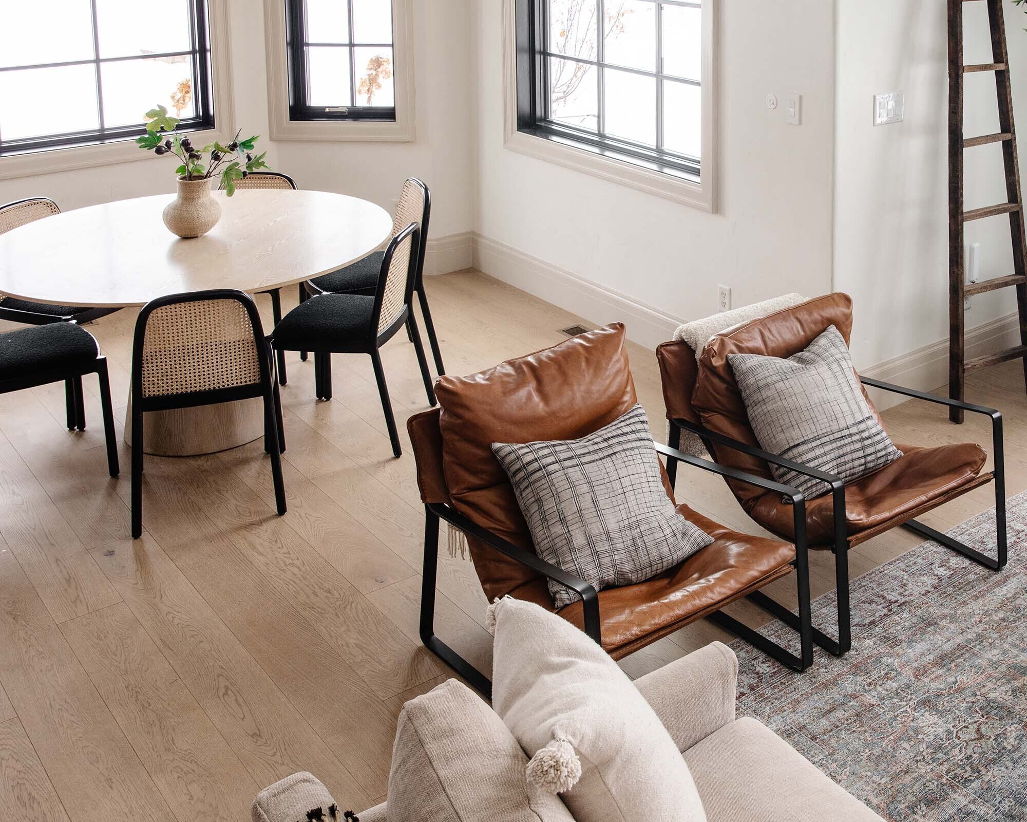
It is time. No more false starts. We're diving head first into our primary bathroom renovation and taking you along for the entire thing. We've heard your fears--"you're going to renovate your bathroom and then move!" And while we have done that in the past two houses, (strange scenarios and had nothing to do with just finishing our bathroom actually), we have no intention of moving after this one. I promise. And I think that's one reason why we have been really taking our time to make sure we get it exactly right. We also have the insurance of so many other unfinished spaces in our house that we can't wait to tackle (more on that here).
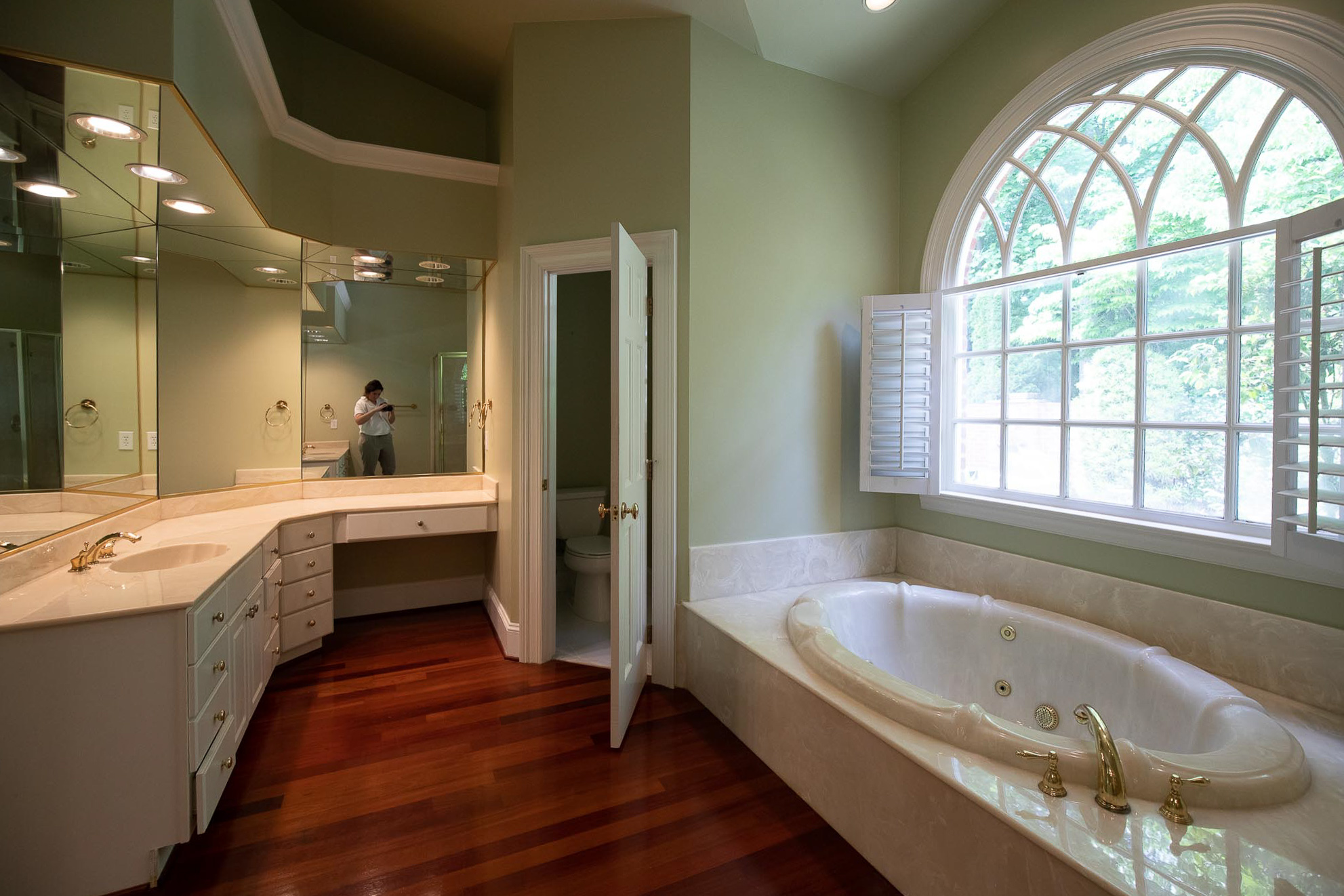
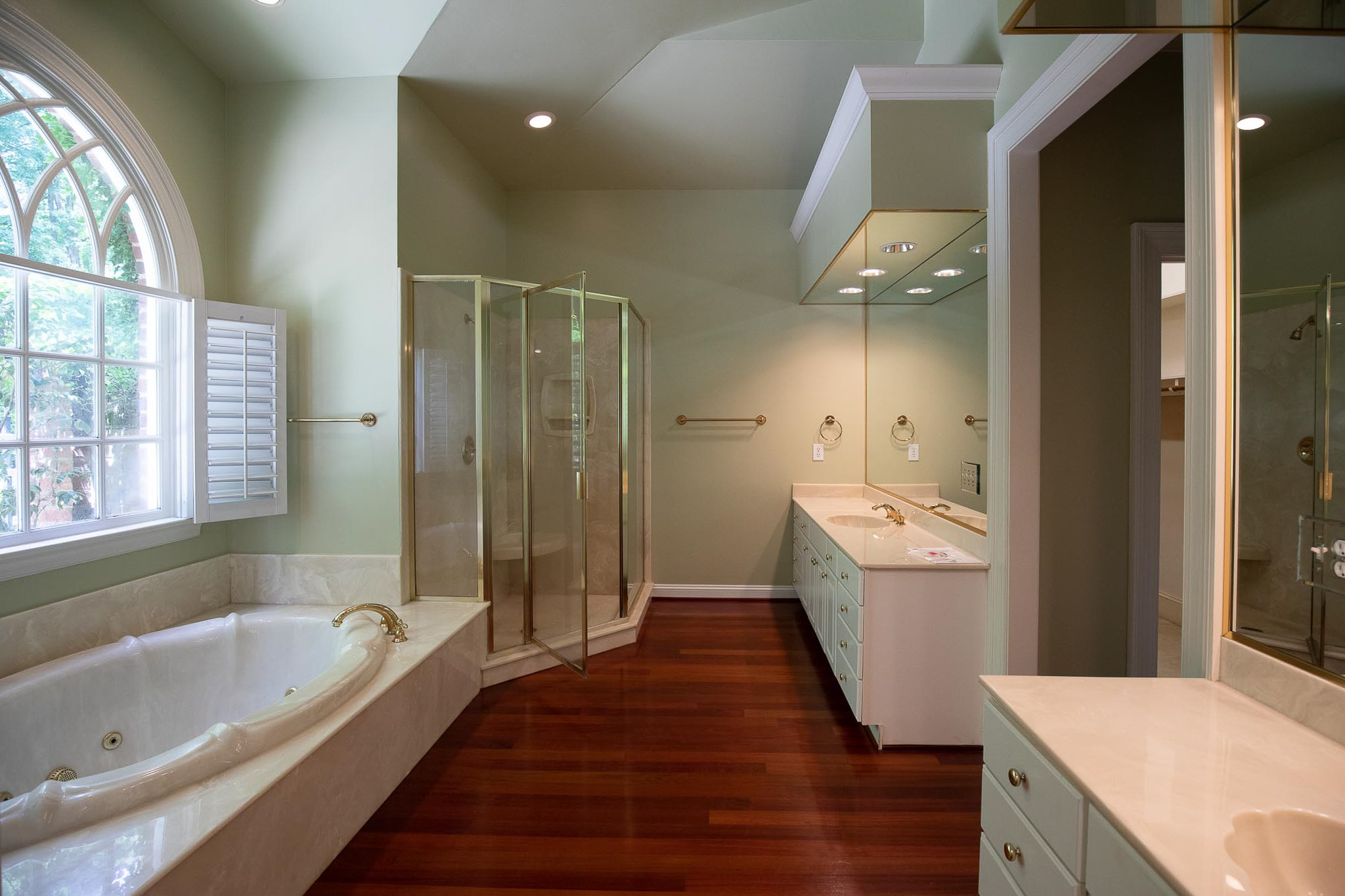
So, to kick it off, I wanted to share a few before photos of our bathroom (note, these were taken before we moved in, so there's not any clutter anywhere, but believe me when I say the drawers in our vanities are so shallow that we both have so much ON our counters that don't fit in our drawers.), but nothing else has changed. We never painted. The cherry floors are still in place. The mirrors on every angle. It's a trip.

The angle below is from the bathroom looking out into our bedroom. The bedroom view has definitely changed--can you believe there used to be a door into the study from the bedroom? We closed that off and put our bed on that wall for more privacy.
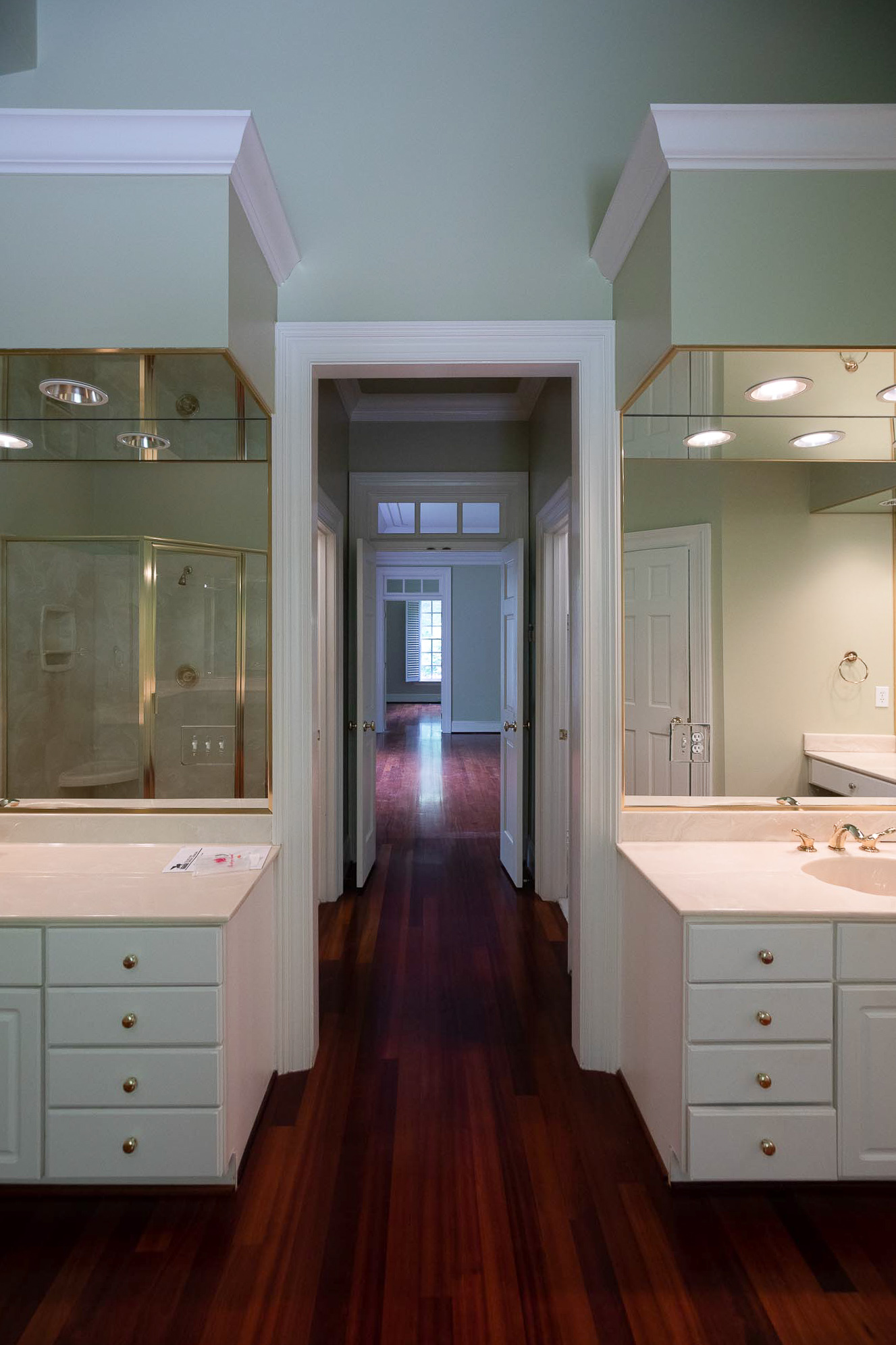
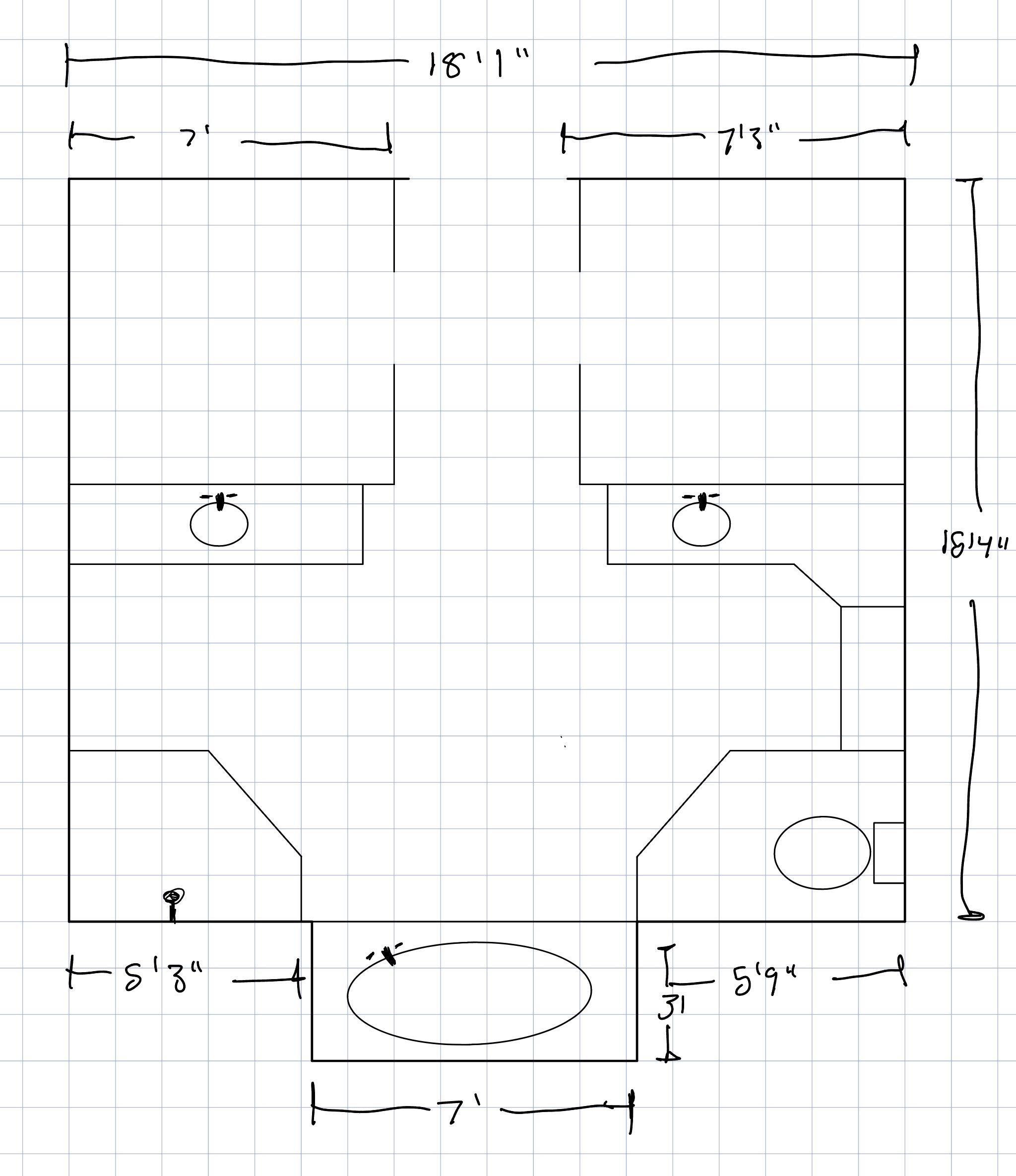
You can also see the his and her closets in the tight hallway that we're also going to be addressing in this renovation as well, and that will impact our bedroom square footage. Below is a rough drawn floor plan of our current bathroom layout. The squares at the top of the drawing are our closets.
This is the new layout plan:
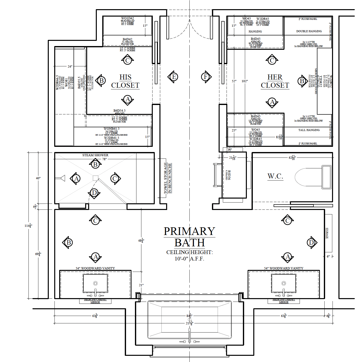
I'm excited to walk you through all of our plans! We worked with Stoffer Cabinetry on these and they have been wonderful to check everything off on our wishlist. Even the things we didn't feel were possible, like a tub and a sit down vanity. We have been editing and adding to these plans for months and I think we're finally to a spot where we feel very excited to star! Most recently, we added a lot of hidden storage and bumped out our closets into our bedroom 24" to gain additional space. But let me show you the elevations and talk you through everything.
One thing that isn't so obvious in the new elevation drawings, but you probably noticed in the before pictures--our ceiling is currently a million different angles. It's quite high in areas and lower in others and no angle is the same. As sought after as a vaulted ceiling can be, I think consistent angles help that. We have decided to flatten our ceiling to 10' throughout our bathroom and closet. That still gives us a lot of luxurious height without the weird angles.
(Elevations A, B, C labeled above, correspond to the labels beneath the elevations below)
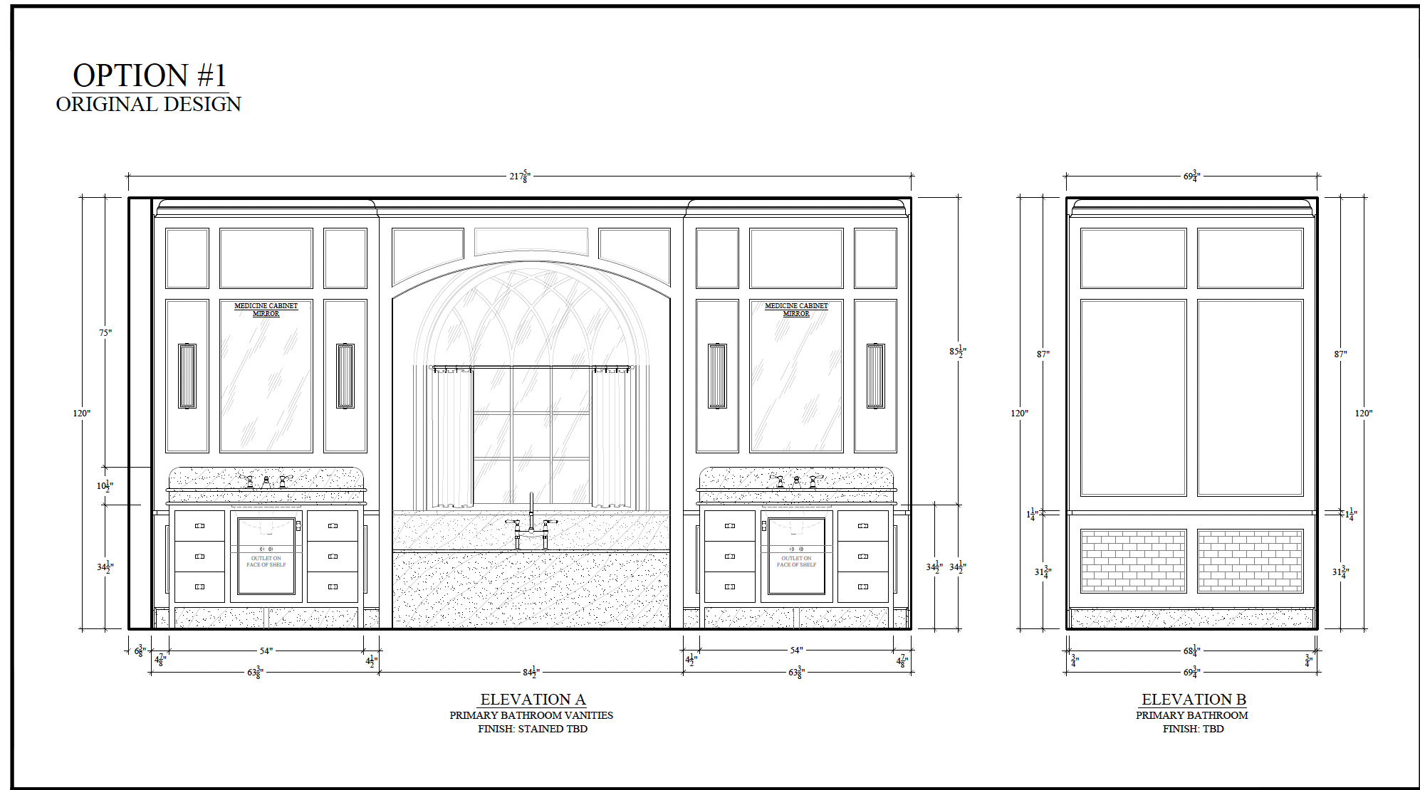
This first elevation is looking into the bathroom at the arch window. You can see we moved our vanities to this wall! I cannot wait to not be backlit the entire time I'm getting ready!!! Each of our mirrors will be medicine cabinets for additional storage. We kept the tub in its current place, and are even leaning toward doing an undermount tub, surrounded by stone slabs. You can get a much larger tub if you do undermount which is appealing to us, as is the veiny stone slab I'm envisioning. (But, I do LOOOVVVEE a free-standing tub, too, and I've truly been back and forth a million times on that decision.) The tub nook will have a cased opening in the renovation. Option 1 (above) has a wider opening that still allows for the paneling on the walls to continue.
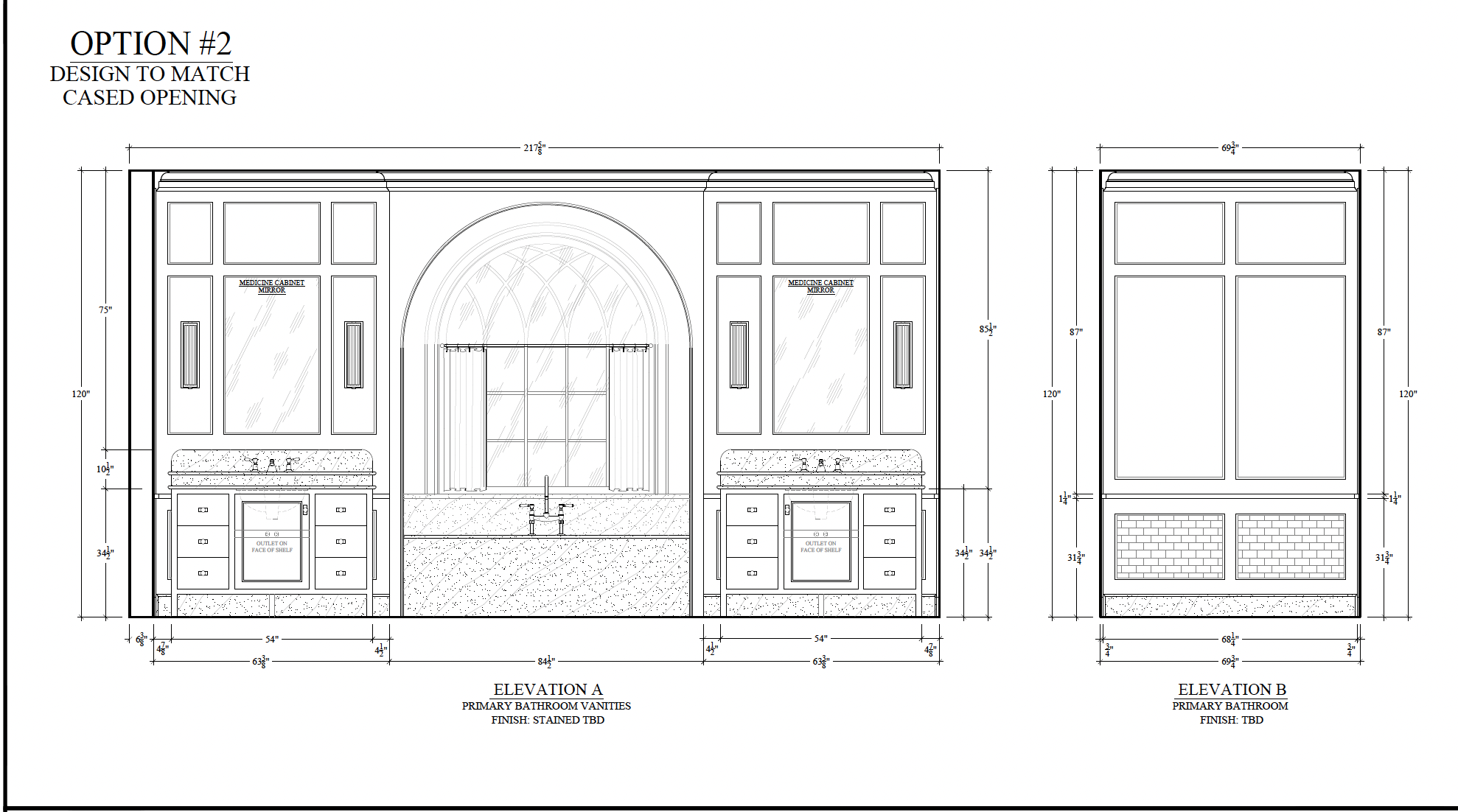
Option 2 (below) has an opening that mimics the shape of the window. Chris and I are still talking through which we prefer because we each prefer different ones! Haha! I like option 1 and the continuity of the trim on the walls and the wider opening to see a bit more of the tile work that will be in the nook. He prefers the pure arch designed to match the window shape. When renovating, you're bound to come up against something you can't agree on. We just talk it out until we are aligned. (And he said, "I don't really care that much, I think both would look good")...so we can probably guess which direction we're going with! But I'd love to hear your preference just for fun!
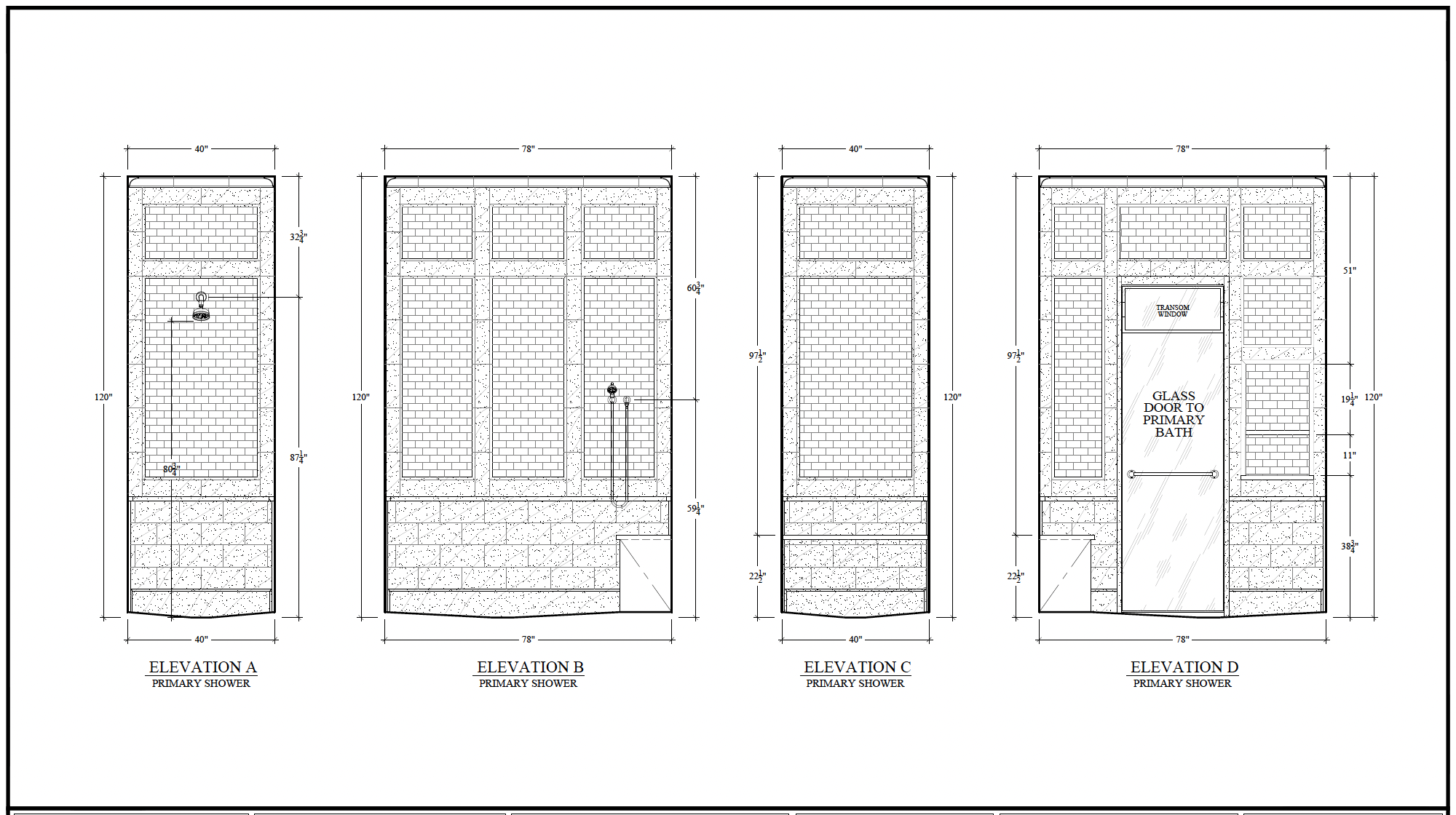
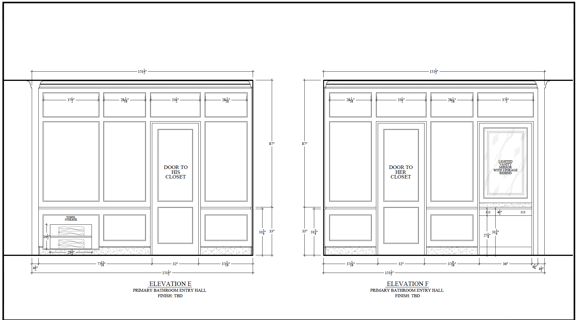
If you flip around from this view, you will see an arch leading into the hallway that will house the sit down vanity and our closets. More on those in a minute. You can see we moved our shower here, mirrored by the water closet on the other side. We loved having a sink in our last home's bathroom's water closet, but we opted to use that space for a sit down vanity instead here. And! Happy to report we have learned that a single glass shower door really gives you the best of both worlds. No cleaning an entire glass shower, but it still allows light to flow in. There will be a transom window above the shower door for air movement when we don't have the steam shower on.
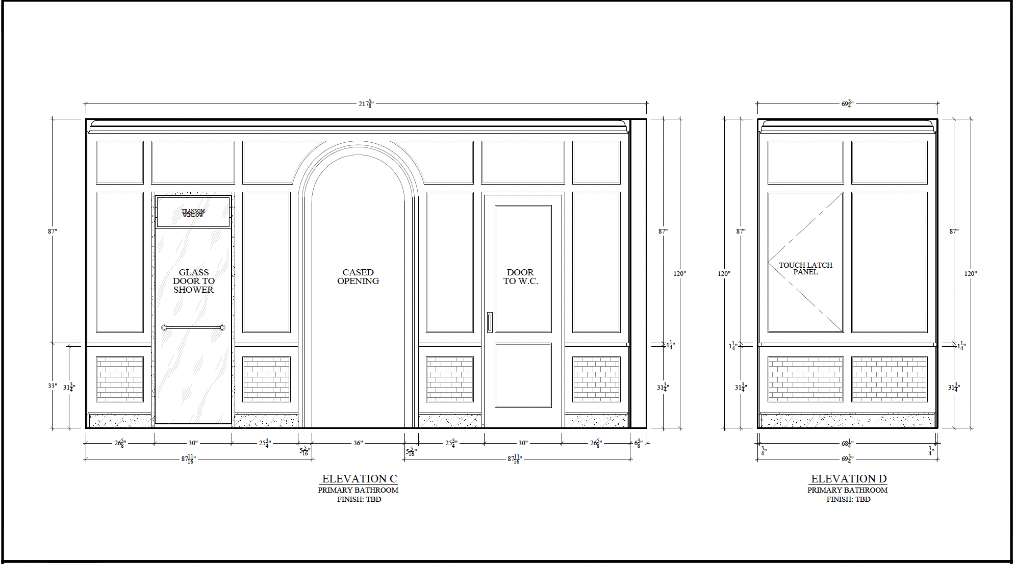
And some pretty in-shower details. No kidding--the DETAIL that Stoffer cabinetry puts into their ideas and elevations are unmatched. We wanted to create the same paneling effect in the shower as the rest of the walls of the bathroom and I can't wait to see this come to life. We are going to do a smart shower, so the controls will actually be on a panel right outside of the shower.
The last view, for today, is the hallway view. On the right, you can see the sit down vanity area, with a pocket door leading into my closet. The vanity area has a drawer and hidden storage in either of the walls. On his side, you can see where we carved out some extra space for towel storage. It actually cuts into the shower bench!
It all feels like a dream come true!! I'll share more about the finishes and the closet in an upcoming post. But for now, this feels like a lot of details to drool over. Just me??
Leave a Reply


WE'RE CHRIS + JULIA
Portfolio
Projects


Love it so much! I have to admit I lean towards Chris' preference with the arch mirroring the window. It also gives you a visual "break" from the paneling sice the entire room has paneling. It will look amazing no matter what you decide to do!
Since you asked, I prefer option 2. Option 1, to my eye, looks quite busy - my eye darts from one feature to another. Option 2 is calm and serene and beautifully highlights the arch as a focal point. Classic. In this scenario, I feel that less is more. Whatever you do, I am sure it will be fabulous, and I cannot wait to see it!
If you go option one for the tub opening, could you do the arched section as a transom type window? The. You have the arch/ shape but arent blocking the light from the window making weird shadows? You could go with a cool beveled glass? Just a thought.
Option 1! Without the trim work, it looks like the sides are for right angles and the middle is for zero angles. With the more gentle arch and the trim, it's a transition moment from the arch of the window to the more linear features in the rest of the room. Regardless of the surround, definitely team Undermount Tub. It fits the vibe of your house so much better.
Option #2--Chris's preferred opening. I would love the sense of enclosure.
Such a beautiful design! I was wondering about hampers? Are they in your closets? I can't wait to see your tile and stain choices.
When I redesigned my bathroom, I made sure I had plenty of counter/storage space--9' linear. It still isn't enough. I wonder if 34" is going to fit all the things you need in a bathroom--I mean, who doesn't shop at Costco-lol? You might be able to turn the cabinets 90degrees and put them on the walls that have a "D" on them. Also, as a designer, I vote for Chris's choice and a free standing tub--just for simplicity and symmetry.
I'm with you, Julia. Option 1 for the tub/vanity wall. I like the paneling continuity going across the entire wall. About a freestanding tub: have you seen the Waterworks tub that Amber Lewis has in her primary bath? The soft curves of the tub would look fabulous with the arched opening and window of the tub area. Beautiful bath plans all around!
I voted for option #2..and looking at the drawings, I continue to like this option - the reasoning...it highlights the window..Option #1 feels a bit too heavy and distracting.
Love the built in tub just feels so cozy and sleek. I wanted a freestanding until I stay at a resort with one and did not like getting and in out. I then stay at a Four Seasons with a built in rectangular tub and was sold. The stone work was exquisite and I cannot wait to start my bathroom remodel. Laundry room is first though! I do vote for Chris's option sorry!
Why again
I voted for Option 1 on Instagram because I like the wider opening and the continuity of the trim on the walls. But now seeing that not only does Option 2 mimic the arch of the window, as well as the other arches in your home, but it mirrors the arch on the opposite wall. This latter point was not clear to me on IG. I am sure both would work, however, and realize you have your preference. :)
The Stoffer team is so talented. Great choice to collaborate with. I agree with Chris regarding the arches. The whole house is truly and experiment. I love reading the posts. So useful. I am an architect and I love the real world advice.
Go for a freestanding tub. You will never regret it. Timeless beauty all the way!
Chris is right on this one! For all the reasons others mentioned below.
Thank you for addressing mismatched ceiling heights! We are in the middle of a renovation of our primary bath, closet, and master bedroom, and I’ve been leaning toward flattening the ceilings to a uniform height, much to the chagrin of my husband. I can’t wait to share this post with him to prove we’re not the only ones facing this issue!
I look forward to following your progress on this reno as we work through ours!
Both options are gorgeous as usual, but I like 2 better as it flows with both the arch in window and doorway! Just a bit more cohesive.
As an interior designer myself, I'm a huge fan of Jean Stoffer and all the incredible designs from her studio. I’d like to suggest an idea, however, that you might not have considered: What if you mirrored the entire shower (including the bench, plumbing fixtures, and door) to create space for a proper linen closet (about 15" deep) across from the sit-down vanity? You could integrate hidden hinges and a push mechanism door hardware into the linen closet millwork door, allowing the paneling trim detail to remain. The trim could be a continuous piece, except for the section near the ceiling, and include a full-length mirror mounted within it. Also, I prefer the arch in Option 2 because it aligns with both the window arch and the arch in the hallway leading into the bathroom. Additionally, there’s already plenty of trim work throughout the space, so changing it here will help make the tub area feel more distinct and "special." Whatever you end up doing, I'm sure it will turn out beautifully.
Can’t wait to see how this comes together! Could you share the new dimensions of your bedroom? I’ve always thought a cozy bedroom makes sense and I’m curious to see how it looks.
It’s going to be gorgeous! Curious, where are they installing the steam shower unit?
The primary is on the first floor, so we have access to the crawl space directly below as an option.
Option 2 on the tub wall elevation. It looks more transitional/updated in my opinion, since you invited readers to weigh in!
Question: this will be a steam shower. Can you share where the steam generator will be located?
Steam generator will likely go in the crawl space, which is directly below.
What is the corner taken out of Chris's closet?
The corner is actually the outside contour of the house. We will be pushing the wall into our bedroom by a couple of feet, and Chris's side gains that contour.
My vote is for option 1.
I like the continuity of the trim work in option 1, but I prefer option 2 because it would better match the arch of the cased opening by the closets and the view from the bedroom would all align to frame the window which would be dreamy!
Gorgeous!!! Are you using 3x6 tiles and what other size tile? Are you doing the tile on the bathroom walls as well? So timeless and beautiful!!!
Tile decisions have not been finalized, but I'm excited about making selections!
It is going to be beautiful and a huge upgrade from your current bathroom! I am team Chris on this one! The arch not only follows the shape of the window, but also mirrors the arch that leads you to the walk-in closets. It not only feels cleaner, but makes the tub surround feel a little more special by providing a slight departure from the paneling throughout the rest of the bathroom.
I do agree! You stole the words right out of my mouth. The shapes work better, it avoids too much wood, and it gives the tub nook its own moment.
I never comment, but thought to chime in to offer I also particularly like opt. 2 best for the reasons others mentioned - It echos the nearby arch and arches in house & you do have beautiful framing all around. But so interesting and good to see your thinking process
I would be sorely tempted to install embrasure doors, a la Laurel Bern’s latest renovation, at your entry. That way if you wanted to leave the bathroom doors open for light and what will surely be a gorgeous view to the arch, tub and window beyond, the doors would disappear completely against the wall.
I like option #1 with the continuity of the trim! Already swooning over these plans!
I much prefer the Arch in option 2, same as Chris! The framing of the first one looks very builder-grade to me & reminds me of the Tuscan homes of 2009; option 2 is much more classic and will age better with time.
Obsessed! Can you do option one and still add the trim to the top? That way you both get what you’re looking for?
I like option 2 - mimicking the arch of the window makes it feel more intentional and consistent. Could you add trim similar to the hallway arch?
Is there a reason you've put the toilet/shower on those respective sides? If you switched you could add a window to the toilet which I think is always nice for smells to easily escape (whereas you don't need a window in a shower, especially with the glass door).
Looking forward to seeing it all come together!
I agree with Chris. I like option 2 because it matches the window shape but also looks less cluttered.
I also agree with Chris, for continuity; especially as the doorway entry into the bathroom will also be a round arch (3 different doorway/opening shapes is a bit fussy). If you choose this option, adding paneling inside both arches would be a great way to extend the design.
Definitely Option #1 for the bathtub! It still has a bit of an arch to complement the window, but keeps the lines flowing all the way across.
This is beautiful in all respects. Since we are all a banana peel away from disability, I urge you to make the doors ADA compliant and to put bracing for grab bars in the shower and toilet.