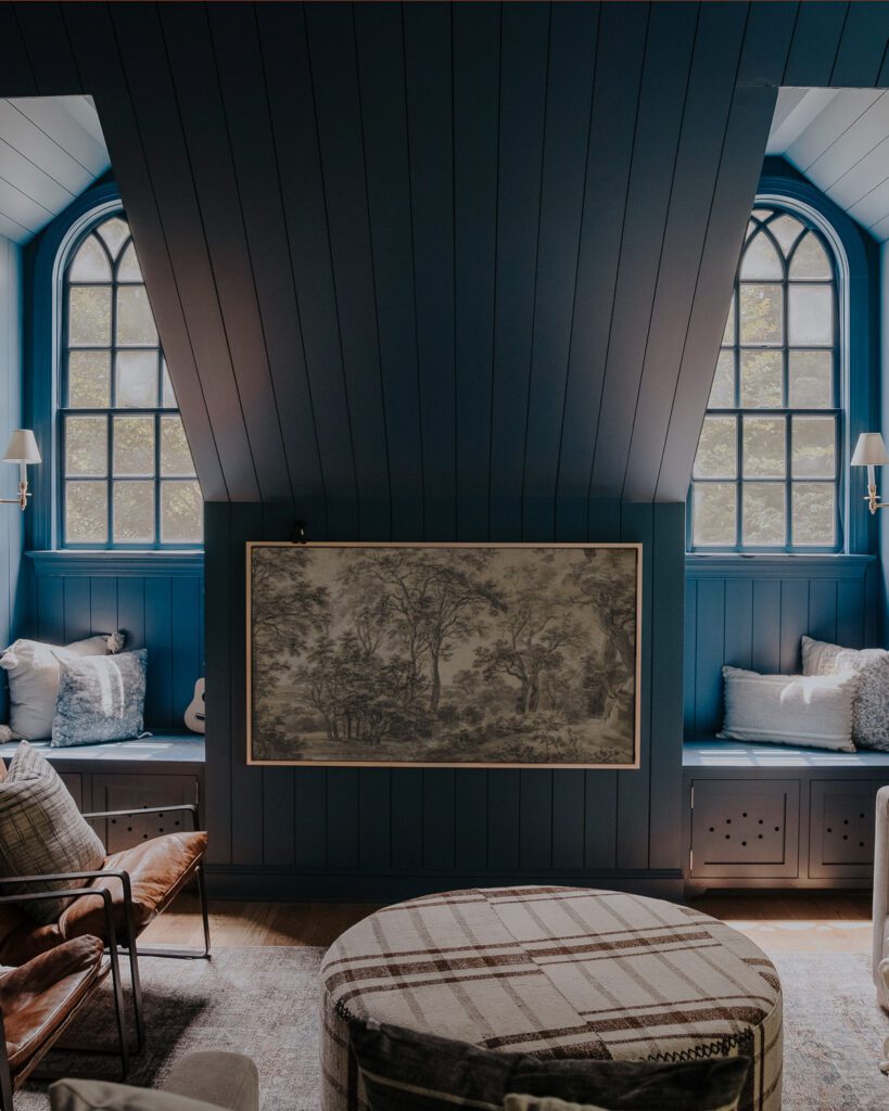
We are no strangers to dark paint. Painting a few walls in our last home’s living room a blueish-greenish-almost black (Crave by Kwal Paint) made for one of our favorite before and afters.

But I think there were a few things that made that dark paint really work. First, the huge window that let light pour in. Second, lots of lighter textiles to soften it up. And third, not painting the entire floor in the same dark hue. We actually only painted three walls (the large paneled one, the window wall and the wall opposite) and the rest remained in the light gray that we used as our house’s main color.
In this house, we are craving a lot of lightness. Currently, we have a bit of a darkness overload. All of the main living areas on the first floor are painted a very dark brown/black.


It’s just too much for us. Now that we’ve lived with it for a few weeks, we know more than ever, we wanted something on the complete opposite end of the spectrum. I actually subconsciously filled most of my inspiration board with white-painted rooms, like this one:

Chris was on board with white, too. As soon as we were up for it, we were going to paint everything white! But as beautiful as that photo is above, I wasn’t sure our family was at an age where we could handle white walls. Huge dog. Active toddler. And then while I was watching New Girl, I decided we should paint our walls a really warm yellowish taupe like their loft.

I thought, I want to live there. I want our house to feel cozy like that. But mustard walls wouldn’t give me a loft with steel windows or exposed brick, or perfectly thick hair and bangs–just adding that in there. Although it did inspire me. I know we want something cozy. I know I want to incorporate a warmer palette in this house. And then, we came across this picture:

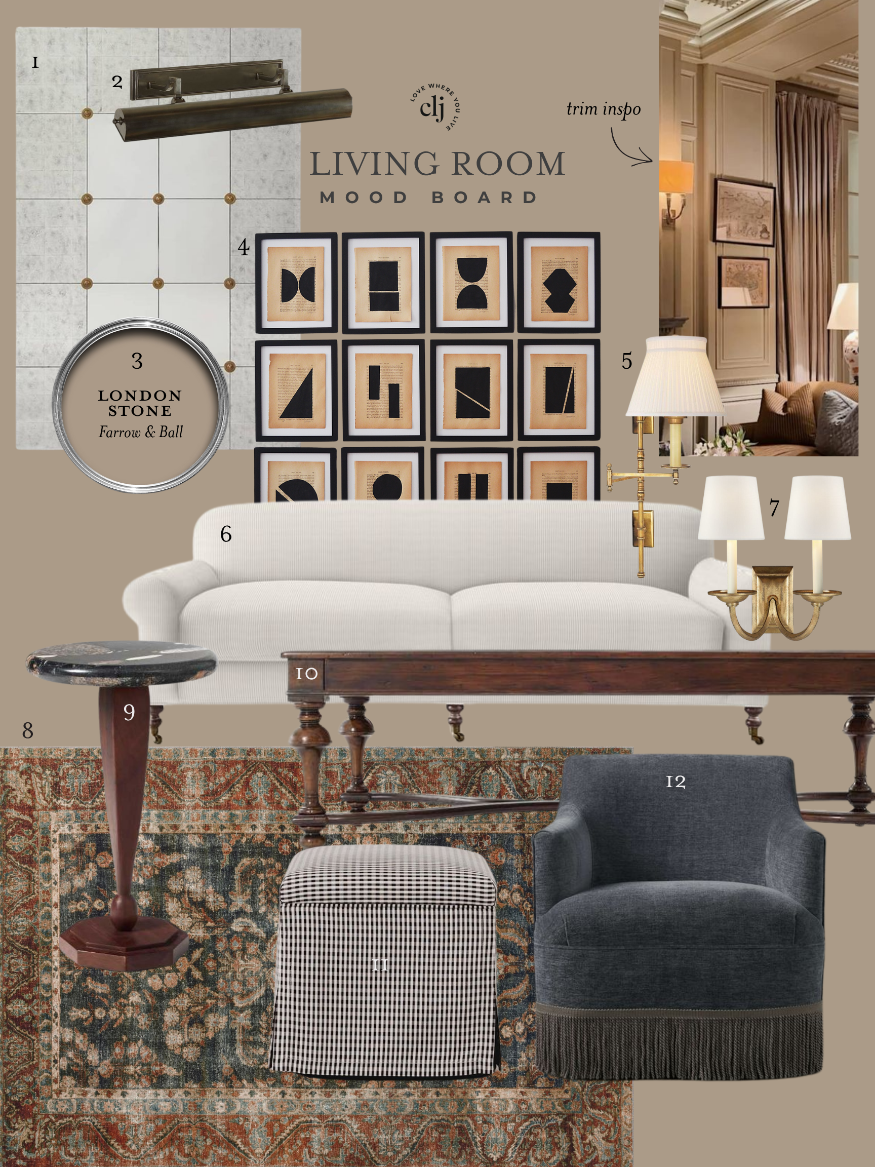
Chris and I both loved the light taupe-y walls that provided a good backdrop for a lived-in look, while still kept things really light and neutral. I looked at close to 60 swatches and annoyed myself to no end with indecisiveness. I tested out 4 different swatches on the wall and we ended up going with an Ace Hardware color called Richland.

We tested it all over the place and decided its a winner. A little gray. A little tan. Some greenish undertones.

So now, I guess we just have to actually paint everything. Stay tuned, or better yet, grab a brush!
I love it- and the inspiration picture! I would’ve never considered mustard either but thanks to you, it’s now an option for the future- just dont tell my husband!
We are hoping to close on our house this weekend and have been looking at loads of paint colors. I totally thought I’d go color crazy, but all we feel like doing are soft, light, neutral colors. It’s hard to go wrong that way! Can’t wait to see it all painted!
OOo! Congratulations and happy painting to you too!
I think this is a great choice! We are using neutrals as well around our house – our favorites are Herbal Escape and Coastal Fog by BM. Both have subtle color changes as the light changes, anything from a green cast to pale gray to warm gray.
LOVE Coastal Fog.
Glad to see you are back blogging. I hope you are feeling better!
Getting there. I’m easing into it, but I’m glad to be mostly back too. :)
Where did you get the rug in the first picture? I’m looking for something similar.
That’s from Rugs USA.