When we decided that we were going to move, there were many spaces that weren't "done" in our house and we accepted they wouldn't be under our watch (we're definitely not moving for "content"). But most of the spaces in our home, we had at least done something to (I call these phase 1 makeovers) and our home flowed really well, except when we got to the laundry room. The laundry room was a very clear, abrupt difference in design style. So before we sell our home, I wanted to do an inexpensive laundry room makeover.
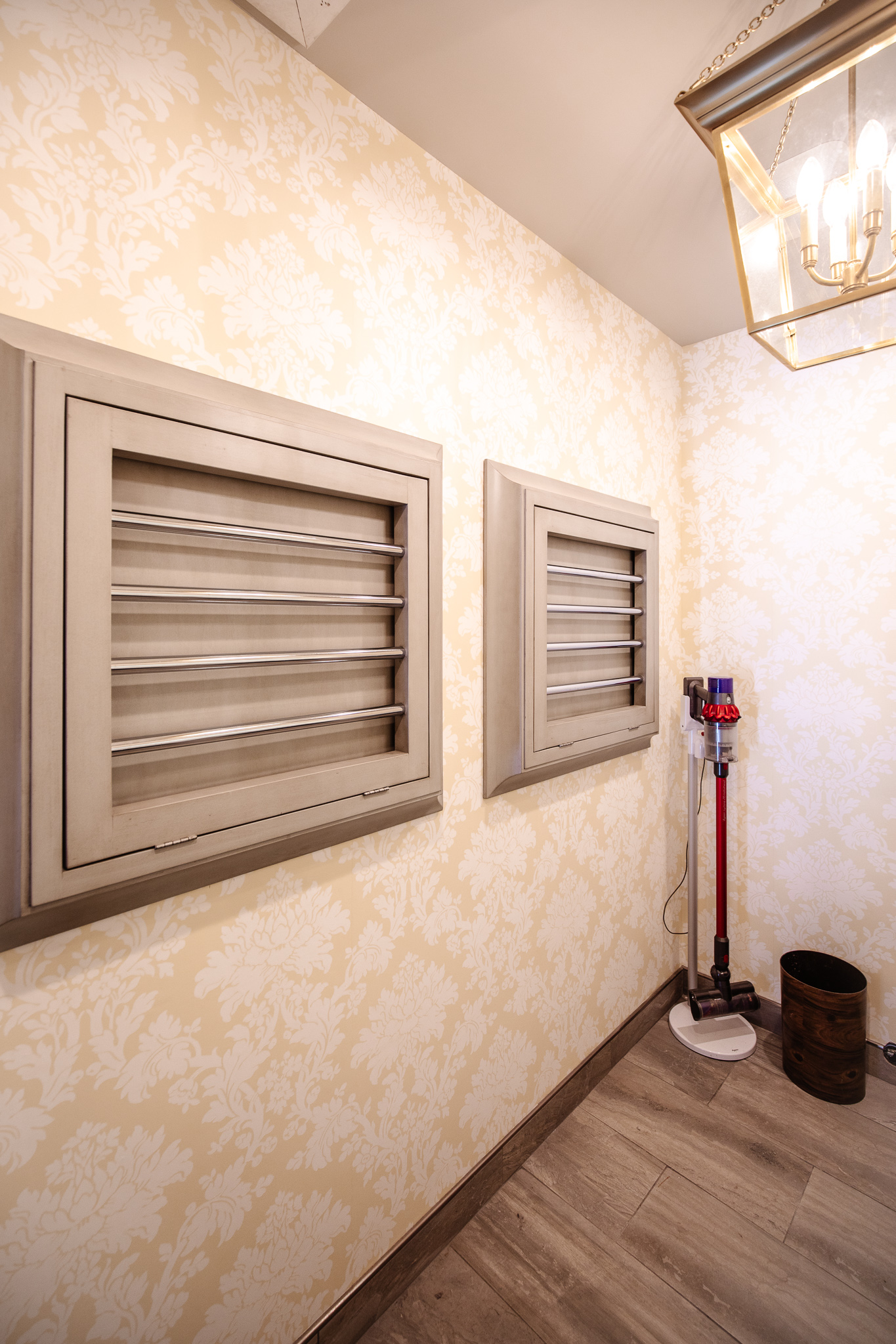
This was the laundry room before (just a couple weeks ago)
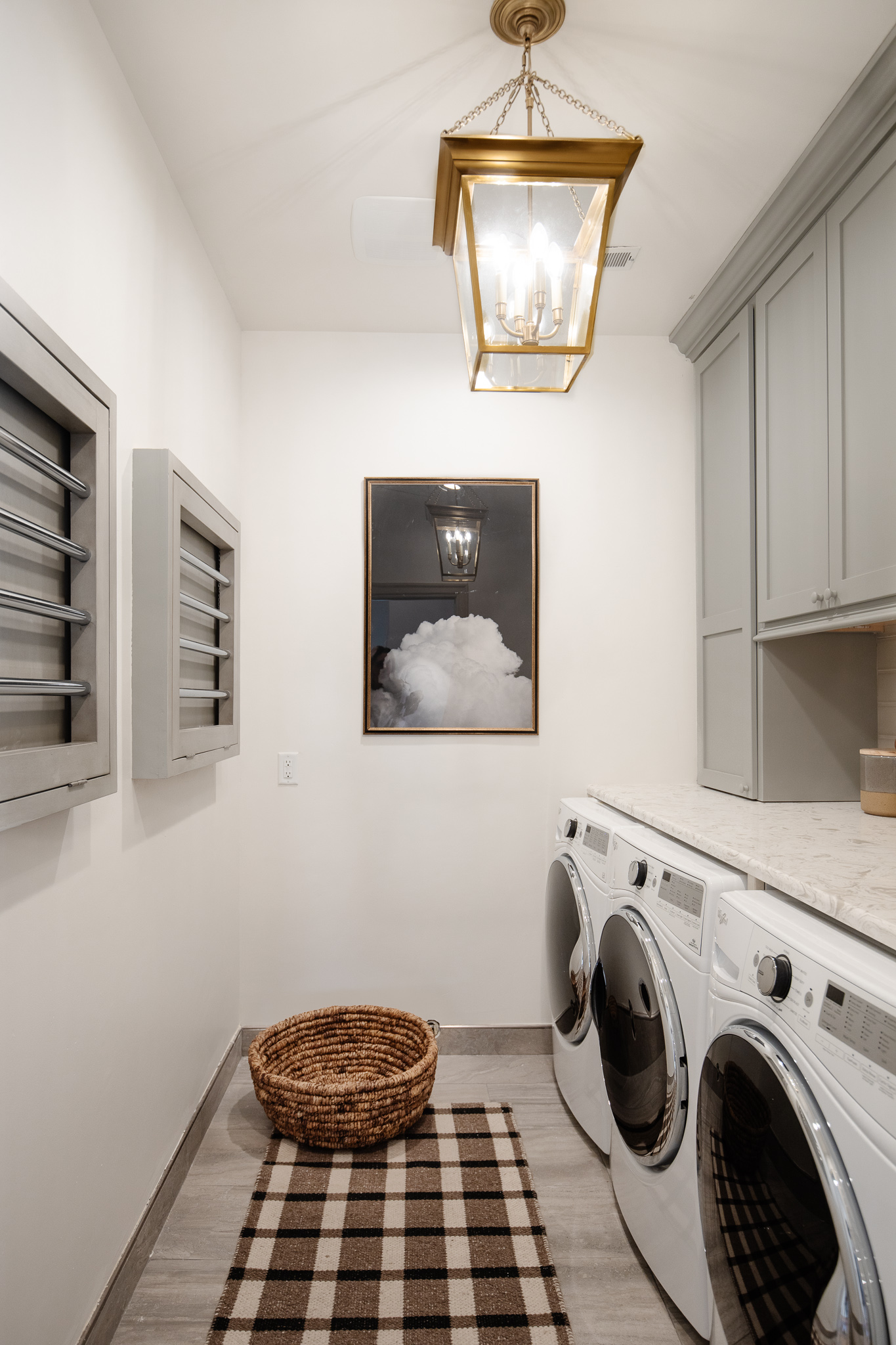
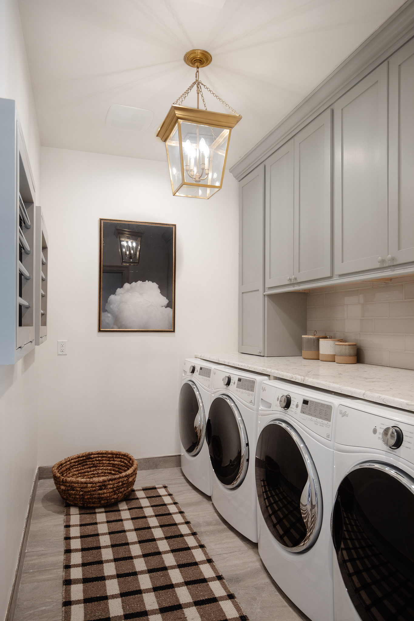
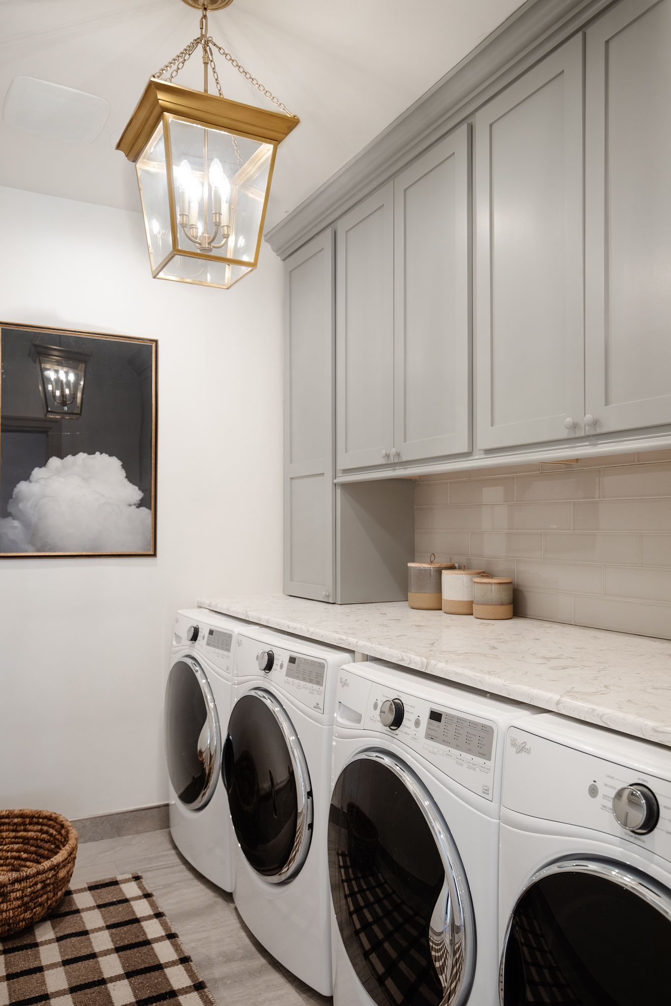
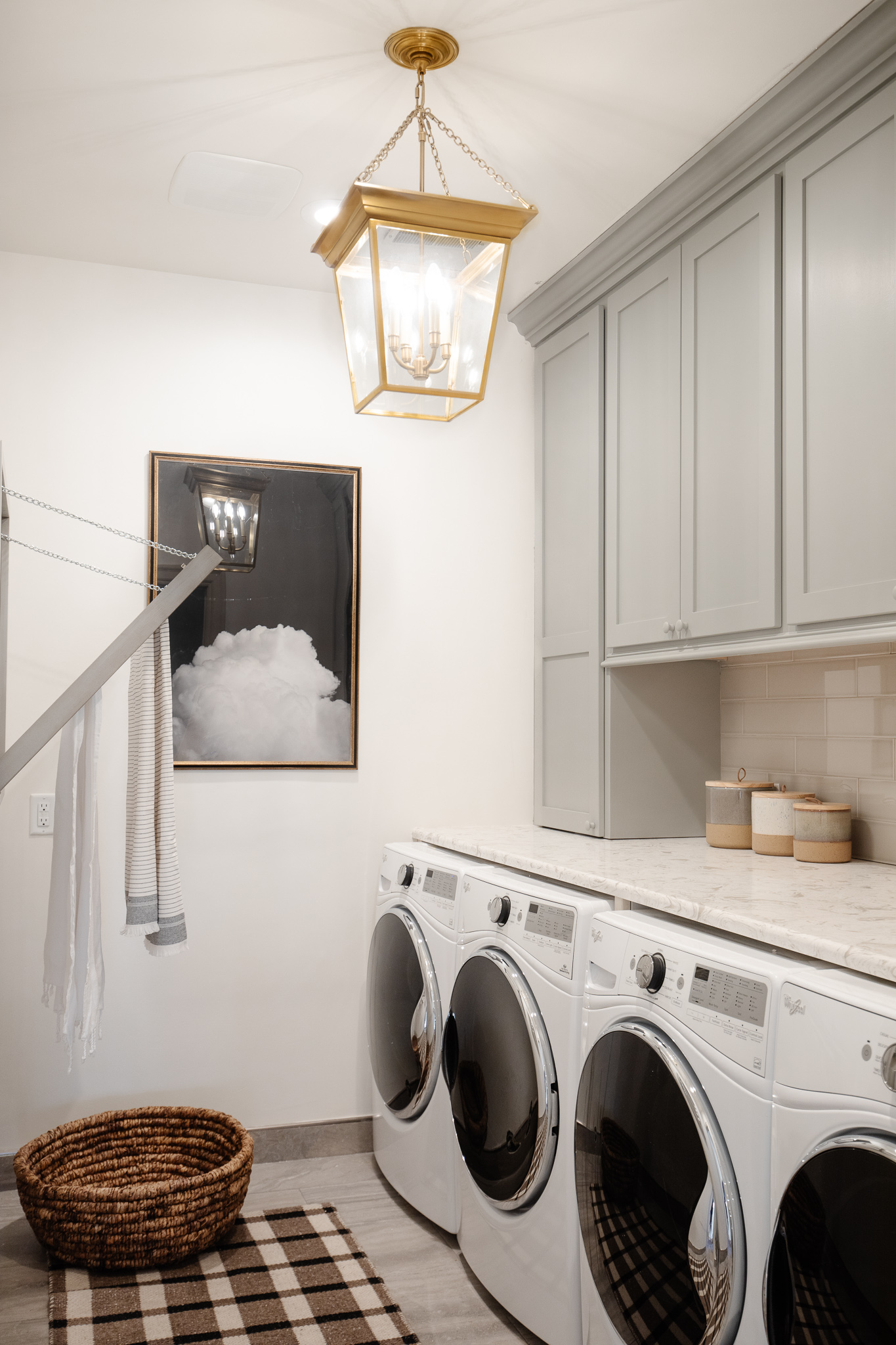
This is how it looks now!
Runner, Lantern Pendant, Art, Basket, Washer & Dryer, Wooden Knobs
We removed the wallpaper. Skim-coated the walls (the removal did some damage). Primed and painted the walls and ceiling the same white that's throughout the rest of our home (Sherwin Williams Alabaster). This made a huge difference because I didn't even realize the ceiling was painted a darker gray color. Paint alone really brightened up this whole space.
We also painted the cabinets. They were two-toned and antique glazed, and we decided to modernize them a bit by painting them all one tone--the same color that we have on the trim in our bedroom (Farrow and Ball Lamp Room Gray. We had it color matched to a Sherwin Williams Enamel based paint in satin for a rock-hard finish.
We replaced the hardware on the cabinets with a "callback" to other hardware in our home--these inexpensive wooden knobs. I think a "callback"--a repeated color or design element--is the easiest way to unify a home. So bringing an existing paint color into this room and the wooden knobs went a long way in making this space feel like it belonged in here.
The last modernizing update we did was remove the chunky crown molding from around the wall mounted drying racks and instead trimmed it out with squared-off pine boards that we primed and painted the same color as the cabinets. The drying racks HAD to be custom made. They're sturdy and made so well and really beautiful and with the squared-off trim, they feel like they really belong.
That's it. That's all we did besides a little accessorizing. And it's a night and day difference!! (I think our laundry room now is the night version haha). The plaid runner is another repeated design element in our home and the cloud art felt like clean laundry to me. (The canisters are old and no longer sold).
I'm THRILLED with the results. With all projects, I wish we would have done it sooner. But what I wasn't expecting was how finished it feels. I went into this project with a "phase 1" mindset. A cohesion makeover, really. But now that it's done, there's very little I would change even if we WEREN'T moving. I think I would change the floor tile or the tile baseboards? It's the power of paint, once again!
We're so so happy with it and more than anything, it's a space I feel proud to show and share now.
Sources
Wall Color: Alabaster by Sherwin Williams in Eggshell
Cabinet Color: Lamp Room Gray by Farrow & Ball in Satin
Runner, Lantern Pendant, Art, Basket, Washer & Dryer, Wooden Knobs
Leave a Reply

WE'RE CHRIS + JULIA
Portfolio
Projects



















Did you do anything to the floor? It looks so much lighter in the after photos.
We didn't! But the lighting and white walls really helped!
I thought I read you were going to lime wash the walls… or a similar treatment. Why did you decide not to?
We didn't get the samples in time and decided to just keep things simple!
When you color match the Farrow and Ball did you bring in the actual pot of paint and have them match it? Or do you paint it on something first? :)
I just bring in a paint chip and they usually already have the formula.
Your laundry room looks great. I had been waiting to see how you would decorate this room especially since you have a dyson vacuum cleaner plugged in. Since you are moving I expect you will not bother to build a special cabinet for this in this location. Just wanted to see if you have a good storage solution for the vacuum cleaner.
So fresh and clean - perfect for a laundry room! Is eggshell the finish you have throughout the house?
Yes!
Do you happen to know of a dupe for the light? I love it, but it’s way out of my price range
Yes we have one here! https://www.liketoknow.it/ltk/DkJTdYoIxaNk0zDTiydTe
It’s so interesting how the tile and countertop seemingly morphed with the color change...in a good way!
Wow! This is such a great example of big impact on a small budget. I remember you mentioning wanting to do some sort of plaster finish on the walls, and I'm glad you kept it simple and did this instead. I totally agree with some of the other comments - the changes made here really help some parts of the room shine - especially that backsplash tile! I also think using the gray paint pulled in the countertops which I think you mentioned possibly changing - now they feel like they belong there with the gray cabinets. Love the drying rack and hoping my carpenter boyfriend can use these pics to build something similar for our tiny laundry space!
is the cloud art mounted on a mirror? I'm not getting how the reflection of your light is there.
It's just the glass front.
What a beautiful, simple, budget friendly makeover!! I bet it feels so good to have it done before you go. I didn’t compute it until this post that you guys didn’t replace the floor in this room when you did the rest of the house.. any reason why you didn’t take the Stuga (sp?) floors in here?
I like the peace of mind of tile in the laundry room. <3
Beautiful!! I love the cabinets colour with that counter. The layout is so similar to my laundry room. What are the estimated dimensions in your space?
Is there an ironing board hidden anywhere? That’s something I’m trying to figure out in my own laundry room. Any favorite wall mounted ones you like?
I'm a steamer gal through and through!! Don't use an iron anymore.
What steamer do you love?
I have and love the Conair turbo extreme one!
Turned out awesome, so much better!
It looks great! It does leave me scratching my head a bit though because I’ve always heard (from you too I believe) that one should never paint a windowless room white because it makes it feel dingy. Can you speak to this a bit? Does this room get some great natural light from across the hall or is that just a rule that’s meant to be broken? Would love to hear your thoughts on this design rule we’ve all heard. It really does look fantastic though, I’m not being snarky. :)
Maybe I'm wrong, but the floor tile looks kind of similar in tone to the stone in your new bathroom. Call it a callback!
I love the runner! But it looks sold out/no longer listed. Do you happen to know where else we might be able to purchase? Thank you!
Just updated the link!
Do you have any idea who made the light fixture and if it is still available?
It is linked at the end of the post!
Looks great!! Where are the mounted clothes rack from?
I mentioned it in the post--they were here when we moved in. I think they must have been custom built!
Where are the mounted clothes rack from??
I absolutely adore those custom made towel holders!
Looks amazing!! One thing that surprises me is how great the light looks now. It looked dated before and I was sure you would change it, yet in the after shot it brings a little bit of warmth and vintage to the whole look now that you modernized everything else. Such a good design lesson!
I thought the same thing about the light! Funny how the wallpaper gave it such a formal and dated vibe, but streamlining the rest of the room makes the light stand out as an intended detail. And who even noticed the tile backsplash before?? It looks so nice!
I think she did change the light from what was originally in there. It was a chandelier she moved to her youngest’s room