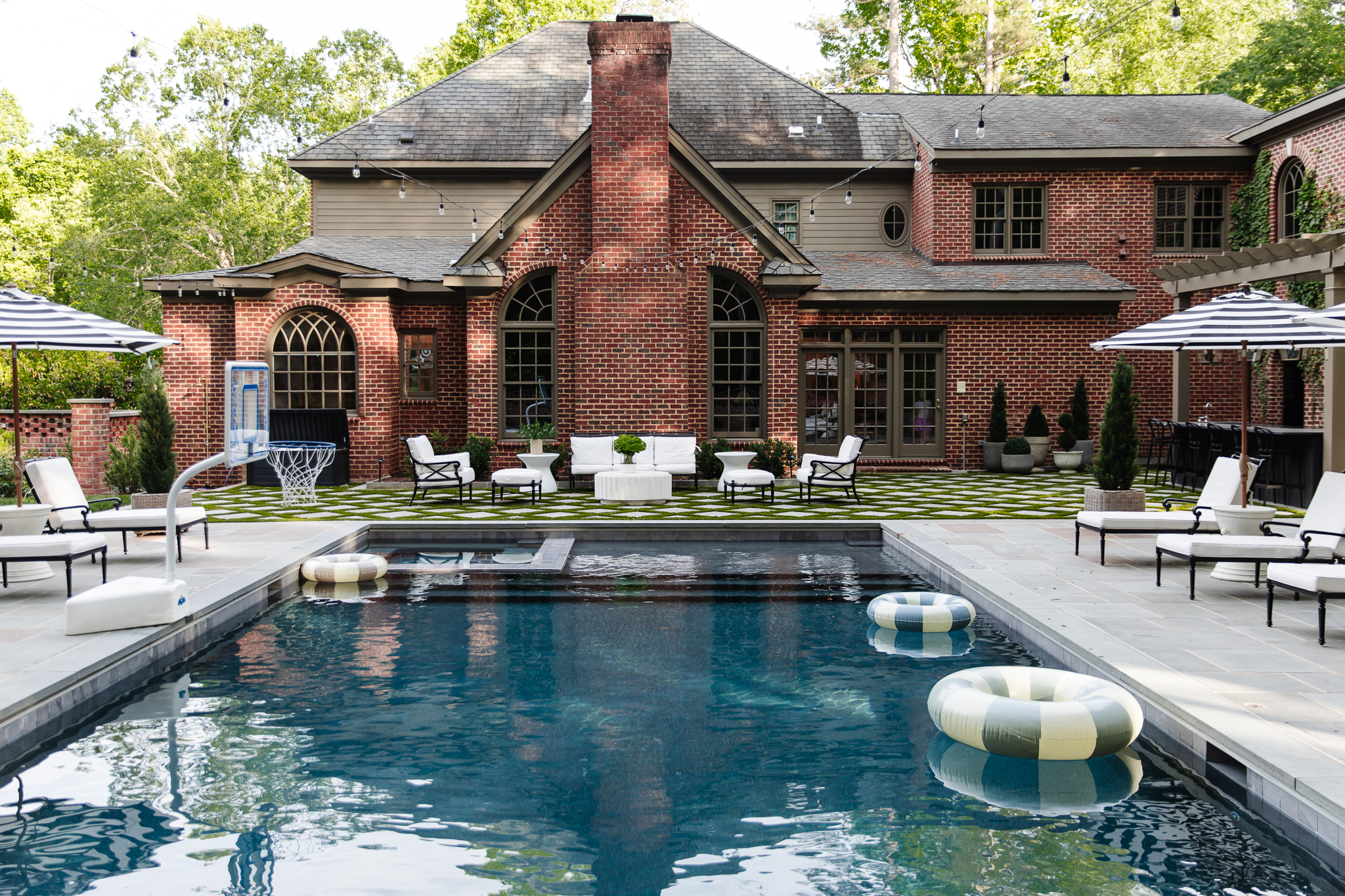
We’ve been on a journey to find the perfect exterior color to pair with our red brick. You see, our windows need replacing, so we’re taking this window of opportunity (see what I did there?) to paint all the exterior trim, soffit, and fascia to match. We color-matched my top window colors, and we’ve been painting samples on all sides of the house, hoping to find the one.

Stone Planters | Faux Topiaries
We decided to go with Sierra Pacific Windows (totally unsponsored) because of their great color options and also their flexibility in replacing just the sash kits. While some of the windows will fully need replacing, a lot of them only need new sash kits, and we’ll be able to paint the trim to match, saving us tens of thousands of dollars! Back in March, we tried on some window and trim colors via Photoshop, which was a good warm-up. It really helped me visualize the drastic change a little paint can make, but the paint colors we “tried on” weren’t color-matched to anything. So when it came to actually making a decision, I chose my top color selections from Sierra Pacific, and we color-matched some paint samples to actually try them on. Here are the options we went with!

Of course, we tested some mossy greens, a few blues, and some grays. These are just some of my favorite hues, and although I love taking risks, I want this color to feel classy and timeless with the brick.

The same color is going to look different in direct sunlight, shade, or under artificial lighting at night, so we tested swatches on a few different windows, and I stood outside and stared at all times of the day.

As fun as the blues and greens are, I was naturally gravitating more toward the grays and beige tones. I’m not one to shy away from color, but I want the color to coordinate with the brick but also the style of our colonial style home. After staring at these samples for days, I was pretty sure I wanted to go with Gull Gray, but I wanted to test two more colors just to be sure!

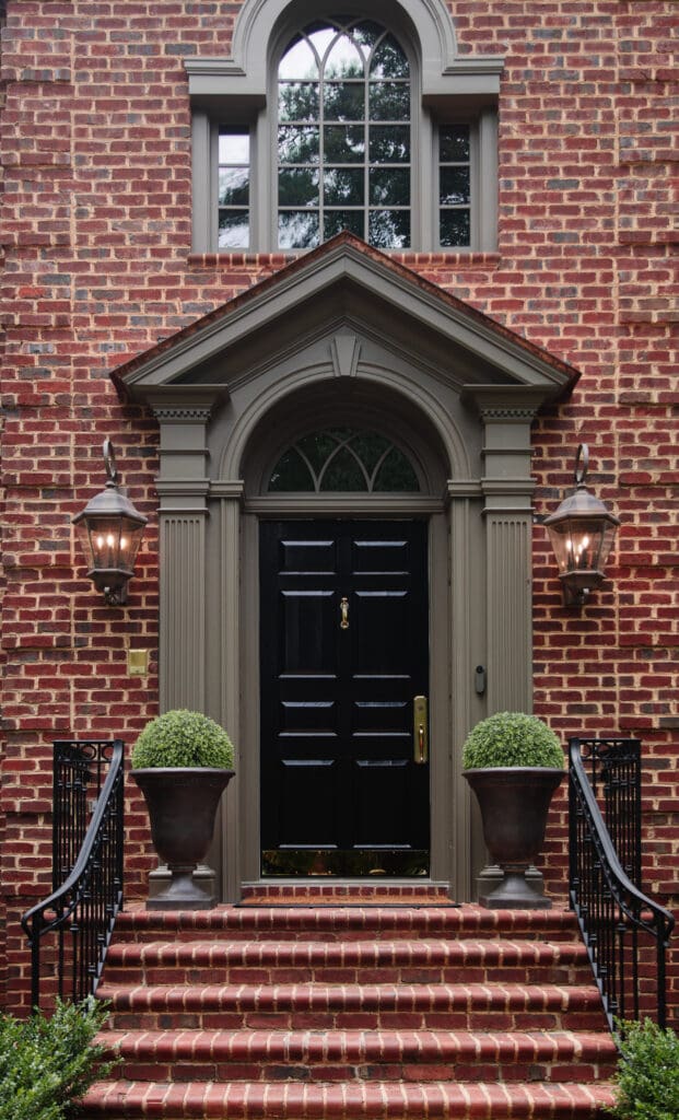
That’s Gull Gray on the left and Antique Bronze and Burgundy on the right. The Antique Bronze looked much greener than I anticipated, and the Burgundy was absolutely lovely and bold but not the vibe we were going for.

Porch Lanterns | Welcome Home Mat
Here’s gull gray and Antique Bronze once more, helping me solidify the decision to go with… Cromwell Gray! I love how it coordinates well with the brick and the roof, and it’s just a nice warm, taupey gray.
Next up, we’ll need to get approval from the HOA, which I’m not too worried about. There’s quite a variation of home colors and styles in our neighborhood, and despite our rough patch with our HOA, I think we’ll be in the clear. Then we’ll get our windows ordered!


From all your pictures it appears you in fact did not use full gray and ended up painting the windows Cromwell gray, is that correct? We are pricing new clad windows form Sierra and are likely going to go custom color so we can get the Cromwell… unfortunately no window company has a stock color that is as beautiful as the Cromwell.
Yes, we chose Cromwell Gray and we love it!
We have the same color around the windows and trim of our house. I love it!! You will too. Looks great with our brick and black front door.
Looks great! For the Topiary balls do you insert anything in the planters to keep them in place?
I’d love a link to the sconces on your front porch! Looking for some large lantern lights myself!
Love, Love, Love! The way it turned out! It is interesting and updated and elegant. Not boring or jarring. I wish I had been as diligent as you in picking a recent shutter color update and door stain. I went for sw succulent – a mossy green but I don’t love how it looks with our Old Chicago brick. Ugh!
Love your selections! They are perfection!