We finally finished the nursery and are excited to share a lot of photos with you today! It's hard to believe we started working on the this room back in December and here we are five months later with a one month old. This room is a great mix of DIY projects (like the huge letter art, the fluffy ottoman, and amping up an Ikea Tarva dresser), a couple splurge pieces, and some repurposed pieces, too (our photo ledges from our last house are now used for lots of children's books and we even painted Greta's old crib)!
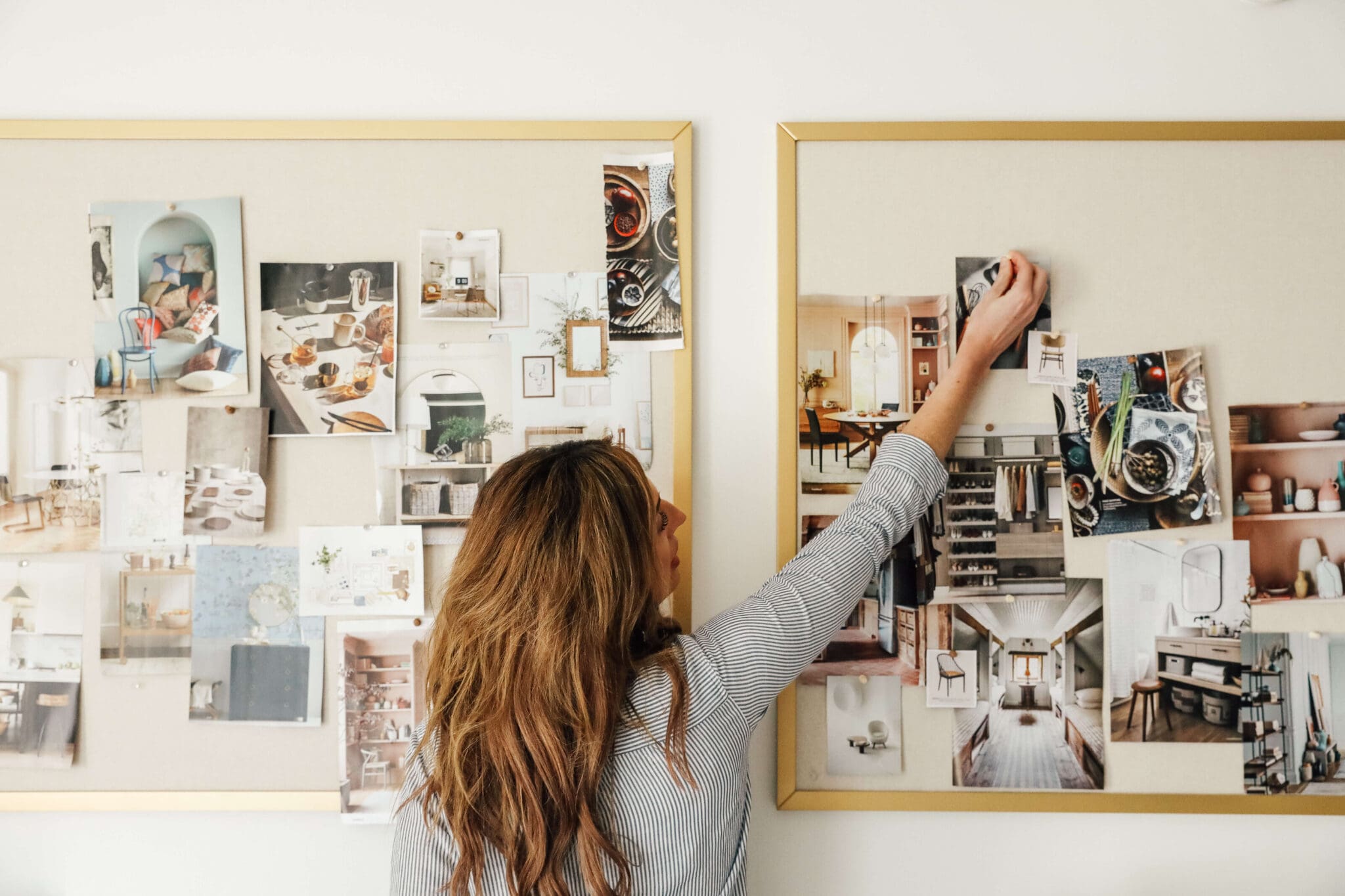
When I put together the mood board for this room, I really wanted the finished space to be charming and sophisticated and I think it is just that. It's a place I enjoy being in, but charming enough for our little girl, too. We've posted about the whole process along the way, so for "reveal" posts, I tend to let the pictures do most of the talking. However! At the end of the post there is a master source list.
One last before photo so you can see what we were working with:
Because the room doesn't have a closet, we needed a way to store a few additional things that didn't fit in the dresser. This floating shelf and a variety of baskets does the job so well. It's warm and organized and even ties into the hot air balloon baskets.
We're thrilled with the way the room turned out. With each piece we added (the light! the crib sheet! the mirror! the mobile! the curtains! the dresser!), we kept saying "this makes the room." While they all work together to execute the sweet and calm ambience we envisioned, now that Faye is here, it's clear that she makes the room. I couldn't think of a more perfect picture to end on. Favorite part?
Missed a part of the nursery process? Catch up on all the nursery posts right here.
Sources: Wall Color-Clark+Kensington White Mosaic; Light fixture-Shades of Light; Area Rug-West Elm; Crib sheet-Wayfair; Crib skirt-Oliver B; Sunburst Mirror-Wayfair; Mobile-Amazon; Curtains-Target; Black-out shade-Steve's Blinds and Wallpaper; Huge Letter Art-DIYed; Graham Glider-West Elm; Side table-Ross; Book ledges-Ikea; Tarva Dresser-Ikea and DIYed; Owl illustration prints-Ashley Percival via Etsy; Be You Print-Sugar Paper; Wire basket on dresser-Rejuvenation; Floating shelf-Ikea; Baskets-Ross; Wheely cow-Amazon; Wood Tile floors-The Tile Shop
Leave a Reply
WE'RE CHRIS + JULIA
Portfolio
Projects







[…] nursery by Chris Loves Julia is very simple, but with with purple ad gold accents. I love everything that they do in their […]
Such an adorable nursery! Where is the faux fur stool from?!
[…] is the illustrator that did the flamingo. I actually ordered it at the same time as the owls for Faye’s room knowing Greta would love the flamingo. She does. You heard all about the butterfly poster here and […]
[…] home, I think. We love replacing fixtures! So far, we’ve replaced the one in the half bath, Faye’s room, added sconces to the reading room, the guest room, the dining room and today we’re adding to […]
[…] we were going to have a boy. Ha! So much for intuition. We couldn’t be happier with how Faye’s room turned out, but if she were a he, it might have looked more like […]
[…] time searching for just the right ones. In fact, the only other room that currently has curtains is Faye’s nursery. I have been following the Etsy shop, Martha & Ash for over a year now and when they recently […]
[…] 5|| Chris Loves Julia’s Nursery Reveal […]
Absolutely beautiful! You did a great job with this space.
Beautiful room! It's crazy, my baby is Evelyn Faye, and she has a purple, gold and white nursery with a gray rocker too. Great minds :)
Love it! Welcome to the world baby Faye!
http://interiorsbykenz.com/purple-and-gold-matryoshka-nursery/
This nursery is just beautiful. Like many other comments - I too, love the color combination over in the "reading corner!" I'm finishing up my Baby Girl's room...hopefully this weekend. Exactly which Ikea shelf is over the dresser? Or if you don't know exactly the name of the shelf, how deep is it?
So many beautiful, yet whimsical details! Each element really shines against the neutral walls. Love it all, such a lucky little lady.
What a sweet sweet space for such a perfect little girl. Hope you're enjoying your two adorable girls- it seems like heaven!
love the simplicity of the space. still very baby-friendly, but totally a space that isn't offensive to adults. very peaceful.
Love everything about it! Good job!
It looks great Julia and Chris. Awesome job. Thanks for sharing it with us.
WOW! You did a wonderful job - that room is absolutely beautiful!
This looks great! I love the added storage above the changing table/dresser. Definitely something I'll need to add to our nursery area.
Seriously so sweet. And as the mom of two boys, I think I can say with conviction that girl rooms are more fun than boy rooms. Where do you plan to hang up her clothes when she gets older? I can't imagine a teenage girl without a closet!
We actually have three bedrooms downstairs (one occupied by Greta) so in a couple years, we'll likely move Faye down there where there are plenty of large closets in the bedrooms. :)
I really love your taste! Your reading room is still one of my fav rooms ever.
That mirror over the crib makes me nervous. I'm sure you have it anchored in well!?!?!
Definitely. In MULTIPLE places.
Great job! I love that it's fresh and not too "overly thought out". It will grow with her well. Good job, guys!
I love that there isn't an overwhelming theme yelling at you when you walk in the room. A great room that will be able to grow with baby!
I love this nursery!!! I love that in your last house the room that you intended to be a nursery turned into an office/studio space and in your new house your office/studio space turned into your nursery. It's funny how things work out! Love it!!!
Awww, I hadn't thought about it like that. Love it.
So chic! My favorite part is the unexpected color combos of the reading corner. Great vision overall. It's a refreshing design.
This turned out sooo well! I love the color palette! well done :) Of course, Faye makes it! (Love her name!)
Favorite part?? the baby, of course.
Of course! :)
Lovely and sophisticated.
I am so baffled by baby rooms with "themes." Why not just capitalize on good style and design — like you did here! Faye will have lots of peace in this space.
I LOVE the combination of textures, and maybe love even more the combination of a seaglass/mint throw, orange pillow and plum rug! I would never think to put those colors together, but they look so pretty!
Okay, you guys are so inspirational and yes, yes, yes little Fine Faye makes the room. Though that delicious rug isn't too bad either ;)
My hubby and I purchased our First Home and get the keys May 16th. Your blog is such an inspiration, I have had so much fun dreaming about making our first nest. I did pick up these curtains at Target yesterday after seeing your first post about them. Eeeeeeeek! My music room (where I teach piano and flute) will be mid-century modern: pale gray-blue with touches of cream, brass (my parents Stiffel lamps are gorgeous), and pops of apple green. I am so glad you posted about these curtains because they will look beautiful around our new bay window.
Thanks for just being awesome, Marcum family. As a cooking instructor, I so look forward to Chris' post, too :) Enjoy your time with your sweet girls.
Sounds so beautiful, Lindsey. Congrats on your new place!!
Absolutely beautiful! I am planning a nursery for our first little girl (we have two boys) and have also eyed up those curtains. Can you share where the changing pad cover is from? I apologize if I missed it.
Oops! Land of Nod.
Thank you - I thought so as I had pinned that as well. Again, looks gorgeous! Faye is a lucky little girl.
LOVE how this turned out! I noticed you said the side table was from Ross- what is that??
It's like a TJMaxx type of store. They have clothing, accessories and home decor.
Cross another project off the to-do list. Bet that feels as good as it looks!
Always. :)
It's perfect. (So is the part that makes the room!)
I love it! It is so understated and elegant. I am starting to really warm up to using gold - after ridding our 70s house from brass fixtures I taught myself to steer clear of gold. This is a great example of how charming gold touches can be when done right! When seeing the baskets at first I thought "those are so high" then I remembered you are like a foot taller than me so they are probably perfect! :)
Oh, haha--yes! Any lower and we'd hit our heads while changing a diaper.
Such a sweet place!! You did an awesome job!
^^i agree with Lindsey! Amazing room! I love everything about it! And I too want to know more about the little blackboard pieces on the baskets.
Probably my favorite part is the sheet! It is so unexpected for a baby sheet. Poor Ellie got so many hand-me-downs. She didn't get any new stuff for her bed. I should look for some new ones. Everyone loves getting new soft sheets!
I'll do a post on the labels--simple! Also, the funny thing about that sheet is it comes from a crib collection that is SO NOT ME, but the sheet was so perfect. Thankfully, they came as separates too.
YOU WIN... Hands down... most beautiful, elegant and simplistic nursery ever... in the history of nurseries.
You and Chris never fail to amaze me. All of the finishes are perfect, but the simplicity of it all is what awes me the most. Bravo!
Did you add the chalk board labels your shelf? I have a collection of baskets that do not match, and this might be the perfect way to tire them together.
You're so sweet. Thank you! I'll do a quick post on the labels--simple simple!
I love that you have Bread and Jam for Frances! Definitely a book that will be passed down in my family. They just don't make them like they used to! Love the whole room!
That was my favorite book as a child because it was dedicated to a Julia. Been connected to it ever since. :)