I feel like I’ve been painting non-stop for a year, to be honest. And when I think about what’s next to be painted, I always think about what is already painted, what color and where. And then I try to tie it in in other areas of the house so everything speaks to each other.
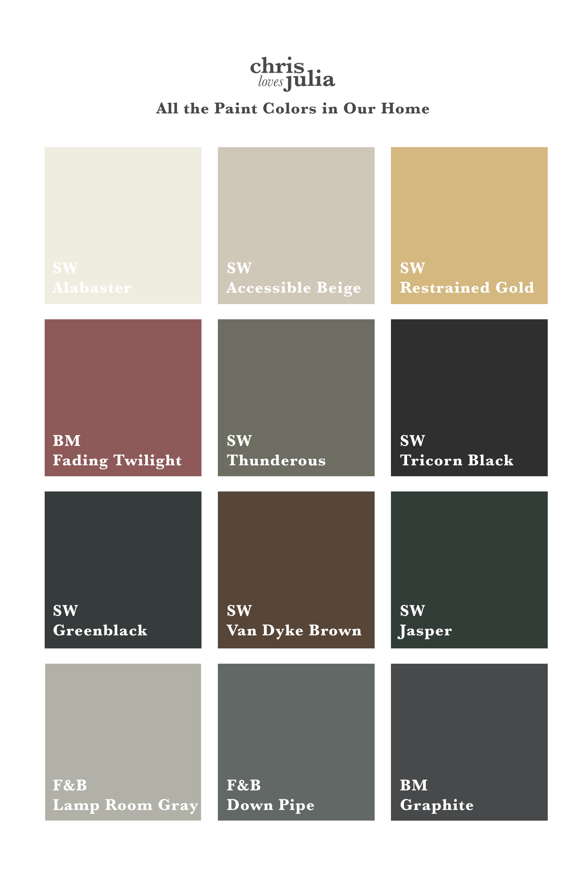
Here are the paint colors we have used so far in our house–it looks like a lot of colors and a lot of deep colors, but it’s really 70%ish Alabaster with pockets of color.
Right now, in the little girls’ bathroom, we’re repeating the Fading Twilight rust color that we have in the music room in the floors. And I have plans to bring some of the gold into Faye’s room–she’s always been our sunshine girl! You don’t have to pick a NEW color for every room, once you have a palette down, think of how to bring in those tones in other ways. For instance, in the home office, we used Accessible Beige on the trim (our all over trim color in the majority of the house) and wainscoting and the wallpaper has Thunderous tones–another call back to the kitchen cabinets.

I’m sure our house palette will continue to evolve over the years, but I’ve been getting some questions about how I decide what color to go where and I generally think of where in the house feels stand-alone and how I can incorporate those tones in more ways–If not in paint, It might be in textiles or furnishings or art as well!
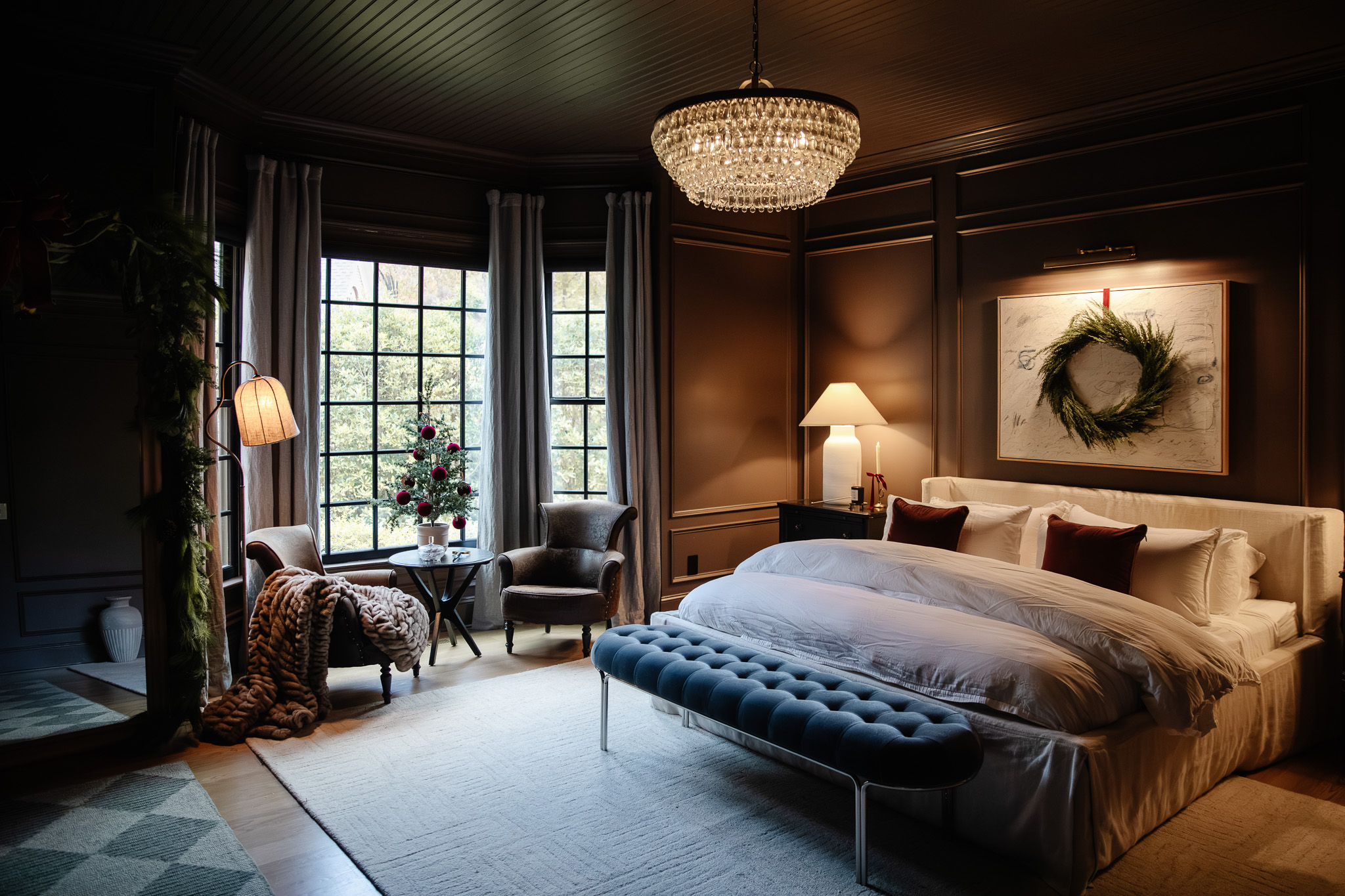
I’ve been really enjoying injecting pockets of color into smaller areas of the house. Like our closet is all one tone–Lamp Room Gray, which feels more like a warm blue gray in real life, is a pocket off of our Alabaster bedroom with the same Lamp Room Gray trim. And even though our en suite bathroom is tile, we chose tile with the same blue gray tones and are now looking for a way to bring that tone into another area of the house–hint: I’ve got my eye on the dining room!!!
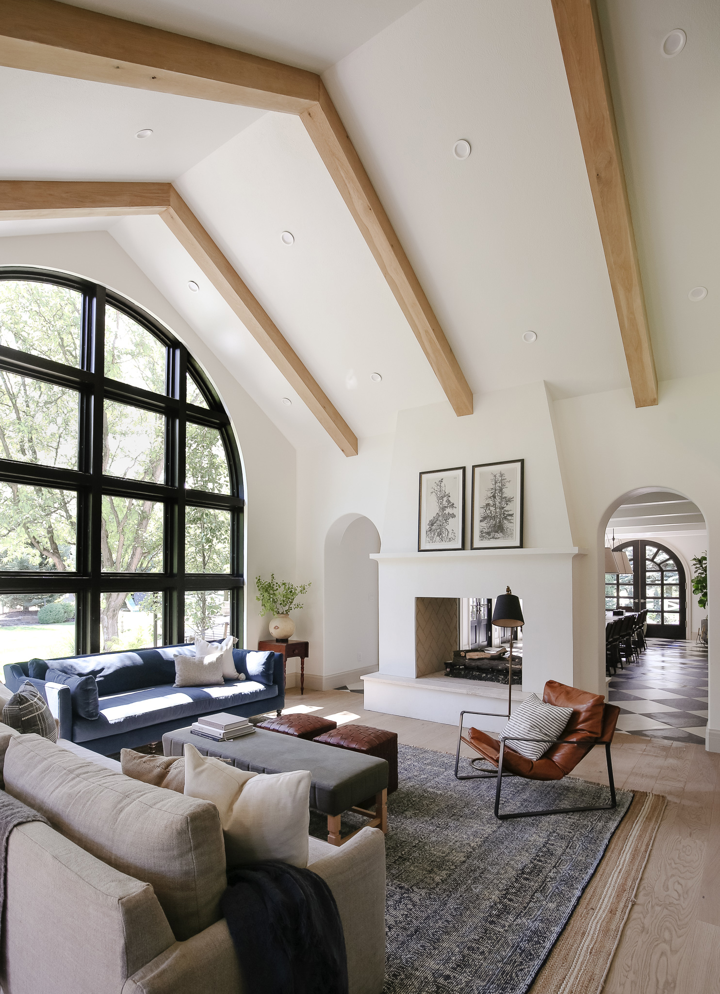
I love that you can go from our white living room with a large, black arch window, to right below in the family room that is (nearly) black–Greenblack with large white curtains. You might not notice why it flows together, but when you think about color as a tool, it’s fun to repeat tones and play with mixing them up throughout the house.
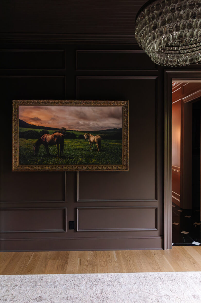
Our walls are still mostly bare, and I’m excited to use our palette to start introducing and repeating color stories throughout our home with more art.
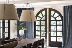
Your home’s color palette absolutely extends to materials too–we love to incorporate warm leathers, black and brass accents and wood tones in every room. See if you can spot the themes below! And I’d love to hear about your home’s color palette!

Alabaster by Sherwin Williams, Trim: Accessible Beige by Sherwin Williams

Alabaster by Sherwin Williams, Trim: Accessible Beige by Sherwin Williams
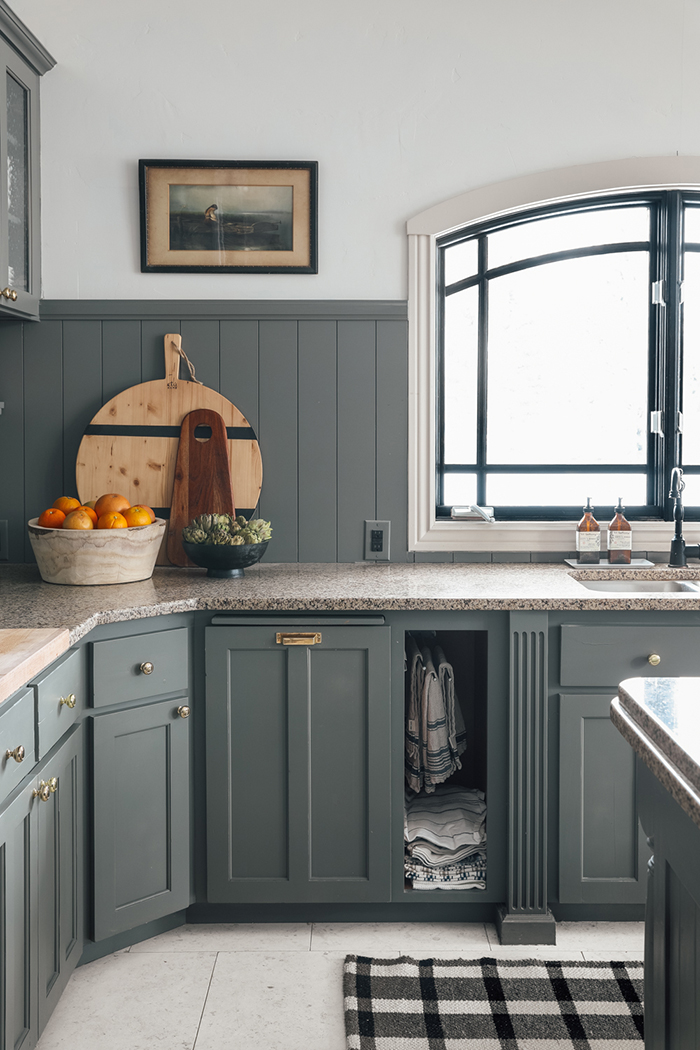
Thunderous by Sherwin Williams

Van Dyke Brown by Sherwin Williams

Fading Twilight by Benjamin Moore

Railing: Tricorn Black by Sherwin Williams

Alabaster by Sherwin Williams, Trim: Lamp Room Gray by Farrow & Ball

Lamp Room Gray by Farrow & Ball

Cabinets: Restrained Gold by Sherwin Williams

Jasper by Sherwin Williams + Accessible Beige on the Beadboard
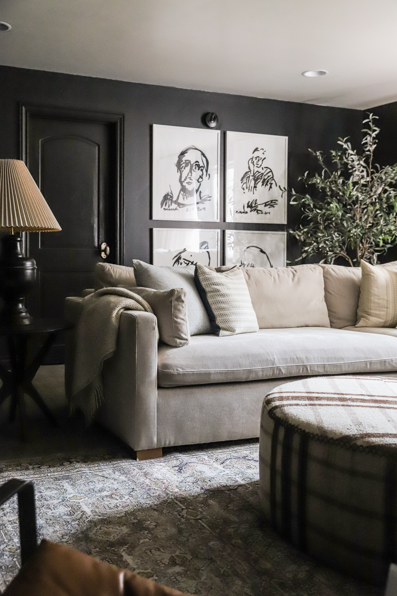
Greenblack by Sherwin Williams + Alabaster Ceiling

Down Pipe by Farrow & Ball


What white paints (I’m trying to decide for a ceiling) would look good with Alabaster walls?
We used Alabaster for our ceiling as well!
Hi! I’m a huge fan of you and your color palette. Question, once you replace the doors in your house, will you paint them accessible beige like the trim or a different color?
I’m thinking about that every day!
I absolutely love your style! Where did you get that beautiful rug from in your bedroom (tan, brown, possibly black?)
We are doing Shoji white walls with Alabaster trim , some 9 ft ceiling , living room vault . Would you do alabaster ceilings ? Can’t decide !
oh man, every home is different! get some swatches up!
Do you ever use a color in the pallet that fits in, but when it’s finally on the walls, it isn’t what you want?
I guess I’m just curious if planning everything ahead of time ever lets you down.
Gus – buckeyearizonapainters.com
Of course!