The studio is done (!!) and now we get to marvel at how far we have come and pat ourselves on the back for making some seriously great decisions along the way. This was the perfect space to collaborate with you readers. We had a great time (although, admittedly, sometimes nerve-wrecking) seeing what you would choose for the ceiling color, the FLOR tiles, the light fixture, the curtains and even what you wanted to see the desk lamp painted--yellow was the perfect choice. Throughout the whole process, the votes didn't always sway the way we thought we wanted them to, but as things started coming together, we couldn't be happier with each element in the room. Thank you for playing along. Now let's get to the goods. And by that, I mean a look back at the bad--where we started--the third bedroom upstairs (a seriously creepy, dingy, outdated nursery) that we hadn't touched since moving in over a year ago:
And here how it looks today as my studio:
I'll give you a minute to scroll up and down and process the fact that it is, indeed, the exact same room at almost the same angle. It feels...alive now. Inspiring. Fresh. And like it belongs in our house. The other side of the room looked just as stale and eerie when we started:
And here's how it looks now:
This side of the room is where I will be photographing most of my work, so nothing is actually hanging on the walls, but the 5.5'x3' chalkboard (showing
this month's drawing) does take up a bit of room. :)
It's nice to back up the camera and show you how
yesterday's post on DIYing that large wall quote plays into the rest of the room. Since there are times when I have to work while Greta is awake, I wanted to be sure there was plenty of room for her to keep busy and "work" too.
Her Ikea Latt table and chairs that I revamped a few months ago provide the perfect workspace for her.
I love how the green chairs tying in to the other green accents in the room. Woot for happy accidents.
And thankfully, there is also plenty of floor space for her to romp around in. Or, these days, roll over. She is on a major rolling spree.
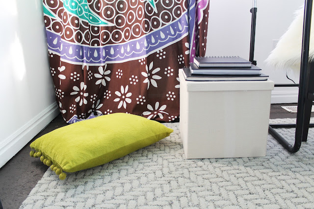
And when she gets tired, she can make her way over to her lounge corner and sift through my sketchbooks, or open the canvas box stuffed with other toys and books to entertain her.
My workspaces are just as varied. My chalkboard is a big work surface for me once a month, but there is also my desk.
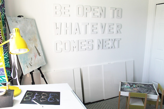
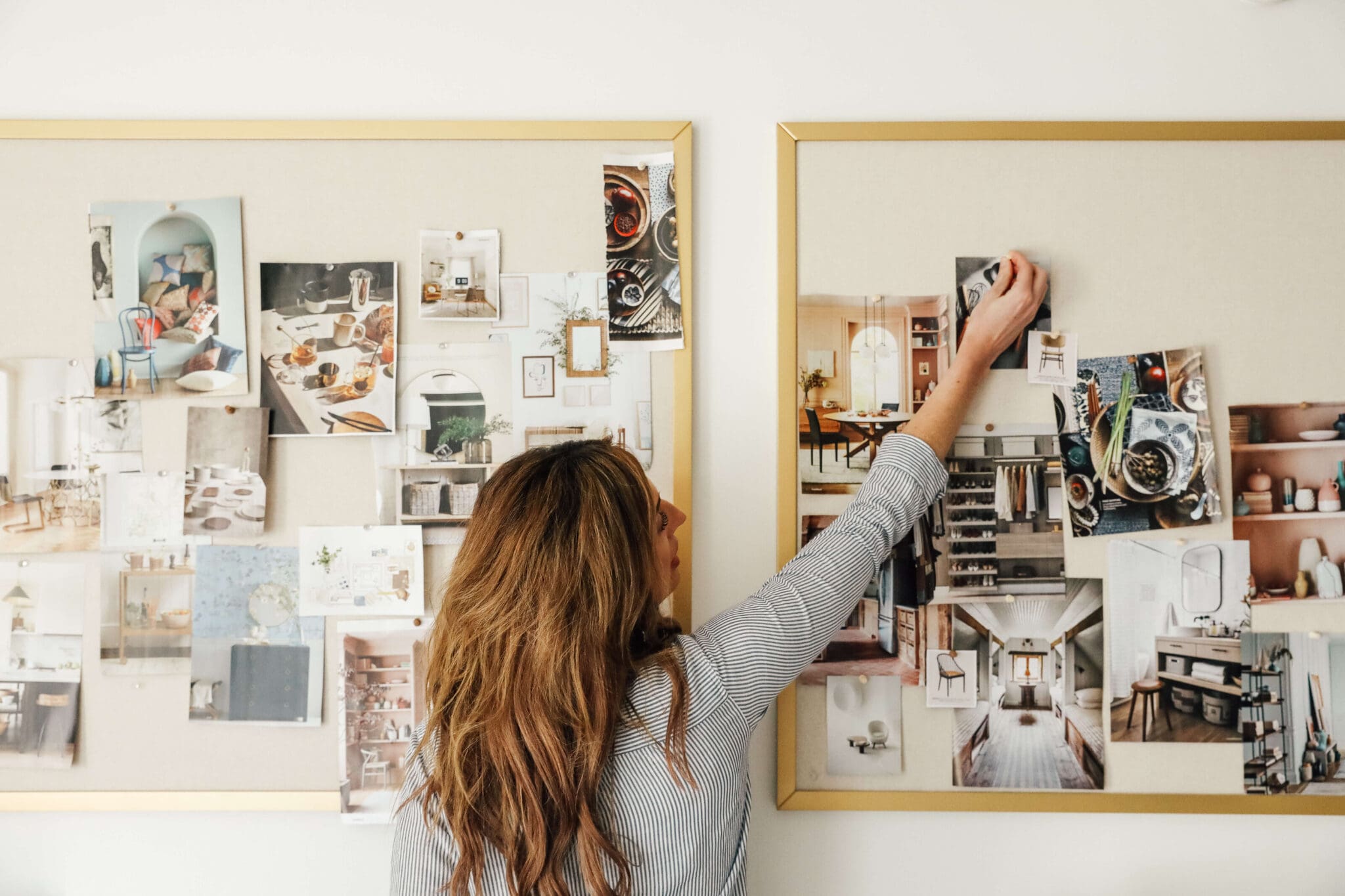
My desk is where I blog from and sketch from and prepare prints to be sent. It's a mood-board-making place, too...and I have a feeling it will take on other roles as time passes (kitchen planning, anyone?).
Next to my desk is my easel I got for mother's day (thanks, Chris!) and I can't wait to give every one of those blank canvases leaning against the wall a ride on it.
This room means so much to me. I had trouble even opening the door to this room that we hoped to turn into a nursery (more on that
here) and now, it has become a major control room for creative things to come about. It is useable now and although we still have hopes to one day turn it into a second nursery, as the writing on the wall says, we are open to whatever comes next in our lives. This is what was next for us, and we are so, so happy to enjoy the space and our lives as a family right now.
What do you think? Of course I love the big wall quote--it feels all-encompassing to me, but in my opinion, the curtains kinda make the room. What's your favorite part??
For inquiring minds, get ready for a complete source list. Readddyyyy go.
Want to look back at the studio makeover process? Check out
where it all started,
readers voting on color scheme,
readers voting on ceiling color,
floor planning,
readers voting on an area rug,
light fixture options,
voting on curtains,
tearing up the maroon carpet,
painting the subfloor,
hanging the curtains and laying the FLOR tiles,
voting of desk lamp color,
installing the new fixture,
the misadventures of lamp painting,
stool buying and messes, and
DIY 3D wall quote.






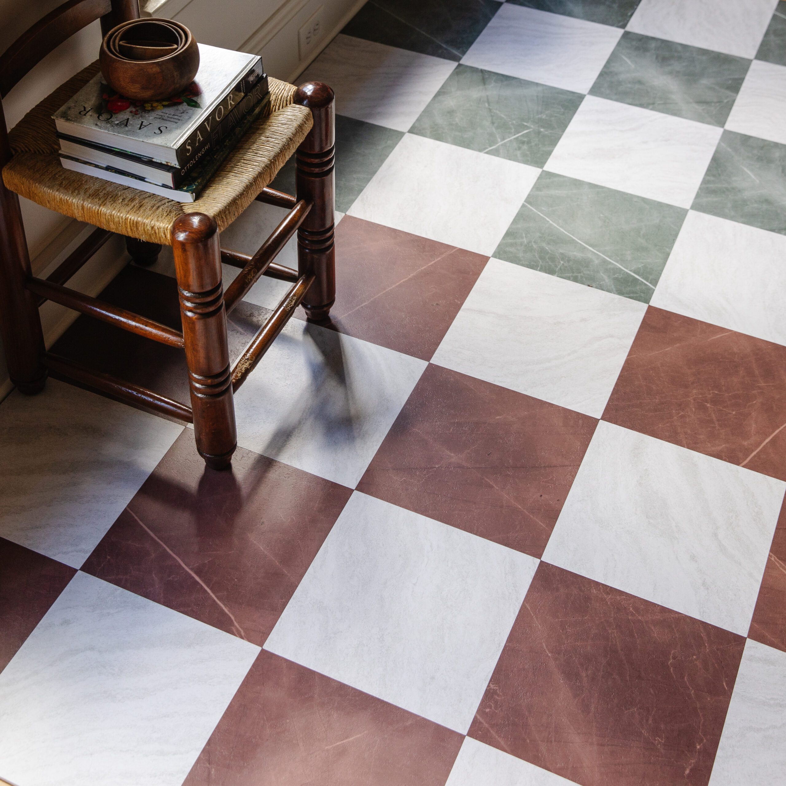


[…] to break the rules when it comes to paint and really go out of our comfort zone. We’ve painted a ceiling a pretty turquoise, painted our base cabinets navy and in this home a pretty green-gray, did a fun 3/4 pink paint […]
[…] hi, washable. It seemed like the best possible rug for our entry with a dog in house, too. We used Flor tiles in my studio, so this wasn’t our first rodeo but it was exciting all over again seeing a new design come […]
[…] After poking around a little, it felt like a good application for FLOR tiles. We used them in my studio in our last house and loved them and really love the way their Suit Yourself line works with the […]
[…] A few other ideas around the blogosphere include these curtains done by Julia and Chris: […]
Found your blog through YHL and ...amazeballs do I crazy love this room. You just want to sit and do stuff in it. It's really an inspiring space and testimony to your wall quote.
It turned out great! It was fun to vote throughout the process and to now see the final product. It came together beautifully! My favorite part is either the block wall art or the tapestries/curtains.
I appreciate you talking about being open to whatever comes in your life...I have been trying to get pregnant for 2 1/2 years with no luck and sometimes it is so frustrating, but I am trying daily to remind myself that it will come when it will come and I can't control it. And in the meantime, I need to enjoy my current life.
SO gorgeous! You are seriously talented. I also love the changes you made to Aaron and Heather's house. You've inspired me to take more color risks in our house.
Thank YOU. You all did a great job!
Aw, thanks And! We are already having a good time putting it to use.
Do it!
The studio came out beautifully! I love the curtains and ceiling color - painting it blue was definitely a good decision! It looks like a perfect space to be creative and you get a lot of credit for having such a good attitude about the challenges life has sent you.
I absolutely love this room. Everything looks great together. Thanks for inviting us to tag along! :)
Wow, it looks amazing! I love all the color!
Wow, it looks amazing! I love all the color!
Wow, it looks amazing! I love all the color!
Our pleasure. You all did awesome!
Ooo, this looks so gorgeous!! The room looks fun and fresh and bright. Well done!!
I really love how the wall quote turned out. If it were me my first reaction would be to pick some bold color for the letters but the white really looks spectacular. The room turned out great, what a fun and lively place to work and create! :)
The curtains DO make it! But I was BLOWN away with how big those letters are! I know you mentioned the measurements in yesterday's post but it didn't translate well, in the pictures they could have been 2 inches tall, it took my breath away! And I cannot even imagine them as a color, it would be too much, nice call. I love how you thought of Greta and keeping her busy, that was practical and smart. It really showed you're not just putting props together for a pretty after picture, you think things through, you're a mom, you're an artist. The whole room is functional, inviting, and alive!!
It's beautiful! So refreshing and bright. Wonderful job - thanks for letting us tag along for the ride and cast our votes!
So lovely!!! It really did come together SO well. The curtains are amazing and I really really like the quote too. Good work!
I love it! I think my favourite is the curtains - they are so bright and cheery. A pretty inspiring place for you and Greta to do some art work.
Yes! I love this room. I love the light. I love the floor. I love the decor. You did such a fantastic job! It's gorgeous and so are your pictures. Very talented!
This space looks AMAZING! I am in love with the colors and all of the natural light you have in there! What a great space for being creative :)
Love the new studio. I can tell you do, too. How nice for you to now have your own work space. :)
YAAAAY!!!!! I am blown away. i love the natural light and how you complimented that with white walls and then pops of color. so fresh and inspiring. what a great place to work!
I'll be honest: I was a little nervous about how the letters would look on the wall. But I love them! So chic and sophisticated. I could hole up in this room all day, just CREATING. Great work, sis!
Oops, yes--there is a closet across from the window wall. Right now it has unused home decor items in it, but we are planning on moving all my prints and shipping supplies up, too.
So, I'm guessing there is a closet on the back wall?? Is there just storage in there? Sorry, I am SO nosy!!!! (lol!!).
My favorite things: the lamp on your desk! What a great addition. I think the color is perfect. It may not be perfect up close, but it looks fab from the pictures! Definitely the curtains. OH baby those were a homerun for sure. My other favorite, the color of the ceiling!
Everything is just PERFECT! And I love that you have your own space and place to put your projects and then just shut the door when they are in progress. You deserve every bit of this, Jules.
solid upgrade! love the light fixture so much!
This is freaking gorgeous. SO inspiring!
This room looks awesome! I love the white walls because they keep it fresh and from being to "cluttered" with color, but the ceiling and curtains still keep it fun and not sterile! I'm in love! :)
Awesome transformation! The new room is so bright and artistic now! Well Chris and Julia you just got yourself a new member. I''ve also added your blog to my bloglovin' list so i wont miss a thing!
The curtains are so beautiful! Love the blue ceiling and your art! Amazing! and congrats on a beautiful space!
Oooh, I can't stop gazing at those curtains! I keep scheming ways that I can get my own and incorporate them into my apartment....
So pretty! I love the 3D quote and will absolutely be coming up with something to say on my own wall.
I wanted to comment to tell you that, but also to tell you that I know that it's not easy to do what you did -- the leftover paint from when we painted our now-guest room is labeled "nursery," if that tells you anything... You've created a beautiful space, one that's so (literally!) welcoming to whatever comes next for you. Whatever it is, I just know it will be great.
Came from YHL and have to tell you that the room is absolutely amazing! I would never have thought to leave the walls white and paint the ceiling a color. And good for you for turning it into a place where you can create!
I love Velcro...I hang everything with it!
Came over from YHL! Love the transformation! The colors, curtains, I love everything =)
Came over from YHL and just had to say how much I love what you did with the space! I love everything about it, so thank you for sharing all your sources and tutorials! I especially love the white letters on the white wall, I never would have thought of that. You must feel so inspired and energized in this room!
Hi. New reader from YHL here. I love what you've done to this room. It's so refreshing! I look forward to reading more.
I’ve been putting off updating our guest room since we bought the house a few years ago in hopes that it would someday be a nursery. Welp, here I am after two years of trying and I’m beginning to think I should just go ahead and start painting it. At least my guests won’t have to sleep in an ugly room, and if a baby ever comes our way, then I’ll get to re-do it all over again!
This room is fantastic!!! I love everything about it!! Those curtains are to gorg!!
I saw you on YHL today. Thank you. This is just what I needed after yet another Christmas has passed with no second baby on the way. Thanks for the visual and spiritual pick me up. :)
Very impressive and beautiful! Enjoy your new space!
Heavy Duty Velcro! If you can believe that. :)
Can you tell me how you got your letters to stay up on your wall??? Did you nail them in?? Liquid nails?!?!?