The study in the front of our home has been evolving over the past nearly 2 years and we recently finished making some more tweaks so I thought it would be fun to look back at where we've been. The funny thing is, with each phase, I rarely thought about the next change we were going to make. I didn't think it was done, but we weren't actively working on it anymore either. Watching, and allowing, a room to evolve can be challenging--especially when thousands of you are along for the ride. There's always the pressure to proclaim a room "complete!" before publishing images here, but living in a space and allowing it to evolve over the years has proven to be rewarding time and time again. (Remember our last living room?) Worth all of the awkward stages!
Here's the room when we first moved in, late summer 2013. The room faces west and is located at the very front of our home.

By October 2013, we had painted it a custom green paint color, hung some pictures, moved in a couch and were feeling pretty good about the situation.
Until December 2013, when we thought, "That far wall really needs something!" (um, yes!) And we DIYed some wall to wall shelves and added a header for lighting, too. The room was really taking shape.
In the spring of 2014, we tore up all the floors of the main level of our home, including lots and lots of tile and carpet, and laid porcelain wood tile throughout--the best decision we ever made. At the same time, we inherited a piano and by the end of the spring, the room kinda looked like this.
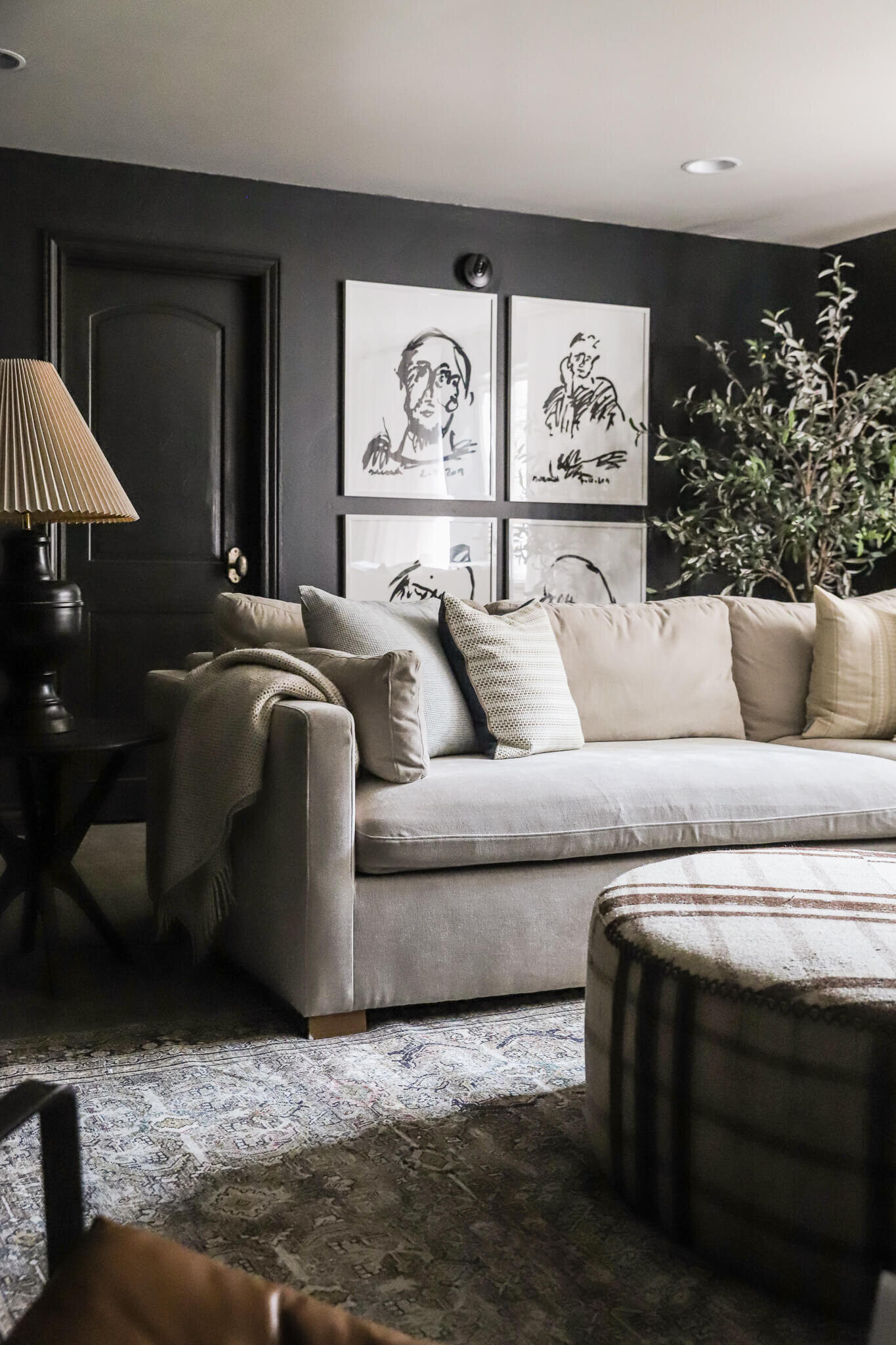
Although some things were definitely moving in the right direction, looking back I feel like the room as a whole had regressed. It lost its main functionality. It took us several months to get baseboards on (thanks to Faye's early arrival) and we ultimately decided just a couple months ago, we really wanted the room to stay a study/office/reading room. And that's where all the most recent tweaks came into play. We moved the piano to another room, went a little darker on the walls, added the couch back in and a small wall desk and this is how the room is looking today:
You read about the addition of the hide here. We also brought in the painting from the entry (it just fit better in here) and a few new accessories from Lulu & Georgia. (Psst--there's a promo code for you at the bottom of the post!)
Their Fay coffee table (had me at the name!) caught my eye because in a smaller, already pretty busy room, I liked the idea of having a clear acrylic table to not take up any more visual room. We've had it for a little over a month now and it's easy to clean and we really like how it adds a visually light, modern element to the room.
I simplified the sofa a bit with just one pillow (similar here) and a throw tossed over the back. The shelves really are the main element of the room, so editing back on other surfaces is what's working for me now.
Speaking of those shelves, a lot of stuff stayed the same, but we did add some new him and her bookends (my favorite!) and an Adler horn sculpture and candlesticks. I'd like to add some fern-like greenery over time and maybe switch out a few placeholder items for something more special and collected--but that will happen over time. I love how everything is popping a little more against the darker paint color. And our fish seem so happy near the sun, too!
Above, you can see a peek at how my desk area works into the rest of the room. It was the perfect last addition; the missing link!
You can read more about my office space in this post if you'd like.
This is the closest I have felt to this room being "done" since we moved in. It feels more like us and functions the way we want it to. But still--let's check back in in a year or two. ;)
Ps. I wrangled a Lulu & Georgia promo code for you all! I used a credit to purchase the final touches for the room and I always seem to find just the right thing. Use love20 for 20% off your order! :)
Leave a Reply

WE'RE CHRIS + JULIA
Portfolio
Projects












Hey Julia could you please tell me what fabric color/type your loveseat is? I'm recreating a similar look in my home but going with more of a blue/green paint. Restless Sea by Behr. Thanks!
I cant find the sconce soource for the reading room/study? share pl?
They are from Cedar & Moss.
What a gorgeous combination of modern and traditional styles, I love the green!
Hi there, love this room!
What brand/color is the floor? Is this time through the whole house instead of wood? How does it sound?
It' is tile. Nordic Brown medium from The Tile Shop. We love it so much.
Hi Julia! I have to say, I'm completely obsessed with your blog/style/IG. It's a completely refreshing feel, and I visit your page on a daily basis. I've been eyeing the desk you have in this room, and I've been considering it (and other similar desks) for our own office.
I don't like clutter or having a lot of "things" out and about when they should be tucked away, but my husband is a different story. How does the main work area and the shelves weigh out for different items? Is it more for lightweight objects?
Thank you so much! The shelves are very sturdy and could hold heavier objects for sure. But they aren't super deep.
Great wall color! Is that Hague Blue by Farrow and Ball? Can I ask what color of white you used? Its perfection.
It's Pine Grove by Clark + Kensington. I'm not sure which white you're referring to.
You can't even imagine how when I pulled up your home tour and saw this room how... just THIS!!! And then I saw the Nighthawks painting that I have a replica of but has yet to find a new home in my house and I am freaking out at how you made it a part of this room!
Julia! I love the way this room turned out! I trust your design decisions 100% but I do have to say I like the room with the couch better than the piano-glad you guys opted to put it back in! The book shelves are amazing and your desk area is just perfect. I actually got one of those letters thanks to your post on Crate & Barrel's sale (so thank YOU!)
Great job, love your site!
Thank you Claire! We're glad we made it back to putting the couch in there. It's just what we wanted.
I love this room. Especially the color.
Making a house a home is always an evolution, I am always tweaking something. The room looks great. It needs a pop of red or green to tie in with the art, to me anyway upon first viewing. If not for your blog I would not have known...There is an abandoned building near home and graffiti was a problem, some artist painted the whole end of the building in this art you have over the couch. It looks great. Boy do your tile floors look fantastic in that last photo.
Hi Julia, On your desk chair(also your kitchen chairs), what foot pads do you use? I have the same chairs on tile floor and can't seem to find any that will stay on.
Darn. Ours actually came with rubber footings. Sorry I'm no help!
My parents have a similar floorplan, but they have this exact room in their house. Neither of them are particularly interested in home design - and with eight kids and very little money - it's never been much of a priority. But they've got a little more disposable income now, and I would really love to see them do something like this with that room. I sent my mom this post - here's hoping!
I love the way this turned out! You're right about a room never really being "done" with evolving. And that's not a bad thing! I say, embrace the change :)
this room looks fantastic! i especially love the colors and the cowhide.
I really love the wall color of this room. It gives it the right amount of sophistication without being overly moody (if that makes sense)! Our guest bedroom has a similar color but we will need to repaint and I am seriously considering going to this same color you have because it just looks so great with the wood tones and the light color of the couch! Makes me want to pull a book off the shelf and start reading!
We LOVE the color. Go for it!
Love this space!
How do you keep your office space so light? I would love a less cluttered office space, but wondering what to do with papers and office "junk" (printer, file cabinet, staplers, pens, envelopes, etc.)?
Haha! Well, let's break it down. The desk has a drawer (can you see it?) and I stuff envelopes and pens, etc. in there. There's a pretty gold stapler on the shelf. Our printer/scanner is wireless, so it actually sits in a closet and our big file cabinet is downstairs in our storage room. My system is, the rhino letter sorter is my inbox. All bills and mail I need to address goes there. After I pay/call/etc, if it needs to be filed, I put it in the white filing box on the top shelf. I file the papers in there maybe once a month or every other month. I think having a smaller desk has helped me cut down on clutter. I love it!
I love this room! It gives me a lot of inspiration :) is it weird to say that I liked it better with the carpet?? I know you had to rip it out for the tiles (love them) but maybe the cowhide rug is just a little dark and blends with the color of the tile. I. Would love to see a lighter colored rug or cowhide in there! Either way, it's a beautiful room!
I know what you mean--the rug was definitely a cozy look. In person it was clearly old, dirty and soiled and we always say, "where there is rug, there are spills." How do kids always seem to find the rugs!? Hahaha. When we initially ordered the hide, it looked a lot lighter online, and that's what we were hoping for, but now that's it's been in there for awhile, we kinda love the tone on tone look.
I LOVE this space - really beautiful and inspiring. I love the coffee table, the hide, the built ins and the wall color is amazing!