Shortly before moving into our current home, we had just finished renovating the primary bathroom in our last house. It was hard to say goodbye to such an incredible space, but it really put us in the bathroom mindset and gave us a head-start in knowing what we wanted when it came time to renovate our bathroom here two years later. We though it would be fun to do a then and now comparison to see what we did the same, different, added or subtracted. (It was actually pretty shocking to see some of the similarities that came out of my subconscious!)
Let's start in the water closet:
Then
Now
Well apparently my love of wallpaper in a powder room has not changed, and both spaces also had pocket doors--an upgrade that's always worth it for a tight space, imo. Our new water closet has an intelligent toilet that's a complete upgrade (it would be hard to go back). We love it. Our previous bathroom did have the bonus storage above the toilet and a window--both were so nice, but I would happily trade both for the pedestal sink we added in our current bathroom.
Now let's check out the showers! Then:
And Now:
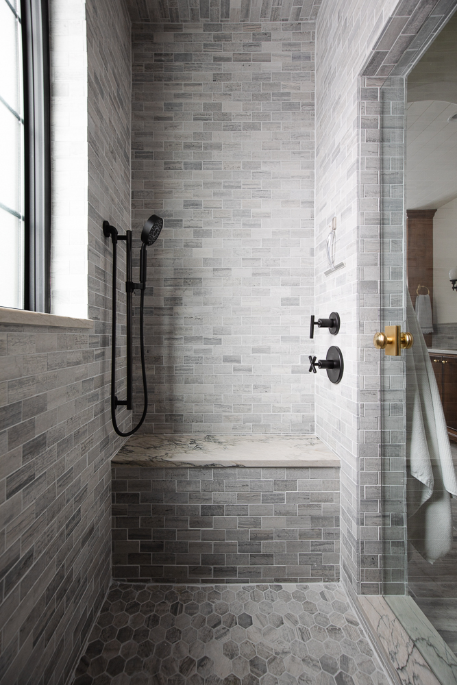
I looooooved that green tile from our last bathroom, but I gotta admit, our shower now feels so much more perfect and easy! Both showers had windows (special water rated privacy windows!) and both showers we used the Kohler Purist line of plumbing but in different finishes. I find the lighter, tonal honed limestone tile and the matte black fixtures both a lot easier to maintain than the dark SHINY tile and polished nickel fixtures. We said goodbye to the rain shower (I wanted to love it, but felt a bit water-logged with the water coming straight down on me in our last shower) and opted for a bench and a hand-held sprayer for shaving my legs! I do miss the dual wall mounted shower heads, but the body sprays make up for it.
The Vanity--Then:
And Now!
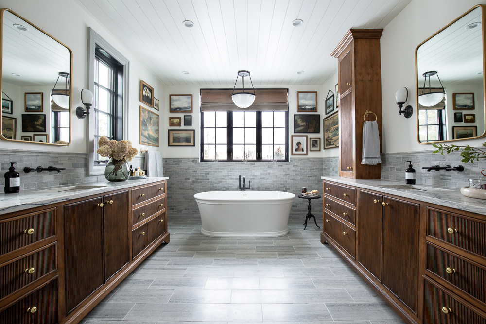
Okay hello. I obviously like what I like. The mirror shape, the sconces on the sides, the wall-mounted faucet, the under-mounted sink, and the exact same cabinet pulls. Can you hear me in the back?
Both vanities were custom and in our current bathroom, I obviously embraced warmth with wood tones instead of black but I still love our old vanity, too!
Major Additions and subtractions? Then:

We had this linen closet custom-made in our previous home and I kind of miss it. We don't necessarily need the extra storage in our current bathroom, because we have separate vanities here that we can store extra towels in, but I did love having a separate, designated space to keep all the linens, medicine, etc.
Now:
In our last bathroom, we gave up a bathtub completely in exchange for a bougie shower. Here, we get to enjoy the best of both worlds. I've never been a bath person, but this bath has converted me. It's substantial in size and I love being surrounded by art. It feels truly relaxing and I'm so grateful we had the space to make it such a prominent part of our bathroom.
A few other similarities: Both bathrooms had heated floors and we added windows in both spaces, too. So which is my favorite? My style is always refining, and progressing, and at one point our previous bathroom was a reflection of what I liked and who I was, and I'm extremely proud of that bathroom. We optimized storage and function, and it leaned mostly modern with a touch of traditional. NOW my personal taste, and the style of our home leans more on the traditional side, with a few modern touches. It's a more accurate representation of who I am today, and I wouldn't change that.
You can see the full reveal posts here and here!
Sources
Previous Home Bathroom
Wall Color– Sherwin Williams Cloud White in Satin
Trim color– Valspar Pure White in Semi-Gloss
Vanity, Linen cabinet, and Water closet cabinet–custom made through Fashion Cabinets in West Jordan, UT
Marble Floor Tile
Shower Tile, 3×9 and Chaine Homme in Loch Ness–Fireclay Tile
Countertop –Venato Quartz
Undermount Sinks
Purist Wall-Mounted faucets by Kohler in Polished Nickel
Walnut Mirrors
Sconces
Towel rings
Hand towels
Soap and Lotion set
White Pocket door
Wood pocket door
Prive sign
Flush Pull and Edge Pull Pocket door hardware
Smokey Floral Wallpaper
Flush-mount light
Unlacquered brass knobs
Toilet
Toilet paper holder
Kohler Purist Shower head
Kohler 12″ Rain Shower Head in polished nickel
Kohler Purist Cross Handle for Thermostatic Valve
Kohler Purist Lever Handle for Volume Control
Triple Towel hook
Simple Human Mirror
First Aid box
Current Modern Cottage Bathroom
Wall Color: Alabaster by Sherwin Williams
Trim Color: Lamp Room Gray by Farrow & Ball
Window: Pella Architect Series
Tile:
Wall Tile
Shower Floor
Wall Skirting
Floor Tile
Chair rail
Countertop: Honed Calacatta White
Water Closet:
Wallpaper
Mirror (vintage)
Sink
Console Legs
Faucet
Hand Soap
Toilet
Hand Towel
Shower:
Towel Hooks
Shower Knob
Showerhead
Hand Shower
Body Sprays
Volume Controls
Thermostatic Valves
Vanities:
Cabinet Knobs
Mirror
Sconces
Sink
Faucets
Hand Soap
Towel Ring
Hand Towel
Round Marble Tray (similar)
Clear Ribbed Vase
Smoke Glass Vase
Oval Tray
Bathtub
Bath Faucet
Side Table
Pendant Light
Roman Shades
Towel Bar
Bath Towels
Gallery Wall:
Peonies
Study of Clouds
Small Landscape
Rocky Shore
Old Apple Tree
The Moment is Now
Leave a Reply

WE'RE CHRIS + JULIA
Portfolio
Projects











What are your storage solutions for the water closet for- ya know- a couple of extra rolls of tp and ladytime supplies? I’m ready to minimize the stuff (art, candles, plant, lots of tp) in my water closet but need a plan for the essentials. Thank you!
I have them in my tall vanity storage!
One of the things that I so admire about how you design spaces is that you take the house style into consideration. In the end every space you design looks like it was always meant to be that way. It's just so timeless and beautiful, and it's what keeps me coming back to see what you're up to next!
What brand is the window, in the shower, in your new home? I currently have glass block in my bathroom, but would love a more "normal" looking window. You just mention is being, "special water rated privacy window". Thanks!
It's Pella!
I loved that first bathroom, but this one looks like it’s older more sophisticated big brother - love to see your style evolve.
The art gallery in your new bathroom for me, completely changed the look from a little cold to cozy, comfortable and added that collected vibe. I love everything you do, but the art in the bathroom is next level, in my opinion!
At times I thought they were completely different, but fun to see the similarities too. Who knew dark glossy tile would be so hard to maintain?!?
I love both of these bathrooms! It’s funny, I think my design style has also veered more traditional with modern thrown in, when it used to be flipped like you.
Thank you for this insight into your current and previous bathrooms! My takeaway is that both spaces reflected you at the time you designed & lived in them. I always loved that green tile, but wondered if it was hard to keep water spots off of it. Wallpaper in the powder room - love both of them! There’s so much good design in both. Thank you, as always, for sharing with us. This IS the show!
I love this post! Such a good way of comparing both and acknowledging change and growth. Both bathrooms are great, and you can tell they were designed by the same mind. I've had your past bathroom saved for years, and now your new one is my current favorite! The mix of the warm and cool tones, and THAT GALLERY WALL is spectacular!
I loved this post! There really are so many similarities-- I didn't notice them before!