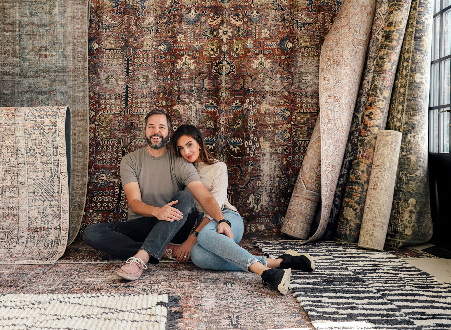
Back in 2019, we set our sights on a new site. Chris had been coding and managing ChrisLovesJulia.com for the first decade, and we had grown so much over the years that it started to feel a little clunky. We had somewhat of a Frankensite, with new parts and old parts and the constant striving for more functionality. We decided to hire professional web designers (for the first time ever), and I can't believe it took us so long. This is the cornerstone of our business! For 12 and a half years we have been showing up right here and regardless of what happens on social media, we always want everyone to know they can find us right here.
We found TONIC from snooping around on site credits of websites we loved. They've designed all of the very best ones. (TONIC has launched new templates today for Interiors Influencers, but they also have the most beautiful templates for every niche! Use code CLJ15 to get 15% off any site)
We quietly launched the new site earlier this year, and we've been working out the little kinks that come with a launch, but we finally feel like it's time to show you around our "new house."
We also mentor a group of content creators under the umbrella of Good Influence(r), and we preach the gospel of website-hosting every day. Everyone is their own brand. Everyone needs a website. We mainly talk about interiors around here, but today we wanted to speak to the back end of how we talk to you every day. (And if that's not your thing--come back tomorrow for a family room update!)
Jen Olmstead is TONIC's co-founder, and she's so witty and cool and fun. She gave us all of the confidence to give our website a facelift (and held our hands every step of the way). She's the No. 1 source of making-sense if you're thinking about investing in or revamping your website, and she eagerly and eloquently answered our questions on the matter:
In the days of social media, do websites even still matter?
Yes. And yes again, but louder. If you’re building your brand entirely on social media, you’re building it on borrowed land.
The only two things you truly own and — should — have control over on the internet? Your website and your email list.
Instagram, Facebook, even Pinterest… all of those platforms are run by algorithms designed to make them money…. not you.
And as we know well, those algorithms are changing every thirty-two seconds or so. Plus, as demonstrated when The Great Instagram Crash of ‘21 left us all confused and bereft… those platforms could literally disappear anytime.
If all of your eggs are in those baskets, the future of your business is going to be up to them. (They’ve got us all making Reels now… what’s NEXT?!)
The good news… your website? Is up to you. The content people read, the images they see, the decisions they can make, the things they can buy… that’s all in your capable hands. No dance moves required.
Think of it like this: Your social media presence is like a beautiful storefront. It’s an Anthropologie shop window. There are lots of pretty things to admire, it’s visually interesting, it’s a great place to begin and pique interest… but when people stand outside a beautiful storefront, what do they want to do next?
They want to go inside! They want to explore, browse, shop, meet the shop proprietor, try things on, learn more, fall more in love with what’s there for them.
When people discover your social media content (your storefront), they’re going to want to take the next step with you. They naturally WANT to hit that #linkinprofile and head inside. So, it’s incredibly important that you give them a next step — a “shop interior” — that makes sense… that feels aligned with what you’re sharing on social, and perhaps even more elevated.
Your website should be the inside of your shop…. a place to connect… a place to shop…. A beautiful, inspiring home online you truly, really own.
What’s one thing that everyone can do today that will make an impact on their website?
Ooh, here’s an easy one! If we’re still going with that shop metaphor (I LOVE a metaphor), think about this… what if you were in a beautiful shop, you were exploring, you found a lot of things you loved, and… there wasn’t a cash register or a changing room? There was no clear step for you to take next?
Your website’s just like that. When it comes to user experience, people LOVE to be told what to do; it makes them feel secure and it gives them purpose. So, make sure you’re adding what we refer to as “calls to action” throughout your site. When your viewers get to the bottom of your about page, maybe add a section that invites them to view your portfolio. When they finish a blog post, show them more recent posts they might be interested in. When they browse your portfolio, ask them if they’d like to read reviews.
You're guiding your visitors through your site. Ask them to look at things, invite them to buy things. Give them something to do, then something to do next. (Bonus: this is GREAT for your SEO since Google sees that people are spending more and more time on your site and goes, “Oh, this site must be really great; people seem to love it, let’s rank it higher!" )
How do you know when it’s time for a new website?
I think there are two primary indicators of when it’s time for a new website — one is how it feels and two is how it works.
Easy “feeling” test: When someone says, “Oh hey, what’s your website URL?” do you feel embarrassed to send people there? Do you often find yourself saying something like “Oh, yeah, but don’t go there. It’s not up to date,” or “Maybe visit my Instagram instead?” or “Ugh, actually, I don’t have one.?” If you’ve been personally victimized by website shame, you probably need a new website.
The second one is a little more practical — does your website 1) accurately reflect your brand at its very best and 2) serve as a fantastic marketing and sales tool to help you meet your business goals? If you can’t trust that when someone heads from social media to your site, they’re going to fall more in love with your brand, have a great experience, and be converted into a customer or a more devoted reader… you need a new website.
What’s your biggest website pet peeve / best piece of website advice?
Thanks so much for giving me a place to get this off my chest. Here it is: WHAT DO YOU EVEN DO, EXACTLY?
My biggest website pet peeve is when I get to a website and it’s really well designed (or not!), and it takes me like four minutes to figure out what kind of business it’s for. There’s usually some clever piece of copy like “Helping you discover the beauty inside...” and I’m like… Are you a plumber? An exfoliation company? A life coach. NO CLUE.
Please, for the love of my sanity / your business’ future, make sure you have a clear, simple, “brand statement” that makes it caveman-clear what you do and who you do it for, and put that front and center on your website.
If you need a formula, try this one: [We do this thing / make this product] for [these kinds of people] to help them [insert the benefit here].
When we worked together, you mentioned that in terms of aesthetic, our website should feel like our home… We loved that. Can you explain why?
Yeah, I mean, we’ve established that I love an extended metaphor at this point, right?
So many of our clients have come to us trying to define how their website should look… the kinds of fonts and colors and imagery it should have. They typically see another site they like and go, “Okay, something like THIS,” or they’ve spent hours on Pinterest searching “Modern website” and end up with a mishmash of colors of fonts and colors and textures from other websites that don’t feel like them... and hand it over in hopes that someone else can make it all make sense.
And I think it’s important to realize that a designer can’t give you a brand… they can only give your brand something to wear.
Just like a great interior designer doesn’t GIVE your home a style, they reveal it; good graphic design should do the same. When we set out to design your website, we didn’t want to give you a “new look.” We wanted this new site to feel like the website you should have always had… so steeped in your style that it spoke to who you really are… that it was made with history and depth and texture and family... it didn't just look beautiful; it felt like you.
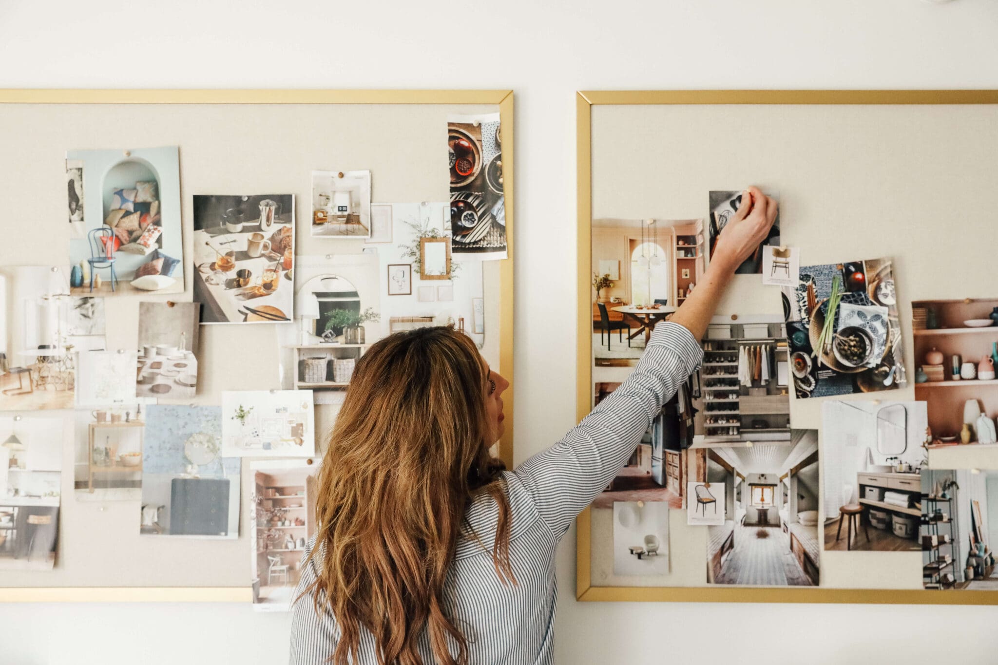
If you’re searching for inspiration for your new website design, my favorite place to look is where you live: in your closet, in your home, on your shelves, on your walls. What tones and textures have you always gravitated towards? For example, some of the hex codes of the new Chris Loves Julia site we pulled directly from images of your home… this moody dark green/blue is actually from your old kitchen! (And I drew that little home icon to match your arched living room windows... a little nod to all the readers who'd know.)
When you’re conceptualizing your website, it should feel like your online home. How do you want people to experience the space? Should it be fun, colorful, exciting, vibrant? Sophisticated, airy, open, natural, organic? Feminine, classic, Southern, traditional? Light and bright, with occasional impactful + moody moments? Try thinking of your site this way and let the inspiration flow!
What’s one piece of advice you would give to everyone that doesn’t have a website they love right now?
Honestly, in this day and age of the internet, there’s absolutely no reason you can’t have a website you love, and there’s no excuse not to.
No matter what industry you’re in, today’s consumer makes decisions for almost every aspect of their life based on branding and marketing. Faced with two options, we're typically going to go with the product with better branding. We expect our local bagel shop to have a decent website. We assume anyone in a creative space or in the influencer culture will have an excellent one.
Thankfully, we also have more access than ever to good design — with the advent of really fantastic website templates (COUGH COUGH), you don’t need to know code, be a designer, or have a bajillion dollars to invest in a beautiful, strategic website.
So, if you've been putting off that website design or overhaul because ain't nobody got time for that, you're overwhelmed with where to start, or you aren't sure the end result's going to be worth it... here's my advice as your self-appointed new designer wingman: a website you feel confident in, that accurately reflects who you are at your best and helps you be known for what you do best... one that you actually love? That kind of website can change the game for you. I've seen it over and over again. So don't settle for any less.
TONIC has launched new templates today for Interiors Influencers, but they also have the most beautiful templates for every niche! Use code CLJ15 to get 15% off any site
.
Leave a Reply
WE'RE CHRIS + JULIA
Portfolio
Projects








Just make sure that you keep the basic paths of the old websites intact. You don't want to lose all of your incoming links.
Web developer here, and I just wanted to say great post and good tips! I would also add if you are running your own website to make sure you enforce https (talk to your host), create very secure passwords for any admin logins (like a WordPress login), apply updates, be cautious of installing third-party plugins, and make sure the site is mobile friendly.
Yes, having a good website is crucial! In my 9-5 job I'm a user experience designer so I spend a lot of time designing websites that provide a good experience to our users. You guys have one of the best blogs out there!
Thank you so much, Lauren!!
Best compliment
All this time I've wondered why there wasn't a Chris Cooks section on the site. This article encouraged me to explore a bit and Voila! I found it in the Lifestyle section...of course!
I'm a blog reader and don't do social media much these days, so thanks for making your blog a welcoming home for us. (Now to just remove all those distracting ads, haha, I understand why they are necessary too....)
I rely on this site so much! I feel like I'm here almost daily to read something new, go back to something old, and I share it all the time when people post a question in a home-related FB group. The new version is refreshing and user friendly--great work!
This is why I love CLJ!!!
I got rid of Instagram a few years ago because it was such a time suck for me. I found that quite a few blogs I followed had the storefront analogy backwards, so I felt like I was missing out on crucial content by only being able to see their website. CLJ continued to deliver! Thank you!!
I love your new website! The photography is beautiful, and this font is easier to read.
I am in the process of doing this and this post has given me my excitement and motivation back.