This post is sponsored by Blinds.com
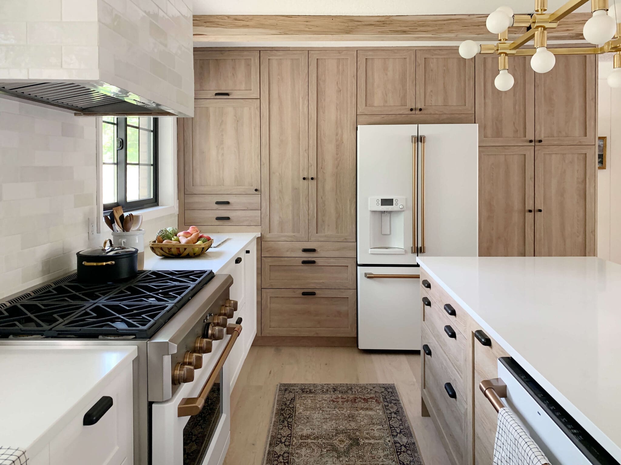
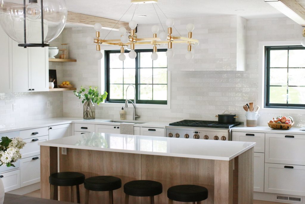
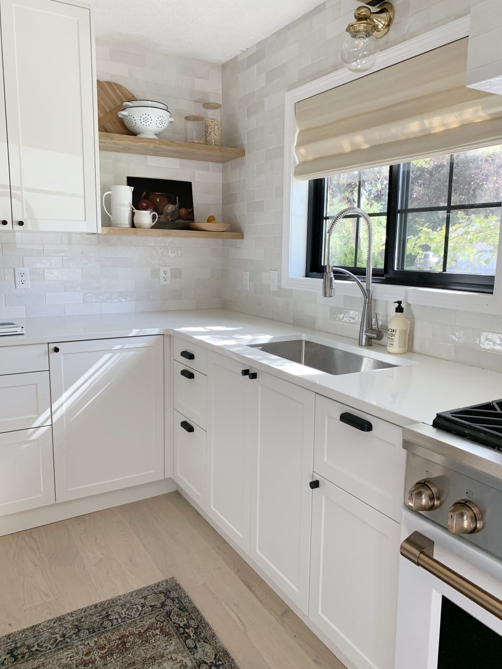
When we finished the Fullmer kitchen a few weeks ago, there was actually one element that we were still waiting on and a few of you guessed it--window treatments! After the new windows went it, it was hard to think about covering them. But the truth is, good window treatments don't cover windows, they compliment them. That is what ultimately lead us to the beautiful, Deluxe Woven Wood Shades from Blinds.com.
We ordered a bunch of samples from Blinds.com (you get the first 10 free!) and quickly narrowed down our nine favorites. NINE!
San Lucas Flaxseed
Covington Silver
Mandalay Liana
Capri-Natural
Milos-Cotton
Kula Coconut
San Lucas Lichen
Linen Stripe Blue White
Hampton Barley 001
When we shared a few of our favorites on Instagram, there was a big push from the majority of our followers over there to use the Linen Stripe option and I get it--it's gorgeous!! The Linen Stripe Vanilla-Stone on top of the pile to the right is equally so. But when it came down to it, we were looking for a supporting character. We were looking for a shade that would block the glaring sun sets at night, add some subtle texture and warmth to the room, be beautiful and complimentary when closed. When we held the samples next to the other wood tones and finishes in the room, the Capri-Natural Deluxe Woven Wood Shade was the winner! We did the cordless option (the only way to go with little ones!) with a light-filtering backing.
It arrived and the installation was a breeze. It took Chris all of 10 minutes to get both hung.
Isn't that texture dreamy?? The shades are so easy to pull down and push up and they actually ADD so much to the space.
It's a warm, textural, quiet softness the windows desperately needed. They connect the other wood tones and really soften the windows. Don't be surprised if we use these same shades all over our new home now!

We carried the same shades into their living room to cover their HUGE window they had there. Because the window was so large, we had to use two shades together, but it works well and the Fullmer's love the ease of blocking out the afternoon rays now.
Blinds.com is having a big summer sale, up to 40% off site wide through August 4th so now is the perfect update your window treatments. (I'm gotta use that pinstripe one SOMEWHERE!)
Ps! You can see the rest of the kitchen sources right here. And the budget breakdown right here. And the look for less here.
Leave a Reply

WE'RE CHRIS + JULIA
Portfolio
Projects











Hey Chris and Julia! I am ordering this exact color for a bedroom and was wondering what option you choose for the twill edging? Thank you!
Will you be posting about the Fullmer's living room and the sources there??
Thank you. I believe there’s a lot of help here in a post about choosing and sourcing blinds. Surely that’s something that a lot of people are doing at any time, and many for the first time. We are all at different stages of our home journeys.
Also I am greatly enjoying your instagram stories about the phase 1 updates you two are doing to make your new home comfortable for you, as you and your contractors start to tackle the major issues.
We feel really good about the content we're putting out right now. The one day we didn't have a post here, we did a play by play demoing our kitchen on Instagram for a budget friendly phase 1 renovation. We are working hard to diversify our content and are so happy you're along for the ride.
Does the shade in the Fullmer kitchen have a valance or did you select the flat waterfall option? Ordering for our kitchen and love the look you chose for this kitchen.
Man, these comments kind of bum me out. Has your voice changed? Maybe. Has your content changed? Yes. But who are we if we aren’t growing up and moving forward. I kind of feel like I get to grow up along with you guys- and it’s my favorite.
I hope you keep doing what you are doing. I love following along.
Okay, the ENTIRE Fullmer home has turned into my dream come true. Do they just hang in the kitchen and family room and stare it all day and soak in the awesomeness? Because they totally should.
Dear CLJ
I really really like to read your blog. But I think the Fulmer Kitchen is getting boring to the extreme. We did see every nook and cranny ten times. I would like to see more from your new house.
Greetings
Sarah
What color light filtering backing did you go with ?
It's white.
Agreed. I've been thinking the same thing for a while now. I've been following since the Utah house and am still excited to see the new changes with the current house, but I'm really only interested in maybe a quarter of the posts anymore. I don't mean this to be a disparaging comment, but I think it's important for you guys to know that your readers are definitely noticing a different feel. I'd rather see a once a week really good post than every day meh posts.
What kind of posts would you like to see more of???
I’m not so sure that your tone has changed as much as you’ve started to use more contractors and design choices that feel a little less attainable for average DIYers. Don’t get me wrong. I’m totally here for big awesome structural changes like you’re doing right now and previously at your cabin and in your master bath. I totally appreciate your transparency about budget in those posts and how it made sense for you to get a contractor for those projects. I love when you show a budget alternative to a more expensive source you used. I’d love more small transformation posts- like what you’re doing in your kitchen, the Pugmire’s Master bedroom, the Fullmer’s front door. I always love your blog, but those posts get me inspired and talking to my husband about doing something similar at our house. (Also I totally follow along on Instagram and your stories are honestly my favorite of all the bloggers I follow.)
Still love seeing the posts about the things you change around your home. I enjoy seeing the posts about your thought process (like the one where you shared different exterior ideas for your new home). Seeing the new table and chairs you just bought was also fun. Some of the sponsored posts are feeling a little more like an ad and less personal and fun. We come here not only to see the great pictures, but also to hear your unique voice. When there are too many affiliate links and sale ads, your voice starts to get lost. You guys are great and we love seeing your unique style.
After your kitchen gets put back together (and I'm loving following that on Instagram!) I'd love to see more "Chris Cooks" videos. My favorite posts are small projects with big impacts like the Fullmer front door remake. Of course I love the multi week projects like the 6 week challenges; the room you did for your two daughters is when I started following your blog. Will you pick a room and be a part of that again? Perhaps for one of your older daughters? And I'm all onboard with the work you're doing on your new home. Will that dining room EVER get demolished?
It looks so great! Still absolutely loving the texture in that backsplash tile.
Shades look great! Is the shade style similar to a roman blind or is it the same thing? Shades also look great in the Fullmer's living room. I think you mentioned they updated their living room decor as well as part of the remodel? The furniture that's behind the sofa, is that a functional piece with storage or just used to place items on the top? It looks great and am wondering in what situation would you place furniture like that behind the sofa when it's against a wall?
It's a working credenza they had previously! I think it's from Wayfair.
Hold up, I love their living room tooooooo! Do you have sources or similar links? Is that the same paint color as the kitchen? It looks so different on that side of the room!
Your blog has always been one of my first reads of the day. The last six months or so, the tone has changed, and it is just different. Out of the last ten posts 6 are sponsored, and a couple others are filled heavily with affiliate links. It just doesn’t feel like the same place anymore. I understand that this comes with more success, and kudos to you for that, but I miss the simplicity, and the genuine fun that used to exist here.
I hope you are following along on Instagram! We are doing a lot of fun DIY in real time. The blog is still our baby and we only have one sponsored post a week here but we share a lot more content everywhere else too!
We all love to support the brands that support you to do what you. Love your blog!
Agreed. It’s a lot of sponsorships and “suggestions” that bring you money. Click click click for affiliate links. Even on Instagram. ????????♀️ To each his own, but if I wanted to see so many “commercials”, I would start paying for cable again!
The meat of your posts/Instagram stories is great - which is why I am still here. The constant revenue streams are off-putting though.
Hi Julia I have loved following your progress on you home question where did you get the bed your using now
does it have drawers Im trying to find a platform bed on legs with drawers any suggestion would be appreciated also I Love Loved your dining table and have been looking for a while so I ordered one as well thanks for the inspiration
I have shades similar to this in my kitchen. I’ve been debating about what do about shades for my sliding glass door that is kitchen adjacent. The shade we used for the kitchen can’t be made into the right width for the sliding door. Normally, I’d probably leave the door without any window treatment, but we get a lot of glaring light from the door that comes it at dinner time. Any suggestions on what might look best?
Hi and thanks for sharing! I'm looking for new shades for over my kitchen sink. How do you think these will tolerate occasional wetness?
Hmm, good question! I'm not sure, but the customer service at Blinds.com was really so helpful when we were making this order. And a lot more knowledgeable than me!