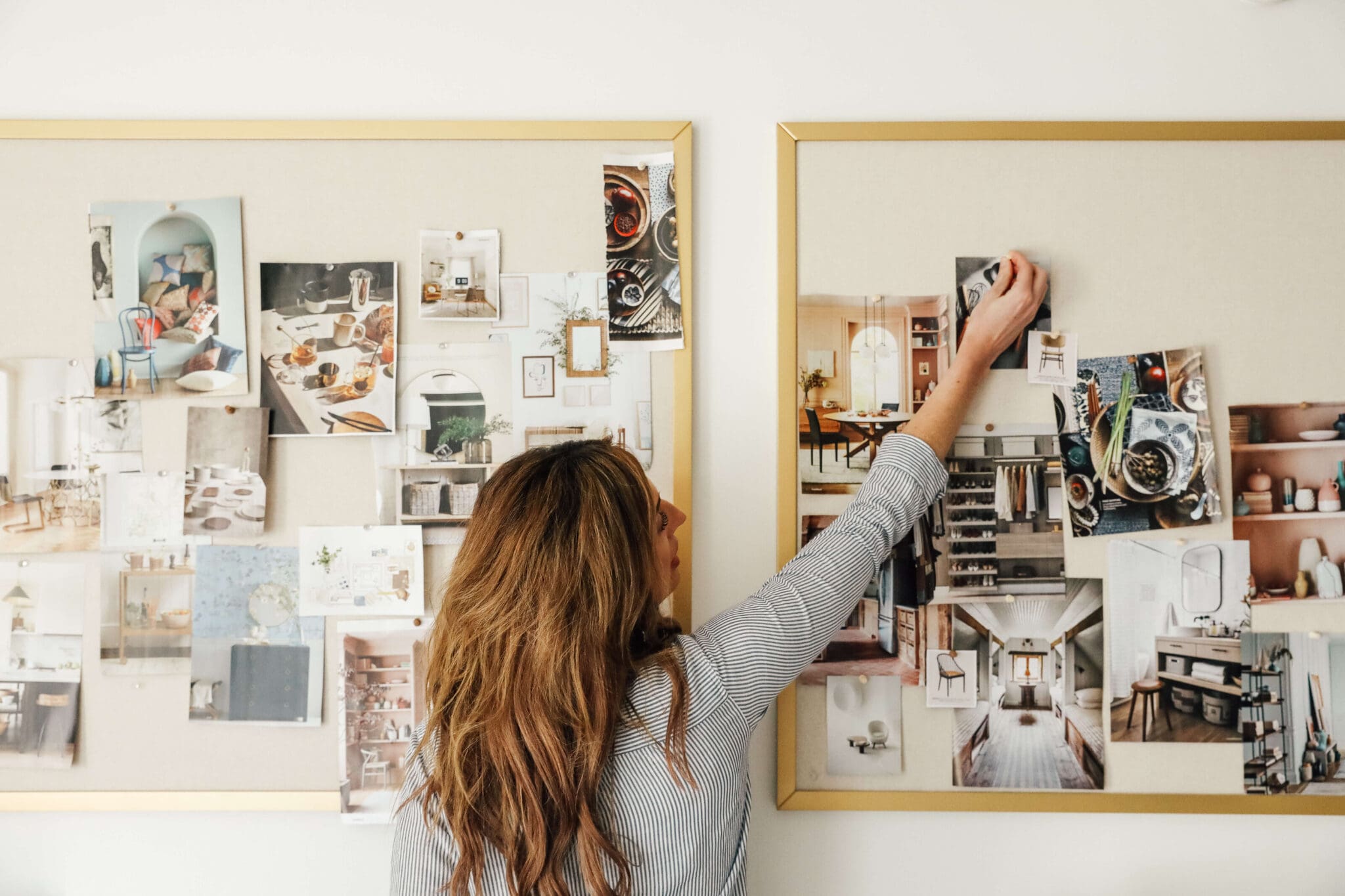
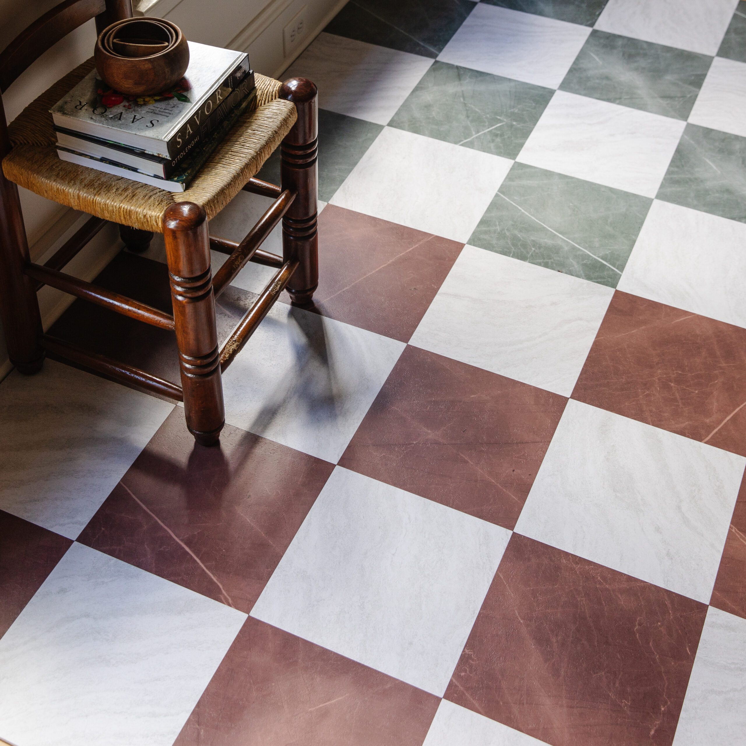
For months, I've been trying to select all the finishes for the Mudroom so we can move forward with this project, but I couldn't get it to click. I thought I had a breakthrough when I decided on a red and cream checkered flooring (still love that concept), but unfortunately, I couldn't get the rest of the room elements to fall into place. Let this be a lesson that when something isn't clicking, take it as a sign to go back to the drawing board. Ugh, I know. But you need momentum to design a room, and if you can't get the pieces moving, then you're better off selecting different pieces.
And so I did. I scrapped the red and cream checkered flooring, revisited my inspiration, and went with my original gut-feeling choice, and the rest of the room came together. Now, I present to you the mudroom mood board!
As a reminder, here's what the mudroom looks like today, along with the renovation plans, which my heart is still set on.

Pendant Light | Paint Color | Mirror | Cabinet Pull | Cabinet Knob | Pot Filler | Upholstery Fabric | Mirrored Tile | Mosaic Tile (black) | Mosaic Tile (white) | Dog Bowl | Hook
Flooring
The plan is to extend the new mudroom flooring into the back hallway and replace it with tile to withstand heavy foot traffic. I think this is partially what has made this decision more complex because it's not just going into a tucked-away mudroom but would be seen even from the kitchen. Between the black and white mosaic tile in the powder bath and upstairs bathroom, plus the black and white checkered laundry room tile, I wanted to choose something that complements the black and white theme but isn't an exact repeat. Enter in this white octagonal with black dots pattern. When I initially started pinning inspiration for the mudroom, my heart skipped a beat. Out of wanting to take more of a risk, I got sidetracked by the red and cream theme, but I'm going back to what my gut wanted all along.
Cabinetry + Trim
Once I decided on the flooring, suddenly, my initial vision for burgundy trim and cabinetry fell into place. I was so inspired by this cabinetry designed by Jenna Chused. I'm still nailing down the exact swatch but I definitely want something close to this (for the mood board I pulled "Self-Portrait" by Backdrop) - a definite contender. While I love the glossy look, after seeing the glossy paint debacle in the study, my cabinetry guy talked me into a more forgiving finish. Good call. The trim will continue into the back hallway. As for the hardware, I'm loving these brass cabinet knobs and pulls.
Dog Feeding Station
Since the mudroom will double as a space for Cricket, we designed a slightly raised, built-in dog feeding station with a pot filler, drain, and I'm loving these brass feeding bowls. To switch things up, we'll use this black octagonal with white dots tile on the ground part where the drain is, with this mirror tile as the backsplash. This is a callback to the mirrored backsplash in our hidden appliance garage.
Finishing Touches
Built into the cabinetry, we'll have a little bench area for sitting down and tying shoes, and I'm loving this ticking stripe upholstery. Above the bench, we'll hang a pretty vintage mirror, and on the wall to the right, we'll have a wall of these polished nickel double hooks. Lastly, we'll finish off the room by hanging this stunning industrial pendant.
We're still waiting on the final stamp of approval from the HOA for the door, but we're ready to get this party started inside ASAP! We also just got the green light to swap the current door for a pocket door (you know we love to do that), so that will also help a lot with the flow of this hallway/mudroom.
Leave a Reply

WE'RE CHRIS + JULIA
Portfolio
Projects







That will be a LOT of grout lines for a high traffic area... unless the photo just makes the scale look very small. The colors are so beautiful together though!