Pantone announced their color of the year for 2015 and a whole bunch of house-fanatics lost it. “I would never use this color in my home.” “The 90s want their color back.” You get the idea. It is a departure from the bright hues that have been thrown at us the past few years. Purple! Bright red! Teal! It’s a mute-y brown-red. And I breathed a sigh of relief. Or my eyes did, at least.
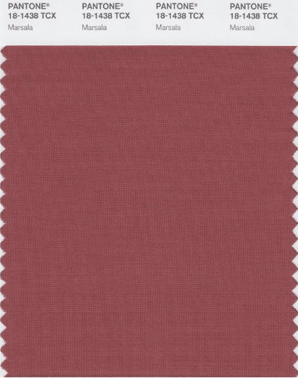
Finally something I can connect with. Muted tones are my jam, 100%. And since there aren’t too many people standing up for Marsala right now, here’s hoping a few examples of the rich and earthy hue actually used in these fantastic interiors will change your mind.
This is not your 90s burgundy. How fresh do these curtains look? Here’s a great example of mixing it with bright colors that so many connect with.
Persian rugs are having a huge moment right now, which fit the Marsala trend perfectly.
Marsala toned grasscloth made an appearance in Jackie Astier’s bedroom in Elle Decor.
I like it in small doses, too. Like these wine-colored chairs:
Or a few accessories on your shelves:
Even a simple throw in the color adds a beautiful amount of warmth.
Agh, I am just so thrilled neutral tones are trending. With so many mixed reviews, I’d love to know what you think! Yay or nay for Marsala?
Ps. More examples on my Pinterest board!


Wow, that worked out perfectly! Thanks for offering the counterpoint on Marsala:-)
Haha, happy to!
I’ve seen this color featured on other bogs…not so favorably. Glad you gave it some credit! I am an earth tone girl – and as much as I’ve tried to jump on the lighter and brighter hues, it just never feels right in my home. I wish there was a bigger space for the cozy calm designers among us…it feels like it’s either bright/trendy or minimalist/rustic. Not my jam!
I hear you! People often expect a “pop of color” in every room.
I love it & I’m glad I’m no longer alone! Marsala is a gorgeous color.
Earth tones for the win!! I’m in the happy camp for marsala. I’m not usually a fan of reds, as Emily said, but I can definitely get on board with this tone. Reminds me fondly of the earthy yellow of mimosa from 2009!
I’m a fan. I like it a lot better than “radiant orchid” or whatever that was this year.