I’m so excited to share with you the mood board for the winner of our 300K giveaway we hosted a few weeks ago. We had so many wonderful and deserving entries--we wish everyone could have won! In the end, a sweet nurse and school teacher's bedroom won. They had done some work on it already but other areas of the house were slowly taking away furnishings from their bedroom leaving it a pretty blank slate. You can click through the photos:
View this post on Instagram
We've spent the last week face-timing them and learned they are really looking for a calm retreat. I learned their pain points (those flat wood doors and lack of lamps and color) and came up with a vision for their bedroom. Our sponsors were so generous and I worked within the those parameters so everything they say on the mood board they could "buy" with the gift cards provided. Here's how it all breaks down!
1. I love the Harper King bed from Interior Define and it's one that we even considered for our own room. It's fully customizable but for this bedroom, we chose the extra tall headboard, in Mod Velvet Elephant. It’s a gray that leans just a little blue—so pretty. You can customize the legs too and I love these black ones with brass caps that coordinate with the nightstand.
2. For the floor we love this tonal rug from Loloi. It has beautiful neutrals with some soft blue in it that we’re going to carry elsewhere in the room. The room is a 10x14, so I'd recommend an 8x10 so it doesn't swallow the room completely.
3. I love this peel and stick Charcoal and Putty Botany wallpaper from Chasing Paper for behind the bed. It’s neutral and organic while still adding a little something to that feature wall.
4. These aged brass and white wall mounted lights from Rejuvenation are beautiful and have been a long-time favorite. I love mounted lamps above nightstands for homes with lots of young children because it's so kid-friendly, but also frees up so much room on the surface for photos, a catch-all, a vase of greens and/or a good book.
5. A good nightstand will change your life! This one from McGee and Co still has hidden storage, but good surface area on top to balance out the king sized bed, while still keeping everything airy so it doesn’t crowd your bedroom.
6. The trickiest thing about this room were the asymmetrical windows. For both windows, I would use these soft white roman shades (Odyssey Whisper White from Blinds.com)—in blackout and cordless! With painted trim (we'll get to that in a minute) and these blackout roman shades, I think I would skip curtains! It only draws attention the the fact that the windows aren’t symmetrical. And this will clean it up while adding function and design.
7. The Arched Mantel framed mirror from Rejuvenation adds high style in between the two doors on the right side of the room and will bounce light from the window.
8 & 9. The wood doors in their bedroom were their biggest pain point and this is a perfect project for the Lowe's gift card they won! Those plain doors just need some trim and paint! It will change everything. Yellow Brick Home had this amazing tutorial about adding trim to flat doors. The fresh white walls are great, but I’d love to see the baseboards, doors, and all the trim painted Repose Gray in the HGTV HOME by Sherwin-Williams Infinity Satin Paint
at Lowe’s will give you incredible coverage and you won’t need much to get the job done. It will make a huge impact!
at Lowe’s will give you incredible coverage and you won’t need much to get the job done. It will make a huge impact!
10 & 11. A pretty vase and faux stems from McGee & Co to keep your bedroom looking fresh all year.
12. I love white bedding, but an easy way to update it is by simply adding a pair of patterned pillow cases. These linen striped ones from McGee & Co will elevate the entire bed and add just enough pattern to your bed while still allowing the rest of the room to sing.
13. Lastly, I loaded the room up with art from Artfully Walls. Pink Horizon by Faith Taylor in the largest size, (no mat) above the bed sets the tone for the whole room.
14, 15, 16. And then I selected three other pieces untitled BY VERED GERSZTENKORN, Clouds BY PHILINE VAN DER VEGTE, and MAGIQUE LOVE BIRDS BY MILOU NEELEN for a small gallery wall to the left of the bed.
Unfortunately for us, the giveaway did not include us traveling to New Jersey to help make the vision a reality but we hope they'll share pictures along the way! And we hope you could take some notes from how we solved common problems in a bedroom, too!
What do you think?
Leave a Reply
Previous Post
all the latest

WE'RE CHRIS + JULIA
We believe we should all love where we live.
We’re a couple of homebodies, working to uncover the home our home wants to be. And we’re so happy to have you here.
read morePopular Posts
Top Categories
01
Portfolio
Befores, afters, mood boards, plans, failures, wins. We’ve done a lot of projects, and they’re all here.
browse all
02
Projects
We have a long-standing relationship with DIY, and love rolling our sleeves up and making it happen.
browse all
03
Design
Even when you don’t want to rip down a wall, you can make that space in your home better. Right now.
browse all










I LOVE your blog/Instagram/Love Letter - thank you for putting yourselves out in the universe!
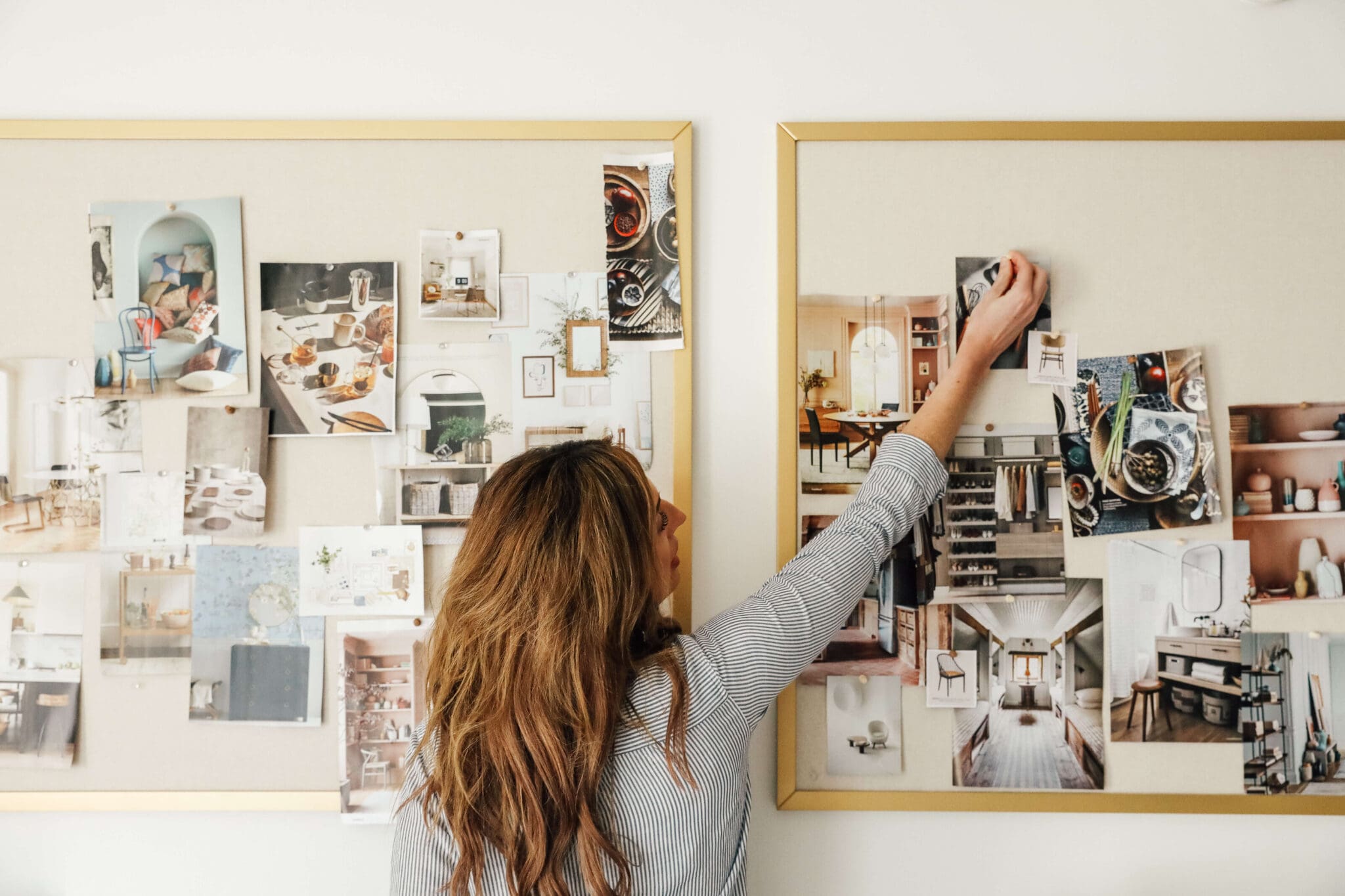
My question: what software do you use for your mood boards? I'm hoping it's a nimble, simple, affordable option, but maybe it's straight up Photoshop. Any advice you offer is greatly appreciated!
I personally use photoshop and illustrator but we're actually coming out with a post that will go over LOTS of options!
Great suggestions! I’m surprised to see they find those wood doors to be a pain point. I think they’re pretty! We recently moved into a mid century home and, funny enough, we added closet doors like this to go with our MCM aesthetic. (My husband bought and stained birch wood and added simple trim to the top to make them look like the doors he remembered from his grandma’s house!) :)
I’m sure their finished room will be beautiful!
You did an awesome job! It's going to be absolutely beautiful! I really love that you took the time to stay within the parameters of the sponsors so the winners didn't have to purchase anything that wasn't included in the giveaway. That must have taken a ton of extra time. I'm very impressed!
What a beautiful design! Hopefully they will share the finished product!
Beautiful room. I'm always inspired by your vision Julia.
Absolutely stunning!! I'm sure the winners are thrilled with your design.
What software/app do you use for mood boards?
I would love a post with pictures of the finished room. Maybe a fellow blogger/ reader in New Jersey could collaborate with taking pictures of it. It would also motivate the winners with a deadline to get their room done for the pictures
I don't want them to feel any additional pressure! As fun as that would be (and I hope we do see some progress photos!), being a winner didn't include anything additional!
I second the comment below that some people are just too dang critical. The winners' room was pretty bare bones to start with and just because something gets replaced doesn't mean it gets thrown in the trash. They won a room makeover and that's just what you gave them. The design you came up with is absolutely gorgeous and I will definitely be drawing inspiration from it for my own master bedroom renovation. Keep up the good (and inspiring!) work!
Gorgeous!!! I would love this room!
Can you share what program you use to make tour mood boards? Thanks so much!!
I use Photoshop and Illustrator but I'm working on a post that shares a lot of options!
Beautiful, restful design. The one thing I would wonder about is adding trim to sliding doors. Would there be enough clearance for that?
If I’m not mistaken I think she is referring to adding trim to the doors themselves to make them more decorative and not just flat.
Yes! It can be slim trim too!
I knew what she was referring to. It's just that sliding doors like that generally don't have a lot of clearance. But, like Julia says, if the trim is slim enough it should work.
So pretty! I love the bed and wallpaper. I can't wait to see it when it is done!
Love your blog! I don’t know if y’all realize how light the print is and very hard to read.
Just thought you would like to know from a loyal reader.
I don't understand why your first thought in every room is to start over and replace EVERYTHING. That's not budget friendly and bad for consumption. Normal people with moderate incomes (and no sponsors) would not do that. Their current rug is gorgeous. And their bed frame is very nice; it just needs a headboard. And the curtains are your standard plain white; why get rid of them? They mainly just need to add pictures and art and get a match to the nightstand on the right and the lamp on the left . Funny enough, the only thing I would get rid of completely is the closet doors. I figure as old as they look to be, they don't function well. But if perhaps they do function, adding trim is a brilliant idea.
It's true, normal people don't have sponsors. These are normal people that won access to all of these sponsors and wanted their bedroom re-done. That included a design by me. In the end they are free to use the gift cards to our generous sponsors as they wish! Also, the rug is now in their daughters room.
I don't understand why anyone's first thought is to criticize EVERYTHING. Do you really think the winners of this *design* contest would be thrilled to be told their prize is to mostly keep everything they already have? Sorry, doesn't make any sense to me....
Couldn't agree more,, Linda!