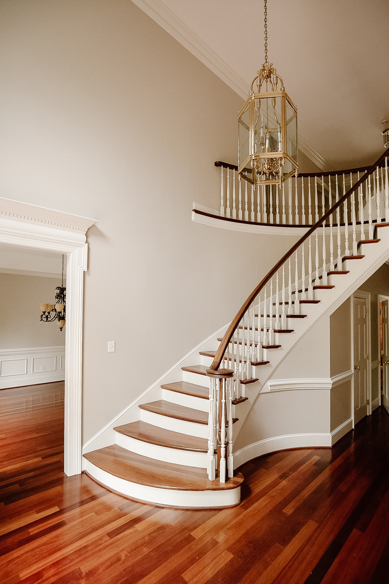
This is not a reveal post. We did that yesterday. But I couldn't wait another day to update you on the staircase and herringbone floor progress. Remember when it looked like this??
Before
I redesigned this entire staircase and entry before we moved and shared all about that process here. And it looked like this when we moved in:
Progress
And today it looks like this:
Today
We've come so far and I'm so incredibly happy with how it's coming together. Just last week we shared a list of 7 renovation projects we're finishing before the end of the year and at the top of that list? Finish the front entry. Is today the day? Nearly. Of course you can see there's plenty of touching up and painting, and trim work that needs to be done, but I'm calling this a win today. We do have a few tweaks.
One minor error
There's one minor error we're having fixed with the stairs. It's a classic case of which comes first, chicken or egg? The herringbone floors couldn't be installed until the front step was in. They needed to know where to start and stop the floors. especially since there was a curved border around the bottom step. The stair guy needed to know where the floors would be in order to make the bottom step flush to the floor though... I realized once the floors were getting finished that ohmygosh they're planning on putting shoe molding trim to fill in that gap.
This is not what I had envisioned at all. I really wanted the bottom riser to be flush with the floor. Clean lines please.
In our original designs, we sent along inspiration photos you can check out in this post here. I didn't include anything with shoe moulding at the bottom, however I didn't specifically say I don't want trim at the bottom.
It's kind of a tricky thing because there were so many different contractors working on their different projects and it comes down to a little communication error. No problem, and our contractor came up with a simple solution. Simply add a wood veneer on the face of the front tread to jut it out and down. So that's why the bottom riser isn't sealed right now.
The other little fix we're making is switching out the wood plugs at the bottom of the newel post. They're necessary in keeping it reinforced, but I'd like them to match the wood tone more.
It's honestly a mix of emotions. Just a few days ago the staircase and herringbone floor was covered in wood filler and I could hardly picture what the end result would be. To see it all finished and especially comparing it with the herringbone inspo photos I shared in this post, I'm over the moon.
The gap and the plugs were honestly the only disappointment. Can't wait to update you on those with time!
The other big change still to come?
I'm 99.5% sure we're painting the balusters black. Tricorn black to be specific. I thought white would do it for me, but I firmly believe every space needs a touch of black and this would be the perfect place for that. I also keep thinking back to the stair railings in our last house. We swapped out the balusters and painted them and the railings black. I'm not over it. Note: We're keeping the wood railing to match the stairs and floor to be clear, but don't you agree we should paint the balusters black??
Mockup of the black balusters
Still to be done:
- walls will be white
- stringers will be white (refer to this post to reference all the stair parts)
- Gonna add a lot of trim here too.
Here's another photo for your viewing pleasure. Walking down these stairs feels like such an experience. Now imagine all those balusters painted black (insert heart eyes emoji). Tell me what you think of the staircase and herringbone combo in the comments!!
Leave a Reply

WE'RE CHRIS + JULIA
Portfolio
Projects













The herringbone floors look amazing. What were the length and width of the boards that you used for the herringbone floor? Did you use the same width planks throughout the rest of the home?
The planks are 25x5 for the herringbone, and the rest of the floors are varied sizes.
So funny! I always pick black! I love black!! I have black accents everywhere in my house but for some reason.. here I say white. Honestly I don’t think you could go wrong either way but I do like the bright airy-ness of the white.
Team white for the balusters, but I like one reader's suggestion to finish the walls etc before going black since painting over the black would not be fun. Maybe even finish the kitchen and music room unless you're pretty set on a version of white walls there too. I would go with a black front door for a touch of black in the entry. But only commenting since you asked....you do you, and you'll love it!
I've just completed gutting/renovating my city home of 30 years (I also added a 3rd story). My new floors are 5" white oak (with a finish that maintains the original color), and the stairway choices are the same as yours. Black ballusters were a must from the start!
*Balusters*
Yes would look amazing black as well as the front door!
I'm in the process of updating my staircase and absolutely love all of your choices. Would you mind sharing where you purchased the tapered balusters? I can only find the thin version online. Thank you!
black...yes! absolutely no question. What fabulous looking floors and stair treads. Seriously.
For sure, Black! love the contrast with the white walls. Lots of moulding will also look amazing!!!
Everything you do is beyond beautiful! I would never second guess your decisions! Haha! I love it when you do what you want and people say, “Oh yeah, that’s cool!” We all run out and copy your look a.s.a.p.!
I love them in white! It looks so clean and fresh, makes me appreciate the design a lot more!
Love the herringbone floors! What a beautiful entryway.
Floors are gorgeous! Surprised myself after looking at photo’s of black vs white…totally vote WHITE, so bright and airy as the first impression walking into your home! Also, for those ‘life event’ walking down the staircase dream photos!
I would leave them white!!
I simply cannot un-see the staircase in Jumanji! I am 100% for white balusters. It looks SO elegant.
https://www.pinterest.ca/pin/344314333992166169/
Yes to the black balusters!!
I also love black accents and have been using a lot of them in my new home. However, I'm really liking the white balusters here. I also like the idea of the floors being the focus. In my head, the balusters would be tricky to paint/repaint (but maybe not for professionals like y'all!) so maybe live with them for a little while, decorate the space some more, and see how you feel down the line. LOVE the idea of a black light fixture. If the space still feels like it needs a little something else, maybe you can circle back around to this idea.
I think the black distracts from the gorgeous herringbone pattern on the floor and wood of the staircase. It also draws the eye away from the white trim of the doorways. I think the balusters are just too plain to be the star of the show in the entry.
Beautiful but I 100 would go with white, I think it fits the style of the house much more.
Definitely black!! They will look beyond stunning Julia 💗
The staircase looks BEAUTIFUL! I really like the wood with white. It looks so much more brighter. The floors are exactly what I want...LOVE!
Stunning!!! And, absolutely paint the balusters black!
Is the contractor at all concerned that running the riser straight to the floor (as opposed to having a small gap and shoe moulding) will greater issues when the wood expands and contracts with the southern humidity? Any woodwork in this part of the country needs a little breathing room or problems arise as the summer humidity comes and goes. (I wanted to avoid quarter round in my home as well, but 7 years on I’ve seen how much my floors, stairs and trim change over the course of the year and I understand why my very experienced contractor insisted on it.)
Our stairs prior to these didn’t have a gap. I don’t recall ever seeing a grand staircase with trim at the bottom.
I like the black balusters love the wood floors. I think I might prefer a black chandelier. There is a lot of visual motion in that space and a black chandelier would connect the height of the ceiling to the staircase. IMHO
Absolutely stunning! Black is definitely going to give everything the modern pop 🖤
Could you do a preview of what the balusters would look like if you stained them the same stain as the floors and railing? Obsessed with the herringbone wood floors and stain you chose, so beautiful!
So beautiful!! Yes to BLACK!!!😍
I’ve been eagerly awaiting seeing the stairs completion as I knew it would be beautiful…then was strangely underwhelmed when I saw the first images on this post. I didn’t know what was throwing me…it wasn’t that I didn’t like it, I just felt something was off…until I saw the black!!! The BLACK!!!! It’s perfect, it’s elevated, it’s neutral but with punch. Understated elegance, casually cool and seriously sophisticated all at the same time. My philosophy is the same as yours - every space needs a bit of black. Love.
I agree with Tahlia. The black gives this area some contrast that it needs.
Black
More trendy
White more timeless
I like the traditional white spindles with the floor and Newell post natural or sealed. Presents a fresh look and there’s plenty of ways to incorporate black touches.
Stunning! You nailed it!
Looooove the black. So beautiful, everything!
I loved the black balusters in your Idaho home but I’m team white here.
Such elegant long lines and I really admire your restraint laying the canvas for colonial finish work. Fwiw my eyes stopped on the squared off base for that beautiful newel post - just feels like to be cohesive and keep the sinuous feel going, it should be turned like the body.
THANK YOU for sharing your talent and bringing us all along on your journey, beautiful spaces are such a gift in a chaotic world.
I agree 100% about the bottom of the newel post. The square base is throwing off the whole thing. Even if the contractor just knocked the edges down it would help.
I disagree but you're welcome to think that
I think the white is fine. But it doesn’t really feel clj to me. Y’all always have that perfect moody pop and the white somehow just doesn’t seem as much like you. Of course whatever you decide will be great though
Gorgeous 😍😍😍. It’s coming together beautifully and I think the black will be perfect 👌🏼
Have you considered leaving the balusters white and painting the handrail black? I think a sleek horizontal black line could be very appealing as opposed to lots of black vertical lines.
Love the black!!!
Go with your gut on the black! I painted the balusters a deep charcoal grey on a property I just flipped and it’s a real show stopper when walking through the front door. It’s breaks up the white trim and adds a little drama!
Yep love the black idea!
I think leave them white- I also love touches of black but it’s not quite working for me here. It just looks so airy and nice with the wood tone. That’s my two cents 🙃
Surprised at all the votes for white. Given the decorating direction for the house so far, I think it needs to be black 100%, otherwise this space will look washed out in context. More contrast please.
The black will definitely ground everything, I think it’s the way to go! Funny, I have the same entry chandelier Circa 1990. I actually like something about it, but have thought about painting it. I’m curious, are you planning on keeping it, changing it or replacing it?
We’re replacing it
I voted on Insta (for black) before I came and read the post. Now, I think the idea of living with the white is a great one! I do think the black is what draws the eye in the mock up. So maybe the question is, where do you want eyes drawn?
It looks really gorgeous, either way! Glad you have another space that feels more like it's yours!
I think everything is gorgeous 😍😍😍. It’s funny people think the white makes the wood stand out. I feel like the black does more because of the contrast. Whichever way you decide, it will be beautiful.
LOVE!😍 and definitely think the black! I am also just picturing walking down those stairs into your Jean Stoffer kitchen 😍😍
Yes yes yes to the black!!! The white is gorgeous but the black feels more like “you”!
Definitely black balusters! Looks so good.
Black! Gives it a real clj touch
Stunning! I like the black.
I think the black detracts from the curve of the staircase, and those beautiful floors. Live with the white for awhile😉
Beautiful and elegant and durable and for everyone.
I like a little black too.
Okay...I'm convinced the balusters should be black. It's an unexpected statement and it relates to the powder room. Go for it.
It turned out gorgeous! Curious if you were thinking about the balusters being black, why not wrought iron? Is this dated or just change the style? (Asking for wanting to update my own staircase) Big cost difference?
Black. It would go so well with your transitional chic style.
If walls are white then black for sure! Plus it’s a nice nod to the black trim in the powder room. 🖤
Balusters would look incredible in the white oak finish. :)
Go team black because it wouldn’t be a modern colonial if it was white. White says traditional. Am I right? ;)
The floor, turned post, wood tone--the stuff of my dreams! So gorgeous!!! I like the spindles either way, but black definitely feels more CLJ, esp now that we've seen your powder room. :)
TEAM BLACK!!! 🖤🖤🖤🖤🖤🖤🖤🖤 it will look fabulous!!!
The herringbone entry is fabulous….I like the black balustrades but…..you didn’t ask - I think the risers should stay natural. I know it’s more traditional to paint them but in my opinion since you have used a light (more modern) tone for the stairs I think the risers should be more modern also - it seems like mixing apples and oranges.
I like the white, it looks so elegant. Beautifully done!
I kept going back and forth and I think the white is better. Love love the new design..gorgeous
I’m a strong believer in design restraint. I’m sure the black balusters would turn out okay, however, if left white they would play more of a “supporting role” secondary to everything else that needs to take a “leading role” in your space. (Herringbone floors, artwork, lighting, etc.)
Love the progress updates so far, and love the discussion just as much.
This transformation is absolutely stunning. Please please please don't paint the balusters black! You've created such a charming, soft landing here with the pattern, wood tones, textures, the newell..etc. GAH. I remember you saying a reason for adding the closed stringer was to make the overall appearance less 'busy'. I think black will go against that goal and interrupt the flow of the elements. A black light or other black hallway accessories will go a long way!! And if the white baluster is 'too safe' for you then try to make it your own, maybe tie in a color from your kitchen, or other spaces, with soft but warm neutral. Can't wait to see what you decide!!
Would the face board (I think that's what it's called lol) be black as well, or stained to match the railing & newel post? Love the color option...you could go dark green or navy as well, or dark charcoal 👌🏻👍🏻
I agree. I love e airy look and totally see the "look" being chopped up with the black. I know it will be beautiful but that's my pick. I've never seen a staircase so stunning! ....10 hours later and read all the comments and post again. Please leave them white. It is so cohesive and beautiful this way. The black IMHO just jars me. Always do you as of course you will , and you always create something beautiful. I checked out, again, your previous post and saw the inspiration for your newel post. I guess pretty much the same shape but somehow yours is totally remarkable and unique, and the inspiration one doesn't have that same cache. Julia you work magic!
I personally prefer white but it’s not my home!! It looks gorgeous!!
The floor and staircase are beautiful but having everything white could seem a bit bland - so I vote for black balusters to provide contrast, but a soft or aged black rather than a hard modern black.
Black will be a nice touch to frame the room! Beautiful! Love the suspension too
I adore the black ! Beautifully breathtaking ❤️
Wow!!! Just wow. Live with the white for a bit, then decide. It took me 18 years to get the courage to change my staircase. But.....I have the natural floors and painted the baluster black. My favorite Covid update ever!! I know you guys love the dark side, let the light stay for a bit.
White - that's where I'm leaning right now but, since the vote seems to be 50/50 for white or black, why not get everything else in place and then see if the black would work? Just a thought :)
I voted white balusters. I came to the comment to share my thoughts on why. I think the black stops the eye too hard when looking at the staircase. The white allowed my eye to experience all the details. I think the black takes the attention away from the beautiful newel which feels like it should be the star of the show. Excited to see which opition you go with!
I was hoping you would say you’re changing balusters! The white was totally killing the intrigue to me
Definitely white! The white blends in nicer with the wood tone.
Loving the herringbone!!
It's gorgeous! And just think of the prom photos you can take with your girls!
The black balusters give a modern look... I prefer a round newel post base instead of the square, “suum cuique pulchrum est."
I don’t think you can truly decide on the color of the balusters until the walls and trim are all painted their final color.
I LOVE the black!! Adds the perfect touch of CLJ drama.
Love the floors and the staircase. I vote for white balusters though...I think black detracts from the beauty of the wood and the herringbone floors.
You can do no wrong in my eyes!! The stairs are GORGEOUS and I like both options.
But I LOVE the black.
I say definitely go with the black. It’s the perfect touch the space needs.
Definitely white this time around, it just suits the house style and is so beautiful and soft. Bring black in with a new light fitting and furnishings (a little round table in the curve of the stairs 😍). You could always paint it black down the track if you are still unsure but I’d finish the rest of the space before making that big decision!
I would leave them white. They stand out too much when they’re black. It takes away from the beautiful stairwell!
If the newel post was black to match the balusters, you wouldn't see the plugs!
I think black would be too weighty and detract from the graceful sweep of the staircase. I agree that every room looks better with a bit of black but in this case, I'd prefer black in the decor.
What about painting the stringer (I believe that is the swooping piece at the end of the stairs) black instead? It would add to the swooping drama and give you the accent without making the rather boring balusters be the most prominent feature.
Please don’t paint the balusters black!! Since you were looking to make things “less busy” with the changes to the stairs themselves, the black will take things in the other direction.
Black is definitely more bold. Honestly you can’t go wrong, both will look beautiful.
I kind of like the white too!!! Feels and looks fresh and serene. I would wait until more of the house is finished, and enjoy the white for now. But really do whatever feels right for you. Pictures only tell half the story. The mood and personality of the house has its own story.
BLACK!!!!!
I’m a fan of the white; however, the mockup of the black was very elegant and once you put the rest of your magic touches to the entryway I may wonder why I said white, lol.
Team white, Based on the character and architecture of the home. Black seems distracting…?
My only thought when seeing your mock up photo of the black is that it might make it look like wrought iron.
Gorgeous!
I love the white! I think the black will be too stark and pull your eye away from the beautiful moulding you will have!
Would you consider making the balusters the same tone as the railing? I think the black distracts from the gorgeous sweep of the staircase. And the white disappears. Just my two cents.
This! It would look like something straight out of Architectural Digest with balusters the same color as the railing. I think contrast balusters, be they white or black, would distract from the gorgeous "swoop" of the staircase.
Oops, forgot to say -- If you paint, I would paint the balusters the same color as the wall.
100% agree.
The black seems too “demanding” and busy. Especially once you add trim/molding, furniture, and styling.
I like the idea of going with oak too!
I really really love the stairs with the floor!! I love the design and color of the wood, but... I like the white balusters, it matches with how the room looks now. Also I don't remember that chandelier, its gorgeous !!!!
Black! I think it makes everything else pop even more!
I wouldn’t dare put a runner on those stairs. They’re breathtaking as they are. I have front and back stairs and wouldn’t dream of a runners. I’m with black with a beautiful black light fixture. Simple elegant. Maybe a black black mixed wood chest.
Gosh it is nearly perfect! What a beautiful space you have created. I would agree that black feels like the perfect modern touch to this space and adds the perfect amount of contrast. Feels a bit more CLJ than just leaving white - that would be the “safe” choice. GO BLACK! :)
Agreed! White is lovely, but black (even glossy black, perhaps?!) feels more CLJ to me. Bring the mood, bring some drama, accentuate the sweep of those gorgeous stairs!
Love love love!
This is so beautiful! I‘m looking fortwarf to seeing the chandelier you are gonna chose for this Space!
Black. Your Idaho stairs are my inspiration for current home.
White
This is gorgeous! Love the herringbone and stain color.
I say trust your instincts because everything you do is beautiful.
Black
Black
Black
😍
I LOVE black staircase, but.... But but but, I think white fits the stairs, architecture, house and the house style better. I think black in an antique bench or console or umbrella stand would be better for that balance.
Lookin' good! YES, absolutely paint them black, your mock up looks great.
I like it white--softer with the natural colored floors;)
I love the black you did before but here I say white! It’s so airy and beautiful with the design.
Looks great! I’m curious why you kept the upper railing so far across the left wall. It goes way past the natural stopping point for the railing meeting the wall.
It has to do with the angle of the curve of the wall.
The stairs are honestly jaw dropping!! Especially that last shot looking down - WOW!!! 🤩 Painting the balusters black will bring a perfect modern touch - and just feels more your style than the traditional white. Can’t wait to see the “after”!!
Wow the division here is major! I am personally in team white balusters because it makes the room feel so bright and airy. The stairs are gorgeous!!! Maybe wait to decide if black is the way to go once you've see the room in a more complete state and have brought color in through accessories?
Black for sure
I was kind of surprised when I saw them. I just assumed they would be black. It seemed more you guys.
Black light fixture and stairs rug would do. The white balaustre is so peaceful without being anodine. Just love them white 😍
Looks gorgeous! Are those the original railings or new?
new!
When you originally talked about the staircase, I thought you talked about all your changes making the staircase much simpler, visually. The white would achieve that better I think (but you're the designer not me!). I also agree with the other comment that white would really let the herringbone shine.
Remember you imagined backyard weddings for your girls in the last house? I can totally see a beautiful blushing bride walking down those grand stairs, train and veil draping and all… Looking so magically already ❤️
Same!!
I think the color of the stairs, floor & handrail is a beautiful shade of wood! I realize it’s probably not sealed at this point. Modern Black/Brass light fixture with walls dark…wallpaper?.
Black for sure! It's need to more drama and elegance.
Sooooo beautiful!! I’m team, leave them white! The black is the first thing I see, leaving them white allows you to take in that gorgeous newel post! Either way I know it will look amazing!
I love the white, but I looove the black!!! It really looks amazing. Way to go!!!
If you paint them black and don't like it? It'll be a huge pain to get them back to white. My advice is to leave them white, finish decorating the foyer (adding some black touches), and then live with it for a while. If you still want them black, do it in six months or so. Or, wrap them in black paper or tape and live with them for a few weeks to check that you like them as much as you think you will. My vote, by the way, is to keep them white.
I did this for my balusters. They were white and I didn’t want the hassle of having to repaint if I didn’t like them black. So I bought some black streamers/crepe paper and wrapped them in black. It was the perfect visual!
And yes I painted them black. No regrets. Team black ALL THE WAY 🖤. It modernizes the space and makes it feel more CLJ. I agree tho if you’re undecided to wait it out to see. You have a whole lifetime here now to decide. No rush.
The herringbone pops out with the white vs black. I love the black, but for your space vote white!
The stairs and floor are stunning!! I really think the Ballusters should stay white! I think the black steals attention from the gorgeous newel post!! You could always do a dramatic black chandelier and a runner on the stairs that has some black elements in it! That would be so gorgeous with white walls!
To me black is like a dramatic eye lash that perfectly frames a neural makeup palette.
The black perfectly accentuates the curvature of the staircase, to me the white blends it all.
I love the idea of black. However, my thought is wait until everything else is painted so you can see what it looks like white on white. Maybe even after you've placed some furniture and the new light? For me, I would need to see how everything else pulls your eye before putting in another element that will draw attention.
Julia, you are planning to add more mouldings on the walls in this entry, right? I think I read that somewhere. There is just so much going on visually here- in THE MOST beautiful way, I don’t think you need the black baulisters. I’d be concerned that the eye would go to the contrast baulisters first. Out of all this beauty the shortened baulisters would not be my pick to emphasize. Maybe some darker art, furniture, light fixure?
But you’ve convinced me on other things in the past. Just love it no matter what!
Black is more modern, it makes the raw wood grain pop, in my opinion. white is safe, traditional, and a bit boring, sorry 😏
Can a staircase be sultry? Can floors be sexy? Yes, ma'am! From the curve of the handrail to that beautifully laid herringbone, I must say I think THIS is the space that is setting the tone for the house and the quality of design we can anticipate throughout. Well done. As for painting the balusters black, since you've opted for a closed stringer painted white (same color as the walls), this should keep it from looking too busy if you introduce another color. I'm saying this while secretly hoping for black front and interior doors somewhere in your future design plans!
I like the black, but the view from above of the white is so stunning!
I love the white! When I saw the black option it honestly just looked like any other trendy staircase with metal balusters. Completely took away from the stairs and the colonial style of the home. Maybe think on it a bit before committing!
I love the idea of black balusters. Something about the white is not doing it for me, but either way, it’s a gorgeous staircase!!
One zillion percent YES YES YES to black balusters. I would never leave a negative comment because I'm not a jerk haha, but my first reaction was slight disappointment ONLY because I thought: Huh. Too much white. BLACK IS THE ANSWER. BLACK IS YOU. BLACK IS SHARP AND CLASSIC AND GOOD.
It's all so beautiful regardless. What a timeless space this is going to be!
The stairs and the herringbone are literally breathtaking. I love the difference that enclosing the staircase made. It feels more grand. Definitely a showstopper. I loved the black banister in your last home but personally prefer these white. I will however reserve my final judgement because I don’t know the entirety of the vision in your head and that makes all the difference. I cannot wait!
The stairs and floors are beautiful! Love the view from top of stairs.
Love love love!! But yes I agree...black balusters.
Black 💯. White looks a little beachy to me.
It’s really coming together. Love the closed stringer(?) and I’m warming up to the black balusters :). Question re the railing & the balusters that are against the wall? Are those necessary there? Hard to tell from the pics but I was thinking those would be eliminated to streamline the look especially if you’re doing trim on the walls (or maybe you’re not?) the railing against that wall doesn’t seem necessary and for some reason my eye is drawn to it but it’s just a wall? Just wondering.
Looks incredible! Completely agree that the balusters should be painted black!
I love them. The wood is so beautiful. I love the black but I think I would wait until other things are done like paint and molding to make a final decision.
I know you mentioned that you imagined hosting a wedding for one of you daughters at your Idaho house and leaving that behind was bittersweet …well I can’t imagine a more beautiful place to see a bride (or a young lady headed to prom) descend for pictures.
Oh yes pivot to black balusters, great call!! It is all gorgeous and really stunning what you accomplished mostly remote and on a compressed timeline!
Soooo inviting and striking!
Love the flooring! Good lesson to learn from your experience about working with your contractor for the finish you envision. Love the black!
BLACK! ALL! DAY!!! It’s the perfect touch of modern to ground the space! The white feels a little “empty” to me, but still beautiful. Those floors and that stain are GORGEOUS!!
I love the white - it allows the wood to be the centerpiece.
It is looking beautiful! What wonderful progress :) What about a warm-grayish-neutral on the balusters? Something that compliments the wood tones and the wall color? Just a thought but, as usual, your pick will be wonderful and just right!
Honestly, I think black balusters draw your eye away from the beautiful wood railing and stair treads...I say leave them white! Or at least wait to paint them until the rest of the space is complete to be sure.
Literally was thinking I wanted to see them black before I read that part!!! I love it! Also, you always pull a space together so beautifully and either would have worked, but YAY! I’m excited!!
We moved into a new house in January and we have almost the same exact foyer!!! Down to the curved staircase and 90s gold chandelier. I'm working through how to update and love seeing this progress. Love the idea of painting them black. What's your inspiration for updating chandelier?
Love love LOVE the herring bone floors and that post. She's a beauty. I am team black balusters and I'm actually *surprised* they already weren't going black ;). I agree - every room needs something black. Thanks for sharing this not-reveal today! ❤️
I’m usually a fan of black balusters, but I just love the look of the white here. It’s so soft and calming in this space. The stain color is wonderful.
1,000% paint them black!
I think white snd black look beautiful and my first thought was oh yes go black. But going back and looking I think it’s a place of practicing restrains and not every element can be the “leading lady” of the design. I think the floors and shape need to be the stars and let the balusters stay a supporting feature and leave white. At the least wait to paint until you do trim and finish up and then do another mock up. Just thinking the black is too many things competing for attention in one room for now. It’s all looking beautiful though no matter what!
Yes! This!! I couldn’t quite put my finger on why I think they should stay white. This is it. The wood in the railing and the herringbone speak for the space. I did however say that I would reserve judgment because I don’t have access to her full vision in her mind. I think either way, with her styling, this space will stop me in my tracks.
I think the balusters should match your stringer.
Black brings attention, it’s “frames”... and that rail and newel post - personally- deserve all the attention.
I do think however you have many more opportunities for black accents in your transitional hallway that doesn’t want to steal the show from the mural music room or the dream kitchen ...
I was also secretly hoping that the powder bath was a precursor to black trim & partial wainscoting in this hallway.
Black front door, black door trim, would really frame out the two rooms that you’ll enter and be blown away with color.
Paint the stringer and balusters a taupe.. with a 25-50% reduction on the walls up to the ceiling leading into the library (or a pick a taupe that works well with white flour).
You can stop the color at the corner end of the hallways just past the powder bath & bedroom wall.
I LOVE the herringbone on the floor! I want to add that pattern somewhere in my house without it being too trendy or becoming an eye sore. The floor seems like a beautiful place to make it work. And you’re right about the black balusters.
Black! Yes!
Love the black! 100% go for that. I love the feeling it adds, some depth and interest. Can’t wait to see it done!
I love the white - it keeps the space serene and airy and allows the floor and the stairwell to both be the main stars is the space. But I’m sure either choice will look great!
I really like the white. I think live with it and accessorize first with some black. Maybe paint first as well.
It’s stunning and 1,000% the balusters painted black would look amazing. Even just looking at the mock up it feels so right (in my opinion). In design school, teachers always said every room needs some black. When we would browse home magazines and select rooms we liked, that’s the one thing they always had in common…there was always a bit of black. I’m drooling over the herringbone floors and the big chunky newel post. Beautiful.
I mush prefer the idea of them being black, white you have them in the front of your vision, black feels like they will be less forceful, and easier to look through (the same effect happens if you are looking through white sheer fabric, or black sheer fabric)
I think the walls AND the balusters should go dark! (Maybe not black for walls). But something more dramatic… it’s more *you* I think. I’d bet money that you will, down the line! 🤠 dark dramatic walls, beautiful light fixture, interesting art, amazing rug, complex mouldings…..!
This is breathtaking. The detail you put into this design, truly paid off. What a bright, shinning way to start my day! And when you first “said” black balusters I was hesitant - I couldn’t picture it in your space (mind you, I have black railing and balusters in my home that I LOVE) but then I saw the mock up and my heart skipped a beat! 100 percent YES! So beautiful! I love the way you present your home and your projects to us, I thoroughly enjoy and look forward to every moment! 😍
Definitely love the black balusters. Wow what a difference everything looks gorgeous 😊
It’s beautiful and I think black would be perfect! 😍
I love both the black and white but feel like maybe holding off if you can to wait and see what black will look like with the wall and stringers painted white. Can’t go wrong either way, though. Both are beautiful in their own way.
I 100% agree that the balusters would look gorgeous in black! (May I say that I think the closed stringers would probably also look amazing painted black, although they will be lovely in white as well). Your entry is dazzling!
White is a safe. Black for sure! I think it will add further grandness to the staircase and boldness to the entry. You have great instinct and that is why you already know what that space needs.
I so enjoy seeing the process of your vision come to life. The black balusters feel like the perfect modern (#moderncolonial) vibe for such a grand entry! Love!!
The herringbone and stairs are jaw dropping. The honey tones of the floor stain is just beautiful. I would strongly prefer white. I have a similar ethos of a little black or dark wood in every space, but the balusters is not the place in this entry. It would make the staircase so busy and be jarring rather than welcoming. I think it would undo some of the beautiful work you’ve done here. “When putting on accessories, take off the last thing you’ve put on.” Black would be the last accessory that you just don’t need in this space.
Love it!! Can wait for you to start painting. Would you ever add a walkway above the front door to connect the two upstairs bedrooms?
Everything looks so beautiful!!! Ah, I love it!! I think black would look incredible, but maybe wait until you paint the walls to make sure?
Completely gorgeous!! I’m in love with it all!! I’ve been so impressed by the design choices in here! I went back and forth looking at the black and white and I think I would do white! It’s more elegant and timeless in my opinion! I also think the black takes attention away from the beautiful floors! Whatever you pick has to be for you tho! And both are beautiful!
I agree with leaving them white! unless you plan on painting at least one of the walls a darker color, OR if your light fixture is going to be dark, then the black sticks out a bit.
Was actually thinking it would be so pretty black, love that change.
Herringbone is so beautiful, love seeing the space come together. Thank you for sharing it with us!
Absolutely beautiful vision Julia. Thinking the black may chop it up. It has a peaceful feeling with the white. I say live with the white, at least for awhile, and accessorize with black. It will keep your eye moving instead of getting it stuck on the posts.
Totally agree that every room needs a pop of black but man, I love it with the white balusters right now. Maybe load in some furniture and accessories first before committing?
I think the black would make you skip over all the other beautiful details. I would live with white for awhile!
I just want to dance down those stairs & onto the herringbone floors- that was such a beautiful choice! I usually love black, but photos are hard. IRL it is even more lovely so it’s hard to really weigh in but too bad oak balustrades are not an option? Too much wood? I think I agree about white keeping it light & airy. So many black ones might seem stripy? Having said that we all follow you for a reason so the final product will wow I’m sure. One thing we can all agree on is having confidence in your design choices!!
Go black for sure! It adds the perfect amount of contrast to the space. I can’t wait to see what light fixture you pick. The foyer is beautiful!
Definitely black! I did feel the stairs didn’t quite have that sigh out loud moment it should have given me with such a beautiful newel post and that gorgeous curve. I absolutely believe black paint will give it that “be still my heart” feeling I know you want!
This is gorgeous! Didn't think original staircase could be improved but this is amazing. Love how you enclosed the risers. Didn't know that was a thing. Expanding the bottom step has made it so elegant. I prefer the balusters white I think because it allows the eye to flow all the way up to the ceiling & chandelier. Black interrupts that IMO. Maybe introduce black with art on the walls.
I think white is beautiful, I can’t see the black for some reason..
Very pretty! I love the pop of black.
Black would be perfect I think. I agree with a touch of black in every room! The stairs and entry are beautiful!
Okay yessssss to the black balusters!!! This is turning out soo good Julia I’m in love! Those minor errors will be fixed in no time and this will be the most beautiful staircase ever 😍
P.S. It looks wonderful! Can’t wait to see it decorated for the holidays!
White posts looks more Scandi. Black looks more dramatic. Honestly like both.
Are you wallpapering the entry? I would leave the railings white until everything is finished. You can always paint them black later.
Will not be wallpapering the entry
Black!
I didn't know it was possible to fall in love with a newel post until I saw your stairs. This is stunning. It feels grand, but not stuffy. Thank you so much for sharing your progress!
Keep the white. Change out changelier to black. Looks beautiful ❤️
What an amazing transformation! I’m not sure I agree with black balusters though. The house is a modern traditional, but still traditional, so the black just feels a bit too trendy for me. I’m sure it will look amazing either way, but I’d stick with white (my own personal opinion). You can ground the space with a touch of black accessories. I love having a front seat to the renos though!
There’s a lot of great points on staying with white for the stairs. I agree with keeping it light and airy, imagining it with your girls for dances (I did), keeping the stars of the show stars like the herringbone. It will be pretty either way but I think like many others said the black details could be lighting or other options.
I absolutely love your foyer. Herringbone is my favorite pattern anyway and it looks soooo good in your foyer. The stain color is beautiful too. I think you're being a bit to nit picky about the plugs. The white balusters makes the foyer look bright and brings more attention to the herringbone pattern in the foyer. Painting them black would bring attention away from the foyer and to the balusters. I think the foyer should be the show piece, not the balusters. If you want to bring black into the space, how about the chandelier instead?
Gorgeous floors and stairs! In my opinion, painting the balusters black could make it look as if they’re faux iron balusters and thus cheapen the overall look. But your heart always leads you to the right decision, so I’m sure I’ll love whatever you end up doing.
Black could be incorporated in so many other ways, including in a gallery wall up the staircase.
This was my thought too. The black makes me think of a cabin with wrought iron balusters for some reason. I’m sure whatever you choose will be stunning however!
100% Trust you Gut. Whatever you do will be Beautiful. :D
Stairs are so beautiful! You have such a perfect eye for design. I vote hell yes for the black!!
So beautiful. The curve of the staircase amd the color of the wood is so calming amd welcoming, amd the herringbone is stunning. Whatever you choose will be stunning no doubt. My vote is for white, to allow the eye to rest on the beautiful curve of the stairs, the floor, and down the hallway (or into the kitchen). Black will no doubt draw your eye straight up to the curved section of the railing on the second floor. Perhaps once your decor and accessories are in, you will have a better sense as to whether or not you need more black? For example, if you do a black-framed gallery wall up the stairs, you might not need black on the balustrades? Wishing all of you health, happiness and peace in your beautiful new home.
This is crazy beautiful. STUNNING.
You’re working with some amazing craftspeople! Although I love black balusters, including those in your last home, I really like them white here. It’s so light and let’s the wood and the drama of the curves be the star. Plus with the white stringers I feel like it just makes sense. I feel like the white suits the house!
I love the closed stringer too and the herringbone floors!! I notice the plugs right away on the bottom newel. That would bother me too and totally get your issue with the bottom step and the gap. For me I would paint the balusters black. I like a pop of color, every space needs it. Cannot wait to see what chandelier you do
Black. Always & forever!
Yes to the black!
I just went back and looked at your inspiration photos and the black balusters beautifully disappear and lets the wood be the star. It’s all so lovely.
Love it but although usually I would like black I think the white looks more open and light
I am team black in nearly every scenario but I don’t think I’d paint the the balusters in this situation. I like how the white feels so fresh in the entry and I think there are better ways to incorporate the black. But I fully believe in your decision making and can’t wait to see what you pick!
After reading more comments, I agree with other commenters. The black beings your eye to the balusters instead of the beautiful curve of the stairs. The white really lets the design and the wood shine bright.
I loved the black banister and balusters in your last home. I think that look would be perfect here as well. I’m not sure about black spindles with the light wood banister. The herringbone floors are beautiful!
Personally LOVE black...but if you plan to do prom and/or wedding pics of your girls on the stairs white will look better in the photos.
The black is striking! But then that’s what your eye is drawn to, not the floors or newel post. If you paint them the same white as your walls, then they’d recede and your eyes would go right to the beautiful wood. I’d add on trim and paint and furnishings before deciding on the black balusters.
This was my thought exactly. I love black but here it is over-powering.
I agree!
I agree! The black in your last house was incredible. This house wants white.
Yes black
Beautiful! The floors are gorgeous. It definitely going to be an experience walking down those stairs. I vote for black.
Beautiful!! Definitely go with the black.
Yes definitely paint them black!
The stairs are dreamy! I loved the staircase in your last home and all thr black accents, including the house itself! However, my vote would be to keep it white, light and airy here! It’s so beautiful as is!
Stunningly beautiful! But definitely agree with the black balusters. I hear you on that teeny disappointment as I had the same issue with wood plugs not matching stain. It is so minor it's become one of those things I don't see anymore (treads only though) Excited for the rest of the entry journey!
STUNNING!!! I am team white balusters, bringing black in via a chandelier! But black balusters will also be lovely! Gahhh. So beautiful!
The black will be so pretty.
Black will look so elegant and modern. Love it. Beautiful design on the entire entry
my vote is for white to keep the focused on the beautiful wood tones. excited to see how you furnish the space!
You're definitely right to paint those black. It'll be stunning
Love the mock-up and agree black balusters would be gorgeous and infuse modernity here.
It looks beautiful! Great job! I can't wait to see which light you chose!
I LOVED the black balusters in your last house, and usually lean towards black. But not this time. The stairs are so airy feeling, and the floor and new stairs are absolutely stunning. The whole space is gorgeous.
The black seems to chop up the space so it’s not so airy. The black also draws my eyes away from the floor.
But, your heart needs to sing, not mine. 😊
I agree. I love e airy look and totally see the "look" being chopped up with the black. I know it will be beautiful but that's my pick. I've never seen a staircase so stunning!
My thoughts exactly! :)
Yes, black is the perfect accent for any space. Love the floors and I’m glad that the hiccups are easily solved! 😍
It’s the last photo for me!!! I vote yes to black!!
I agree with all of this!
I loved the railing in your last home!
I would actually leave the balusters white. I do agree about every space needing a bit of black, but I would add it in some other way, like the new light fixture or something. I agree with another commenter here that the stairs are now the main focus but if if you go black, that is where my eye would go before the stairs.
I also think the closed stringer making the balusters shorter in length makes me favor white. Black would draw attention to a shorter line.
Black!!
Those floors, the newell post, that little curve joining the railing with the newell post, is all perfection. Details really do matter. And I love the black balusters black.
It looks beautiful and truly a work of craftsmanship. We redid our stairs and hallway in our last house and I know how much work it is. Very good of you to be good with a solution for the bottom riser, as the that would have been a crazy trickle affect of tread/riser removal to replace it. With your style and how you are modernizing (in ways), the black balusters will look stunning with the white walls and warm floors. I'd love for you to talk more about the newel post design. I know you sighted examples in your stair design post, but when it came time to getting one, did you order it from somewhere? did your stair guys make it? find a local craftsman? Thank you, looking soo good!
100% to black!! <3
Oooh! It’s a tough call— black would definitely add your signature modern element; but as stated previously, with the white, closed stringer, I think it would draw attention to them being shorter, and feel “choppy”. The herringbone and sweeping stairs are too beautiful to detract or distract from. I’d add black to the entry in a different way, if it were me. You can always paint them black later, if you can’t stop thinking about it…?
All black everything 🖤
Black will be the perfect touch 😍 man everything is so beautiful!!!! The lighter wood is just to die for.
Definitely black balusters! Looks so amazing! Loving watching you put your style into this beautiful home!😍
Looks soooo good! And definitely yes to the black!
I love the transformation. That newel post and that delicate banister create such a great visual line going up the stairs. I think that painting the spindles black changes the balance and your eye emphasises the vertical line and nullifies that upward sweeping line that you so beautifully created. However I know that whatever you do it will be fabulous. Can't wait to see the finished product!
Agree completely! I think the herringbone and stairs should be the key feature in this space. If you are planning wall molding in white, you may not want to “stop” the eye with black balusters. I think a black light fixture, and a foyer table with a beautiful black vase or sculptural piece would bring in enough black to anchor the space!
I agree. I would do a black table and a light fixture with black being at least part of the finish.
This is a gorgeous entrance! Im loving the white balusters!
Gorgeous!
When looking at the staircase I imagine your girls in prom dresses taking photos with friends here 😍 it's beautiful!
Yes to black! It felt like it was missing a punctuation point, especially if you are keeping the entry white!
Love the tone of the wood and the specialness of the patterned floor. I wouldn't have settled for shoe mold trim either and good for you for noticing every detail down to the plugs. I, too, love when a space has a little 'black eyeliner.' :) I don't have the ability to see the space fully in my head with the black ballisters. If you had doctored them in a different photo where I could see more of the total space, I'd probably be better able to offer an opinion. But I think it could be really nice!
I'm so curious about what statement light you will use! (Is that another place you are considering black?) Also curious about how you will dress the little curve next to the stairs. I can imagine a round table there with a gorgeous vase of branches or flowers. And I also can picture a tall slender Christmas tree there at the holidays! Can't wait to see what unfolds.
Definitely black!
I agree! Paint them black 😊
Stunning!!!!! Truly! You're eye for the details is killer. White is by far my vote and here is why, the stars of the show are the floors, the curve of the grand stair case and the big post at the bottom. Going with white posts, the white posts fade away and the stars get to be the stars of the show. Going with black posts, the posts stand out as another star of the show and compete with the rest. This staircase is different than your last in that it is grand and doesn't need the black. White would still read as modern colonial as your updates are truly spectacular. finish off this space with a more modern chandelier and it will be the perfect, modern colonial marriage. Just my thoughts.
Agree completely. Kind of wonder if it is worth waiting as you bring other things into the space to see how everything comes together--and what other ways you can bring black into the space. But currently it just feels like it's breaking up the flow of what you have and demanding attention when the floors and wood of the staircase are really the stars.
Agree completely- there will be black moments in the other details- furniture, lighting- and the white balusters keep the staircase cohesive and allow the wood to stand out.
This looks so beautiful, I just love custom renovations in older homes. And I totally agree - I would also wait until all the other elements are in and make the decision then. The floors and sweep are SO gorgeous, and it would be a shame to pull focus if you can get the contrast (which I agree is necessary here) through other decor elements.
I am normally a hard “YES” on painting almost anything BLACK 🖤 it’s my design language…. but…
I’m torn here. For the reasons mentioned above the white is subtle and stage left while the craftsmanship & curves of the wood is the star of the show. Logic says finishing everything else first then deciding seems prudent. However, it’s just paint (not like you’re painting over a stained wood) so you could always go back white if in the end you changed your mind. You could even use a black painters tape on them for a while to see which you
prefer. Regardless they’re beautiful. Brava!
What a beautiful entrance! You’ll have to sell me on those black balusters, though. I’m sure I’ll love the completed room. Do you ever suffer from design fatigue?
I’m suffering from decision fatigue big time right now. I’m dreaming about making decisions. It’s exhausting! Haha
Usually vote Yes for black but here vote for white. Black chops up the staircase and takes away from it's beauty and the floors.
Wow! It looks incredible and makes me really regret not doing herringbone in our entry when we renovated. You must be thrilled! Whatever colour you go with will look gorgeous. There are no wrong choices :)