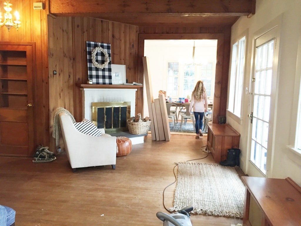
When we first saw the Freeman's application for the Lowe's Spring Makeover, we were immediately drawn to it. Although dark and dated, it felt warm and charming and there was definitely evidence that they had already poured their own sweat into the adjacent dining and tv room even though they had just moved in a couple months prior. So we knew they were go-getters. They hinted that this house had significant meaning to them, but it wasn't until we were in their home, knee-deep in the makeover, that we were really able to get to know them and their story and realize how truly inspired this modern lake house makeover was.
I'll get more into that in a minute, but here's the space when we started. We arrived in Long Island late on Friday night, April 8th. We were originally hoping to stop in and at least take in the space a little bit that night (remember, we had never seen it in person), but it was very late by the time we got out of the city and after a day of traveling we thought we had better get our rest and start the day early Saturday. We worked for 20 hours on Saturday (from 6am-2am) and then slept and worked for a few more hours on Sunday before taking photos and catching our flight around 2pm. Making this a true 24 hour makeover. Here's how it looks now:
It was a whirlwind 24 hours where the game plan quickly became EVERYONE GRAB A PAINT BRUSH! We had the help of 5 Lowe's volunteers for that part and Chris and Ryan (the homeowner) tackled the fireplace area and built-ins, which was our main focus.
Before:
After!:
We repurposed the slate slab that was on the hearth of the old fireplace by removing it (luckily the mortar was really old and it came up pretty easy), demoing out the bricks underneath and then reattaching the slab to the ground using mortar. It really opened up the flooring and made the intersection of the fireplace and the built-ins possible. We popped off the old mantle and Chris started framing out the new design with 2x6's.
Things always look worse before they look better, right? Right!? Before Chris added the MDF pieces on the front, I brushed the bricks with high heat Rustoleum paint in black. One of the issues the homeowner had with the previous fireplace was the white bricks always showed soot, so not only did the black bricks fit into the design we envisioned, they served a purpose, too.
One of the things we noticed in the before photos was they had wood stacked on their hearth, so when we planned for the built-ins next to the fireplace to fill that slanted wall, we also wanted to include fire wood storage on the bottom.
We had no idea the significance of those logs until the project was well underway. I was out picking supplies up with Jennifer when she shared the story of why they landed in this house and why those logs are so important to them. And with her permission, I want to share that with you. Her dad, a carpenter and very skilled perfectionist, passed away suddenly in an accident in 2009. Both Ryan and Jennifer had been mentored by him from a young age (and we can attest, they are both skilled DIYers). Birch was a huge part of his life, so when he tragically passed, the funeral florist wrapped all the arrangements with birch bark. Jen even relayed how the smell of saw dust still reminds her of him.
The following years after his death were extremely hard, and they eventually decided to pack up and move to Long Island for a fresh start. This house, the only one they looked at, was empty for a long time. When they walked in, Jen stood in the entry way just taking it all in. She glanced at the fireplace and there were 6 birch logs stacked. It was in that moment, she felt her dad was there and this was their home. They made an offer on the home and the only condition they requested, despited other repairs needed, was that the wanted the birch logs included with the home.
We feel so honored to have a small part in paying homage to those logs. The photo of Jen and her dad, dancing at their wedding fits right in on the built-ins, we painted in Valspar's Coastal Dusk. The art above the fireplace is a photo I snuck away to take a couple blocks from their home. I sent it to Staples to have printed as an engineer print for less than $3
As for the rest of the space, I mentioned we pretty much painted everything. This view looking toward the front door received wall paint (Valspar's Light Raffia), trim paint (off the shelf white from Valspar), door paint in a glossy black and we painted the radiator covers (in the trim paint), too, tossing on a few pillows to make them more like window seats.
Here's how it looks now:
Painting all the paneling required two coats of primer (Kilz for the win!), followed by a coat of Light Raffia in the Valspar Reserve brand. It's zero VOC, stain-blocking, paint and primer in one, really wipeable and our favorite paint at Lowe's. When we were painting the MDF around the fireplace and built-ins, we just used it (without an additional primer) but we wanted to make sure none of the knots started coming through on the walls, so we took extra care by applying the Kilz to the paneling first.
We also swapped out doors, added baseboard and crown molding and an additional light fixture to the center of the seating space, while swapping out two of the fixtures that were in place: the dated chandelier in the hallway for this pendant that fit into the modern lake house aesthetic we were going for and the brass sconce on the back wall for this outdoor sconce (I've linked it at the end of the post).
One thing the Freemans were most excited about was removing the faux beam and partially paneled ceiling in the space. It really broke the room up, so we were happy to oblige. One of the Lowe's employees used to do sheetrock and plastering work (how lucky are we!?) and he did an amazing job making that ceiling smooth.
While I didn't have time to take proper photos until the afters, I documented the whole thing on snapchat (juliamarcum over there), saved it to my phone, and compiled all the short videos into one five minute video so you could see how it all came together over the course of the 24 hours. (I apologize in advance for the vertical, snapchat video format.)
The Freemans are an amazing family and we feel so fortunate Lowe's gave us this opportunity to give this space a purpose and transform it into something they'll enjoy for years to come.
A few more after photos!
1.Outdoor Wall Sconce 2. Piedmont 4-Light Antique Bronze Chandelier 3. Allen + Roth Pendant 4. Lamp 5. Valspar's Light Raffia 6. Valspar's Coastal Dusk 7. Mohawk Home Gray Woven Area Rug 8. Mirror 9. Mango Wood Stool10. All plants found at Lowe's 11. Camel Leather Chair 12. Throw 13. Plaid pillow 14. Navy pillow 15. Champagne pillow 16. Green pillow 17. Striped pillow
What's your favorite part? I'm still smitten with that fireplace makeover, but that area rug is so beautiful and such a steal, too!
All of our thanks to Lowe's for sponsoring this home remodeling project, the Freeman family for opening up their home to us and all of our readers for consistently rooting us on.
Leave a Reply

WE'RE CHRIS + JULIA
Portfolio
Projects










Love the updates without breaking the bank. Time and money well spent. Goodbye 80’s hello 2020!
I was wondering if a discussion had been held about building the bookcase/storage unit to fill the entire wall? Seems like that space between fireplace and bookcase as just a dust collector of no use. Maybe it has to do with the wall being at an angle.
Absolutely love everything else including the birch story. Colors, lighting, saving the hearth, everything!
It was a really weird angle, but we still felt we maximized the space.
Late to the party (clicking over from Manhattan Nest's link), but oh my goodness, this is awesome. I love the paint color for the fireplace, and the built ins are awesome. The birch log story is just precious. One question - where did you find the frame for the engineer print? It looks great up there, and I think it's the answer for a wall in my house that's been driving me nuts for years. Thank you, and again, wonderful work!!
Thank you so much! It's from Ikea
I thought that might the case. Thank you!!
Love!! Where's the sofa table from??
Marshall's. :)
Love the combination of colors you guys went with and love that story!
Ohhhh so beautiful! That gray/blue paint color is to die for. We are trying to pick a gray for our base & casings... this one might be a little too blue, but it's just gorgeous!
Wow, big changes in such a short length of time, nice job! Though, not to be a "Debbie downer", but for being such a focal point of the room, the top left corner of the fireplace isn't a very smooth miter joint....surely i'm not the only one to have noticed that.
Amazing transformation. You guys are so talented! I love it all... Except for the leather chairs. They are just odd and weirdly shaped. I much prefer the shape of the chair that was already in the room. Great job though!!
Surely I'm not the only one drooling over that little stool in front of the fireplace!? Did you pick it because it was called the Greta? That site should be replacing their photo of it with yours because you made it looks much more appealing :)
Totally in awe of this space as a whole. Three cheers!
Hmmm, the new englander in me thinks that entry hall is not meant to have chairs in the middle of it. A round table goes where that rug is. A nice generous one. And the radiator tops are a great place to sit...if there were not a million pillows. I'd have rather seen cushions there and a chair with a lamp for reading by the fire. And in place of the console table a piece that held entry-way things like outerwear odds and ends.This is a pretty looking space, for sure, but it's no the space's intended or I'd think, actual use.
(I had this same kind of room in my old house: awkward shape, lots of doors, fireplace. I get it, it's useless and perplexing, but this layout is weird. Why would you sit in the middle of the roo like that? In what circumstance is that where you would congregate?)
Hi Holly, we worked with the homeowner to design a room that would fit their lifestyle and family. They wanted a place they could sit and read and we gave them that. I'm sure there's lots of different ways the room could have gone. :)
This is SO INSPIRING. I'm in love with those paint colors. And you did a great job making that fireplace look chic :)
WOW. Seriously amazed! You guys did a fantastic job! :D
I forgot to ask, are those chairs comfortable? They're cute.
You guys did an awesome job. The space makes sense now. You need your own show, book or something!
How do you pick paint colors without testing them out first? I am THE. WORST paint color picker outer ever!
I look at and coordinate undertones. I'll have to do a thorough post on that!
YES! My living room walls look like I intentionally painted them camouflage from all of my test spots!
You guys Nailed it! Now the question is How booked are you for design services? Because I want in!!!!!
Hahaha! We're booked through July right now.
So many favorite parts - the rug turned out to be perfect, the shape of those chairs, the way you COMPLETELY re-worked the fireplace, the built-ins and the entire color palette. (And the lights, simple shoe basket, all the plants and glossy black doors!) Basically, everything. Watching your video gave me all the feels, especially as we're coming down from the high of our own makeover! What a great story you guys were able to play a part in.
LOVE IT! and love your sunglasses- where are those from??
Target!
Really great job. It sounds like a fun and exhausting project. I like the color choices too.
Everything is so lovely! And I think my favorite part is those chairs! I expected to see a standard arm chair there, but those really provide interest. Great job!
Wow, it is so cozy and warm but still bright now! The fireplace makeover is just the best little touch. Modern but still traditional. Great job!
http://danielleandco.com
Great vision Julia!
Wow! You guys did an amazing job!! I can't believe all you did in such a short amount of time. I love the color of the built-ins and the story about the logs gave me chills.
What a gorgeous transformation! Just goes to show the power of paint and amazing designers!
I've got no volunteers, but I do have a friendly dog who promises to trip you, Can you guys come save my house next? ;D
Bravo bravo!!! I love this space. And I love this family. Everything was just so meant to be.
Ahhh it's so awesome. I love how you mix and match colors. This is , like, my favorite palette ever and I kind of love the painted paneling look. Well done, y'all!
Okay. My house next?!? Tucson is calling your names!!! Bravo!
This is a STUNNING makeover! Just beautiful! Those chairs look so comfy...for that price, I'm wondering if they're as soft and sturdy as they look?
Jaw on the floor right now. Incredible job. The light that is in the new space is so gorgeous. I love your snap video! I think my favorite part is the drop you guys did on the fireplace. Something I would never think to do, but it makes such a dramatic difference. 24 hours?! Sounds like the Marcums and the Freemans are a dream team! You all did fantastic.
What an INCREDIBLE transformation! Bravo, all!
Chris loves Julia and we love both! How a great job! Absolutely lovely...
SO GOOD!! CanNOT believe you pulled it off in 24 hours. What a whirlwind, but, goodness, what an amazing gift to give to total strangers. Of course, your design is on point but I love the personal touches most. Bravo!
I love it all. The beautiful family story and the makeover. I would have to say my favorite part is the raffia paint accented with the
Coastal dusk. I love a white room but they are sometimes too stark for me and that grayed down blue was perfect. Great job!
Absolutely beautiful!! I love the built-in, but truly, the overall design is just so pretty, it's hard to pick one detail! You're making me want to run to Lowe's to pick up some new houseplants!
My only question - is this an entry space for the house? It's hard to tell from the pics and the shape of the space seems so big, and yet it doesn't feel like a typical living room.
So unique, right? A major challenge of the room was definitely defining it. The door (that we painted black) IS actually the front door so this is the space you walk into. There is another living area/tv room to the left and a dining room to the right, and a closet for coats and outdoor gear, so they wanted this to be more of a sitting area where they could sit and read.
Great job! I love it all!
How did you paint the brass fireplace insert? We have the same thing and need a fix!
You can see that in the little video, but we used Rustoleum high heat spray paint from Lowe's, taped off the glass and went to town. Really easy!
I cannot believe you guys did ALL that in 24 hours. I know you did some pre-planning - but still. It's amazing. I love it ALL! Might favorites are the light fixtures and the fireplace/built-ins. Love the paint color you chose for the built-ins too! :)
Amazing!!!! Great job!!! love it!!!
Great job Julia and Chris! Question about that rug. Do you think it is comfortable enough for kids to lay on? There is no info on the site about how thick it is. Thanks!!
It's super, super soft. It's probably 1/2" thick, but you could make it even cushier with a rug pad underneath it.
Such a great transformation! I love the color on the fireplace.
However, three years after painting a TON of wood in my own home, I've learned the hard lesson of using latex paint to cover wood, including Kilz Stain Blocker. Everything looked great for about two years and then slowly, knots and woodgrain have seeped through. I've got entire closet doors that need to be totally repainted.
I only use oil based primer now when painting unpainted or stained wood. I hope the same doesn't happen in this house down the line.
What a bummer! We're hoping with the Kilz and the Valspar paint which has stain-blocker in it, too, they'll be set for the long run.
I have to say that I had a similar experience as Jaclyn. Used two coats of Kilz blocker and 2 coats of Valspar paint and 18month later the wood knots coming through look terrible. Really sad.
On a happier note, your transformation looks amazing. Love the design choices. What an difference to have the first room of the house look so inviting. Awesome work!
Love the color of the built-in wall and the overall space! What a difference painted paneling makes!
Thanks Sam!
So, I did the Lowe's makeover last fall and I'm sitting here with my mouth on the floor. First, BRAVO. The transformation is incredible. The design is on point!! Those colors, those chairs, the light! Love every detail. Secondly, I'm amazing at what you accomplished in such a short amount of time. Seriously. *bows down* :)
Anyway, truly spectacular. You should feel SO proud!!!
xo Michael
Thank you Michael! And psht, your living room was night and day! Loved it so much.
Just beautiful! And so strange to see my local beach here - you guys were just a few blocks away. Small world!
Crazy! What a beautiful place you live in.
Is there a link for the lamp over the photo over the fireplace? I love that one!
That's just from Ikea. ;)
I love the ikea light above the fireplace but where's the cord? I see it's going down behind the picture but that's where the on/off is. Did you hard wire it to a wall switch?
We ran a recessed plug behind the photo for a picture light we ordered from atgstores.com. Unfortunately, it didn't arrive in time so we ran to Ikea to pick this one up. However, I believe the original one is there for the homeowners now and all is well. :)
exceptional work you two! I cant believe this 24 hour transformation, it's incredible!
Looks awesome! great job everyone!