This blog post is sponsored by The Tile Shop
One of our Instagram followers replied to a preview photo of our mudroom tile with the comment that "it's giving...'I live in a boutique hotel,'" and they couldn't be more right. Every time I step into the hallway, I feel like I'm strolling into a glamorous patisserie in Paris or a five-star lobby in NYC. I wanted to share more details about how we created the look in case you're hoping to replicate something similar in your home. So I'm turning it over to Chris to share the behind-the-scenes process with you.
Why the Change to Tile
Chris here. So the back hallway and mudroom had a bit of a problem. It had wood flooring that separated with the hot and cold temperatures through the seasons. That was what spurred on the idea of redoing the floors.
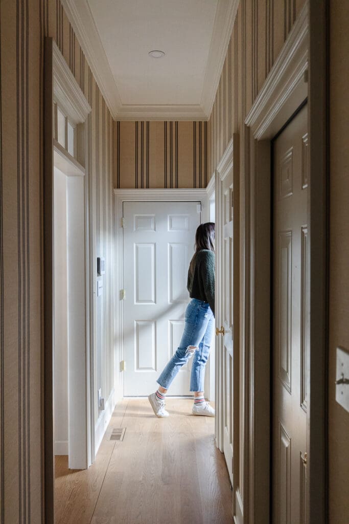
We immediately thought of The Tile Shop. We've used their tile in lots of projects in the past, including the penny tiles in our downstairs powder room and five different tiles (!) in the primary bathroom in our last home.
When we landed on tile for its function and decorative qualities, our contractor ripped all the hardwood out — Which actually ended up causing some pretty big gauges in the subfloor that they then needed to fix. The way that they fixed it was to lay down an extra thick layer of thin-set mortar with a concrete board overtop. And then they used the level as they were screwing it down to ensure the substrate there was nice and even.
From there, they taped and mudded the seams to make it seamless on the substrate so that — as the seasons shift — we will no longer see the gapping that we were getting in the wood.
How We Decided on the Look
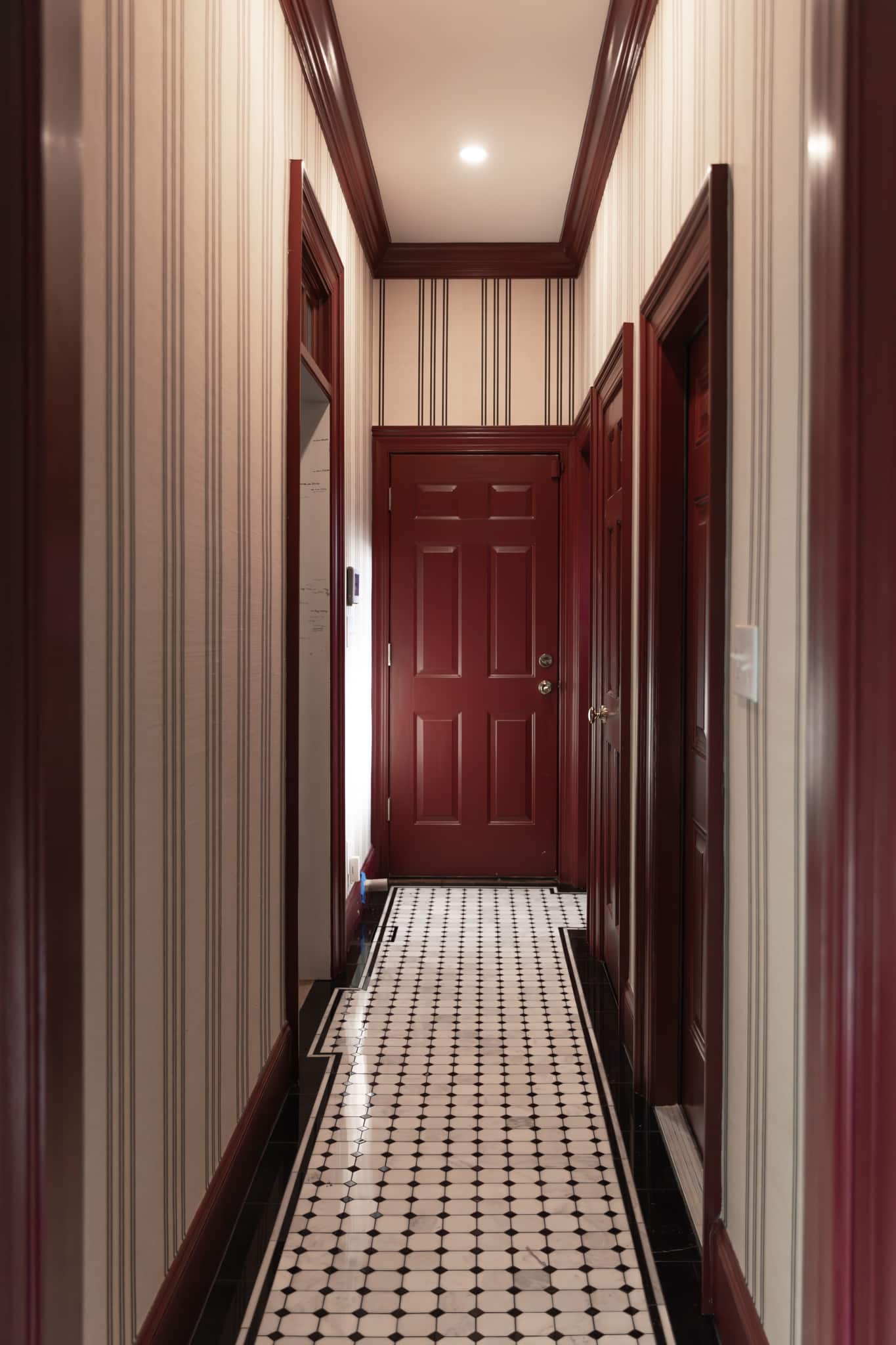
We saw some inspiration online for a hallway that was just so classic-looking. So we created a mood board and went to The Tile Shop to see what we could find to match that vision. Originally we picked one thick black border around the central white octagonal with black dots tile pattern. But then Julia wanted to add a more detailed look with two adjacent pencil trim tiles. We picked one that matched the lighter marble stone in the main area. And then we decided to add another pencil trim in a black border.
The Tile Shop had the lighter pencil trim available, and we were able to cut the black pencil trim out of original black border tile, placing the cut edges into the wall so that it was below the baseboard and you couldn't see it. It was so worth it — I think these pencil trims made all the difference in how the pattern pops.
The Tile Shop has so many options for trim and accessories that allow you to completely customize your design. Additionally, they often have full collections with coordinating trim pieces making it easy and approachable to get a custom look.
Choosing a Grout Color
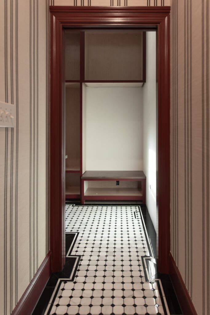
Our contractor Kennon Construction brought over a couple of samples in tile grout books. They have plastic chips that match the color that you can set down next to the tile to get the look you want. Typically Julia likes a lighter grout color. However, if we went with a light grout in the mudroom, then the black border tile around the sides would stick out like a sore thumb. She felt like the white tile could handle a darker grout more seamlessly (no pun intended) than the dark tile could handle a lighter grout. So she chose a very dark charcoal that had a little bit of warmth so it would almost blend into the black border tile.
Executing the Tile Installation
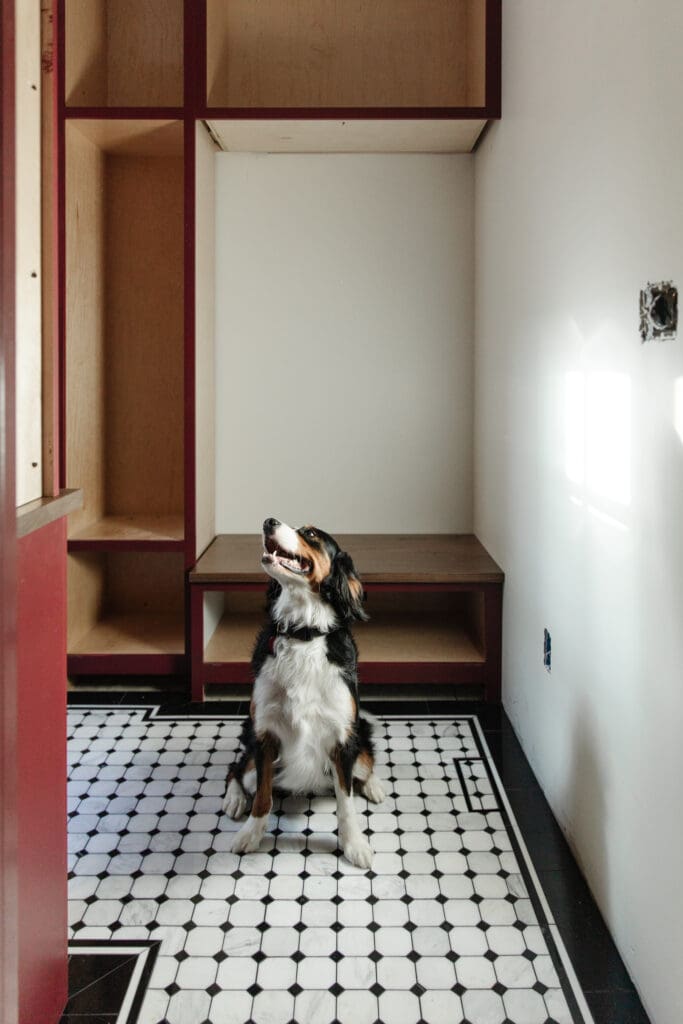
The sub-contractor laid the entire border first. We talked through every doorway, how we wanted it to look. Honestly, I've never seen a tile worker like this. His attention to detail was just impeccable. He was planning for the doorways: Like you're coming in this doorway and the pattern is centered, but also how far do you start this other way so that it's centered on the stairs right next to it. So that you're not getting weird visual tangents on either one of those areas. We found him through our contractor Kennon; they just have great sub-contractors.
Then the crew built the hallway in the garage out of pieces of wood so that they could measure that perfectly and dry lay sections of the hall and the mudroom out in the garage. The reason they did that was that they wanted to perfectly center the tiles in the hall in that space. It helps make sure everything lines up evenly.
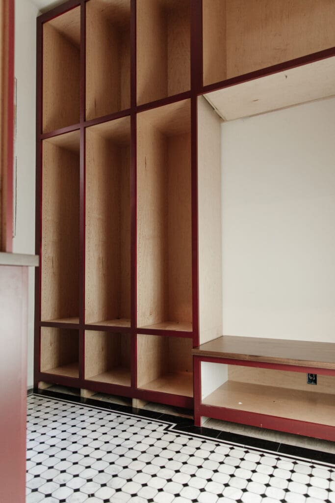
So they measured the space they had to lay tile and then used wooden stripes. They would glue them together and clamp them out in the garage. Then they would measure that, cut the tile and lay it in big sections in the garage. They would stack that section up in the garage and then work on the next section. So they had the entire area dry-laid, cut and ready before they even started laying anything in the actual space.
And so once they got into the room, the crew started in the back corner in the mudroom. They were able to lay everything within a few hours. And everything was just perfectly lined up.
If you're going to DIY something similar to at home, one tip from our tile installer is to put masking tape or painter's tape on the cut lines to reduce chipping around the mitered edges and cuts. Tape the cut lines and cut very slowly to get those perfect seams that look professional.
It's so rewarding to see a vision come to life like this in stunning black & white. In case you're interested, we'll share more about the dog-friendly nook at another time, so stay tuned!
Leave a Reply

WE'RE CHRIS + JULIA
Portfolio
Projects













Just in love with border on the floor!
The hallway came out beautiful, very classy looking. What was the paint color you used?? It’s not mentioned anywhere.
Thanks! The trim is painted in Farrow & Ball Preference Red.
I think it turned out amazing! I love that you take risks in your decorating and while the home is cohesive, each room stands on it's own.
I disgree with some of the comments about the tile being too busy. I love the corners - I see it visually stimulating.
Great job once again.
I can’t imagine how this transitions to the kitchen area? Please show photos of going from mudroom to kitchen?
Wow this is such a lovely old world look that adds charm and character to a cozy space. I would love to be greeted by a mud room like that—it has transformed to another level and another era! What a gorgeous place!
I also think the black border tile should have been installed in a straight line without the bump outs. The tile is busy enough without all of the extra angles around the room. The room could have done with neutral aspects. Not everything has to be a statement piece. Busy floor tile & installation, red trim, textured & striped wallpaper in a clashing color, mirror tile backsplash. Everything fighting for attention creates chaos for the eyes.
I agree with everything you have said! Also, it’s very distracting that the wallpaper stripes are not centered over the doors at the end of the hallway! I actually prefer the before !0
Beautiful and elegant. Usually I have a problem with lines and certain patterns looking too busy but you executed this perfectly. You are fortunate that you found an excellent tile expert and contractor.
Gorgeous! It's as if it's a throwback to a 1940's home. It's brave and visually interesting.
I was hoping to love this. It screams money but lack cohesiveness. Simple fix might be to paint walls white. I have a feeling this is office replay.
Your contractor should have had an eye to help with those costly mistakes. Good luck !
Stunning!!!!!
I absolutely love it. So many spaces in your home feel chic rather than simply fashionable. These color choices are classic but bold.
This hallway reminds me of being in Europe. So high end and classy/classic 🖤
I love the tile selections. I worked for a tile and stone distributor for 15 years and it will always be my favorite part of a home remodel or new construction. That said, the black border marble should be straight lined around the perimeter of the room and not bumped to accommodate for cabinetry, thresholds, or door ways. Especially with a pentagon or octagon mosaic field tile, which is already a busy pattern. You want to minimize the “extra” design and focus on the lovely mosaic marble. In the threshold areas where the depth is more or where the cabinetry depth leaves more area, you would use the black marble field tile. Regardless, this is your mud room and if you’re happy then we are happy for you! The colors are dynamite! Such an improvement over your old mud room. Keep doing you! You’re fabulous!
Regarding ignoring g the projecting profile of the cabinetry when laying out the tile pattern. That cpuld be the rule of thumb but it's just one way of doing it. I like the thought process that went into it. It's a detail that special. Take a look some time at the Guggenhiem Museum terrazzo floors at the baseboards. The metal trim goes vertically up the base. This luttel detail is just beuatiful. Many decisions Chris and Julua make are right on. In an okd post, I did not like the introduction of the new circular window - but only from the outside. Inside it makes sense. I've made 'peace' with the choice. This is the personailtu that adds to a home. Love Chris and Julia's work!!
Me, too. Always so many insightful ideas and beautiful concepts put into action. I haven’t been to the Guggenheim, but it is on my list.
I agree with you about the border tile. Busy tile installed in a busy way.
Love it!! The hallway ceiling is jealous and wants to be red also! 😆
Absolutely beautiful! Love the tile and wallpaper. Classical, elegant. Bravo!👏
I have not yet had the opportunity to select tile for a project but OH how I love pencil trim now that you've shown it a few times since I started following!! Also I love that tile matching on the floor vents. Swoon!
Beautiful! Does the tile carry into the closets in the hall? If not what flooring is in there
The tile turned out beautifully. I LOVE the pencil trim detail! It's so classic looking. Just what I would want in my home!
I'm really trying to like this, but it's just not doing it for me. I love the red trim color. I don't love the clashing undertones of the cool white floor tile and the warm off white in the wall paper. It makes the wallpaper look like it's been living in a cigarette smoke filled room for the last 10 years. I also think all of the border tile would look better if it was installed more streamlined. The bump outs and doorway transitions make it look too busy. This whole project is a big miss for me.
I agree with the wallpaper clashing. I love the tile though. I don't know how I feel about the reddish brown trim against the black border. I used to love the wallpaper but it definitely clashes now the stark white now.
I don't agree that the whole project is a big miss but I found it interesting there was such a disconnect between the cream paper and white tile. When I needed to choose tile I was always encouraged to compare color tones and harmonize (cool undertones of white with cool pastels and the opposite for warm colors). This is a warm hallway, with a stark black and white and maybe because it's all so classic it's something modern we don't have to be married to anymore. I'm not sure what to think because the rules are always changing! The final veto power goes to the homeowner, obviously but it would be an interesting conversation.
I totally agree. I love the tile and the red paint color independently from the wallpaper and the border bump-outs. All together it's almost hard to look at - so busy! I anticipate the wallpaper being swapped out down the road.
This turned out absolutely perfect. I love seeing your vision come to fruition!!