Saturday, we finished hanging a few things in Greta's room and are calling it a wrap! We started out with a school theme, but that sort of morphed into a plain ol' everything-Greta-loves theme--which is anything but plain, really. It turned out so sweet and she loves, loves loves it. I'm so excited to share with you how her room looks today. But first, obligatory before shot.
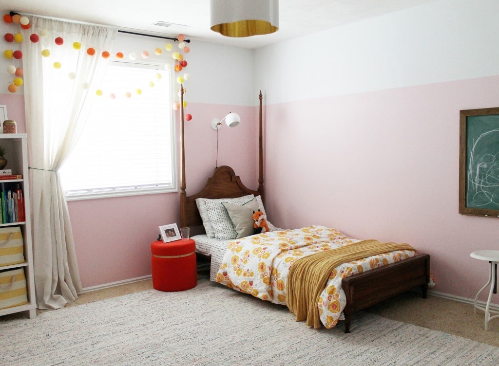
And now!
There are a lot of new things, but a lot of things from her last room, too. This vintage "princess" bed we got for her old room and it has transitioned so well here with some new bedding. I'll list all the sources at the end so this won't get too link-heavy throughout.
Greta really wanted a place to put her cup of water at night (I love her.) and this storage ottoman from Target was such a happy color. She has some other favorite stuffed animals inside and she likes to pick which one to sleep with at night. Foxy has been a new favorite, as well as a lion named Stephanie.
This chalkboard has been such a hit with Greta and her friends. After we made it and it started getting some use, I noticed that her and her friend Lizzie would draw on the chalkboard for at least 45 minutes at a time, sometimes more. Although they never complained about standing to write on it, I thought a pair of stools would make it an even more enjoyable activity.
So now they sit and doodle and doodle and doodle.
That unicorn! I spray-painted the horn gold at the last minute and I love her even more now. Or is Rarity a boy? By the way, Greta was so excited I got Rarity for her room. ;)
This shot shows all the new lights for her room. The reading sconce above her bed from Schoolhouse Electric:
The strand of Bright Lab lights hung from her curtain rod that now serve as Greta's night lights:
And the shiny new ceiling fixture:
On the other side of the window from her bed is a small bookcase with canvas bins housing blocks, trains, puzzles and books too.
On top, I plopped the globe I painted on, a photo of her and "her baby" and an old candle tin that she likes to store her quarters for the arcade in. Fun fact, Greta is obsessed with going to the arcade (Fat Cats)!
Greta's "gallery wall" has some familiar pieces in it as well. The painting she did for her last room and the "Greta the Great" poster and the Max Wanger balloon print were in there, too. I did the still life of blocks and balls in college and I felt like it fit well in here. The flower wreath is from my sister and the paint-by-numbers dog she is vintage and she is convinced is Charly and kisses it all the time. Ashley Percival is the illustrator that did the flamingo. I actually ordered it at the same time as the owls for Faye's room knowing Greta would love the flamingo. She does. You heard all about the butterfly poster here and that amazing pennant is from The Ardent Forager.
There's a little nook when you first walk in her room. I hung an old mirror--that I painted with a wash of the wall color-- nice and low so she could see herself easily and hook to hang her backpack and jackets. A princess dress or three might find its way here, too.
On the other side of the little entry nook, I tacked up a little bulletin board with finish nails for her to hang some of her school projects on. Honestly, I am running out of room on the fridge and luckily she is so excited about hanging her creations in her room.
This room was so much fun to put together. Maybe the most fun I've ever had doing a room. Greta has such a big personality and I'm so glad she now has a room to explore it in. One detail that surprisingly made this room more approachable and more kid-friendly was actually painting only 3/4 of the walls a color and the top part white like the ceiling. I didn't know it at the time, but it really brought the walls down to her level and suddenly, hanging a mirror at my waist level looked normal, and proportional even, to the height of the pink wall color. I'd totally recommend this treatment for a kid's room. Hope you enjoyed some other details, too. Sources below.
Wall Color-Clark+Kensington’s Rose Quartz | Contemporary Rag Area Rug- Wayfair | Bed- Vintage | Imperfect Plus Sheets- Schoolhouse Electric | Gold dot pillowcase- Land of Nod | Linen throw Pillow- Lamps.com | Fox- Ikea |Floral Duvet Cover- Schoolhouse Electric | Yellow Cableknit Throw- Joss & Main (a couple years ago) | Storage Ottoman/Nightstand- Target | White and Gold Reading Sconce- Schoolhouse Electric | String Lights in Sorbet- Brightlab Lights | Linen Curtains- Ross | Overhead Quatrefoil Light- Shades of Light | Bookcase- Land of Nod | Globe- DIY| Yellow and White striped baskets- Land of Nod| Flamingo print-Ashley Percival | Butterfly Poster-Urban Outfitters (frame DIYed)| Balloon Print- Max Wanger | Gaston Pennant- The Ardent Forager | White hooks- Walmart|Bumblebee backpack- Amazon| Bulletin Board- Walmart| Chalkboard- DIY| White Stools- Wayfair | Unicorn- White Faux Taxidermy on Wayfair
Leave a Reply

WE'RE CHRIS + JULIA
Portfolio
Projects








I love love love this room! I want a chalkboard just like that and can't find one online. Can you tell me where you got it?
We made it! Check out this post.
Hello,
Can I ask what white you used? Thanks!
Hi Carolyn! I believe it is Clark+Kensington White Mosaic.
I always paint my rooms 3/4 of the way up with color. An old design trick seen many years ago from an interior design book to make walls look taller!
Turned out great! What a lucky little girl to have such a special room. I love your tip about painting 3/4 of the wall the color. I've never seen that before and it makes so much sense for a kid's room too and helping make things proportional!
I didn't even notice the paint thing until you mentioned it at the end! I love it now that I notice it, but obviously it also blends very nicely. And I think you make a good point about it making things hung lower for Greta feel more like they belong. Brilliant!
I love how it turned out! I also wanted to give you credit for my inspiration in choosing paint for my six year-old daughter's room. We recently moved to a new house, and I was having trouble deciding on what color to paint her room. I saw your post when you painted Greta's, and then shortly after a gallery of "half-painted kid's rooms" on Apartment Therapy and it was the perfect inspiration to do the same for my daughter. We ended up doing 1/3 white on top and 2/3 (roughly) a happy grellow color that she chose on the bottom and it turned out great (despite needing three coats of the green and FOUR of the white..ugh)! It's just so unexpected, and I hadn't even thought of the proportional advantages you mentioned!:)
Greta the Great, you are one lucky girl. Her bedroom is just wonderful. I agree with you Julia, I'm really into the paint stopping below the ceiling line. It make this space unique and charming. Great Job!
What a fun room! Awesome that it looks so much like a kids room and yet so pleasing to grown ups. What a lucky girl. :) And I have a special affinity for the fox- my daughter has the pair of them. I picked them out when I was pregnant and it makes my heart happy that she chooses to go to sleep with the little one every night (she's just over a year).
So cute. I really like your taste. Your music room is still one of my fav remodels.
And excuse me if I have a preference for the lion. :)
It looks fantastic, Julia! The pink wall treatment is my favorite part of the room and really ties it altogether. As always, you did a great job juxtaposing different prints, old and new, feminine and masculine. It's one of my favorite rooms you guys have created, too!
What a room!! Love everything about it, enjoy Greta!
i love everything about this Julia!! I always love kids rooms that reflect the child's personality. It's perfect!
great job! I love how the room came together. I am digging that white sconce for my bedroom.
It's so pretty!! I'd love for my own "big girl" room to look this fabulous! =)
Why does the bed look so squat? It looks like there's a large gap between the mattress area and the bottom of the headboard. Greta is tall, right? Couldn't she climb up into a taller bed? My son is 3.5 and is short, but we just have a step stool for him at the bottom of the bed that he uses to climb up -- a regular bed, box spring and mattress.
All this to say that I like the room overall, but the bed seems odd and way too low to the ground or something.
So I went back in the archives to see the original bed and saw that your boxspring didn't fit. Could a regular twin boxspring work? Or just some new bed rails (prob only cost $50 or less)? If only a mattress is sitting on the current rails, how is that stable? Sorry so many questions from an infrequent commenter, but I'm just confused.
No worries, SS. The bed is low and when she was first getting into this bed, it was perfect (rest assured, we got wood slats supporting her mattress). But we'd love to get a box spring soon. It just didn't/doesn't feel urgent, ya know?
This room looks so great! Will you be reviewing the rug at some point? I'm very curious because it looks great and the price is ever better!
We've had it for a couple weeks now and just love it. The shape is squared off and uniform (I've seen a lot of wonky rag rugs in my day) and I have no complaints so far.
I think this might be my favorite kids room!!! I love all the details such as the low pink paint with white at the top, I'm drooling over the gallery wall and all the lights! So pretty, especially the nightlight balls over the window! I just love everything you guys do! You're an absolutely adorable family!
Ohhh, thank you so much Yalanda!
Very nicely done. I am so glad Greta has a finished room that she loves. That Duvet you found is perfect, it really pulled all your colors together, and that gold blanket looks so much better than the one in your moodboard, the wool striped one you had chosen. Very nice indeed.
You really have a talent at doing "just enough" in a room. The decor is playful visually stimulating without being too busy. I also love how the color scheme is something that will work even as Greta gets older and how collected the room feels. Great job!
I love the color combos you put together for this room! The light sconce above her bed is a great idea - my daughter would love a reading light like that. Also, nice idea to cover the carpet with an area rug.
This is adorable!
SO. MUCH. YES. It's so perfect for a kid but not overly-saccharine in a way that makes it hard to be in there. And now I want a chalkboard in my room. Haha.
One question: where do you keep her clothes? I don't see a dresser or a closet.
Thank you! And good question. The wall opposite her bed, there's a large closet. You can see it in the post where we painted her room: https://chrislovesjulia.com/2014/09/34-painted-pink-walls-in-gretas-room.html
Home run! This is maybe my favorite room that you guys have done. I love how it is stylish but not "overdone" at all. Cohesive but not matchy matchy. Girlie but not in a cliched or predictable way at all. It looks eclectic and collected. Really practical too with a lot of space for activities and playtime, and conducive to a good night's sleep also. I think a lot of the ideas would translate well to a boy's room as well (I have a son). The vibe you have going in this room is very similar to what we have in our house in general, but we haven't done a big kid's room yet (son is just a baby) so I'll definitely be filing this away for future ideas about how to bring our style into a big kid space. Love it.
A lion named Stephanie :)
Every Single Detail! I love everything. Is Greta in heaven!? Seeing a Fox on her bed made me laugh because Brinley's current favorite stuffed animal is a fox named Foxy too! Our girls :-)